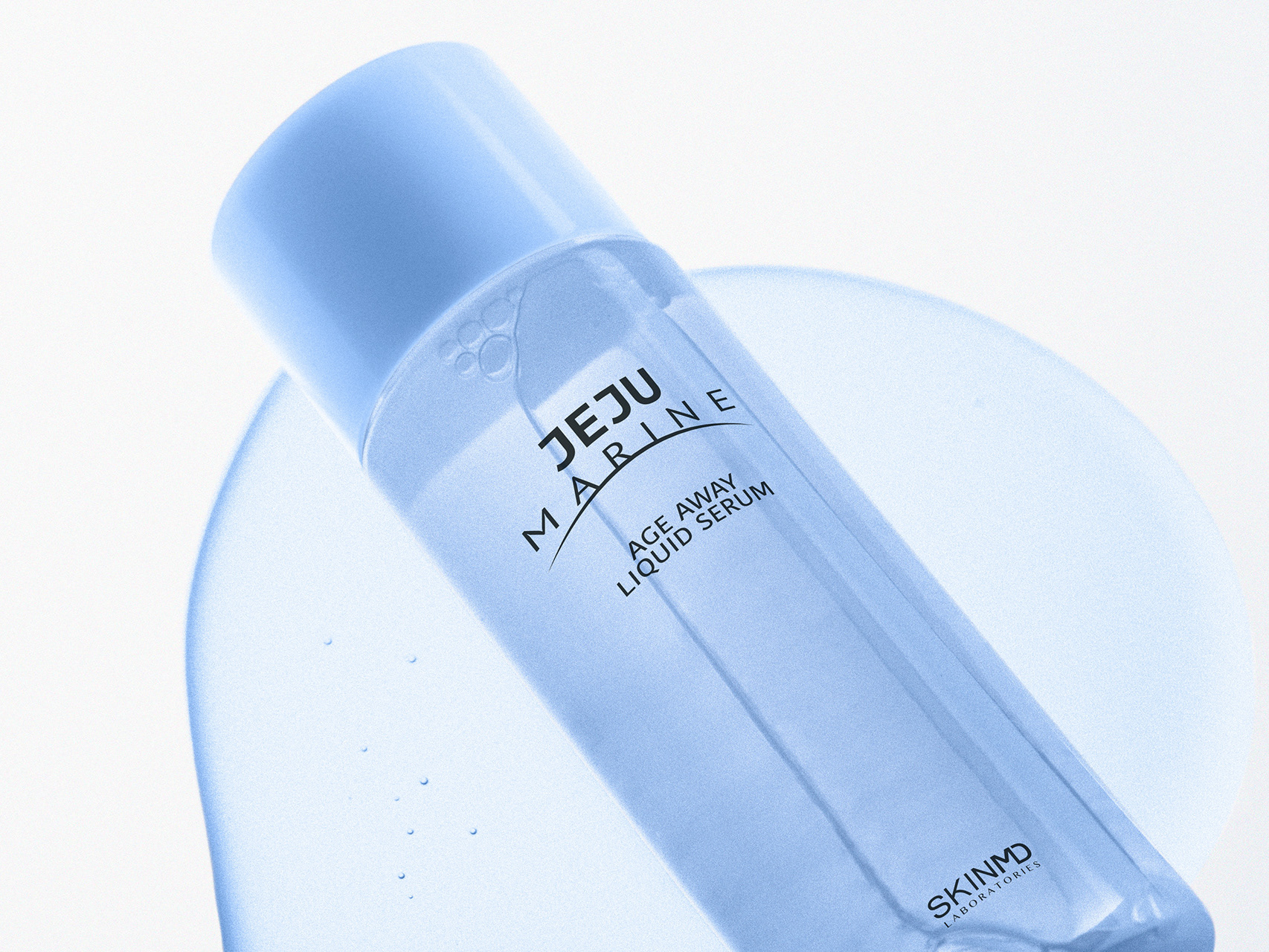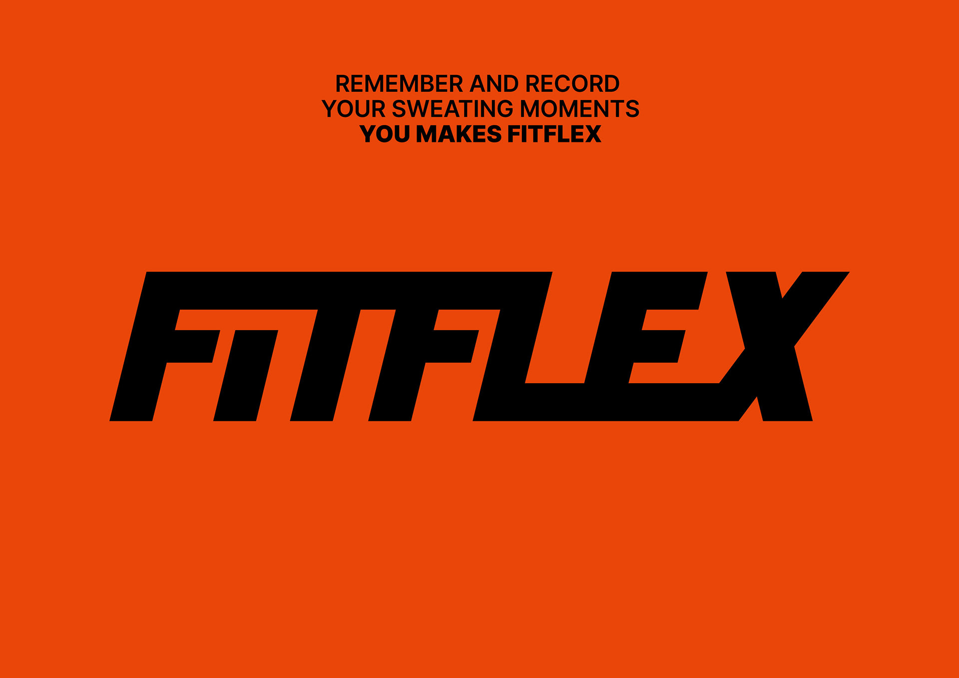
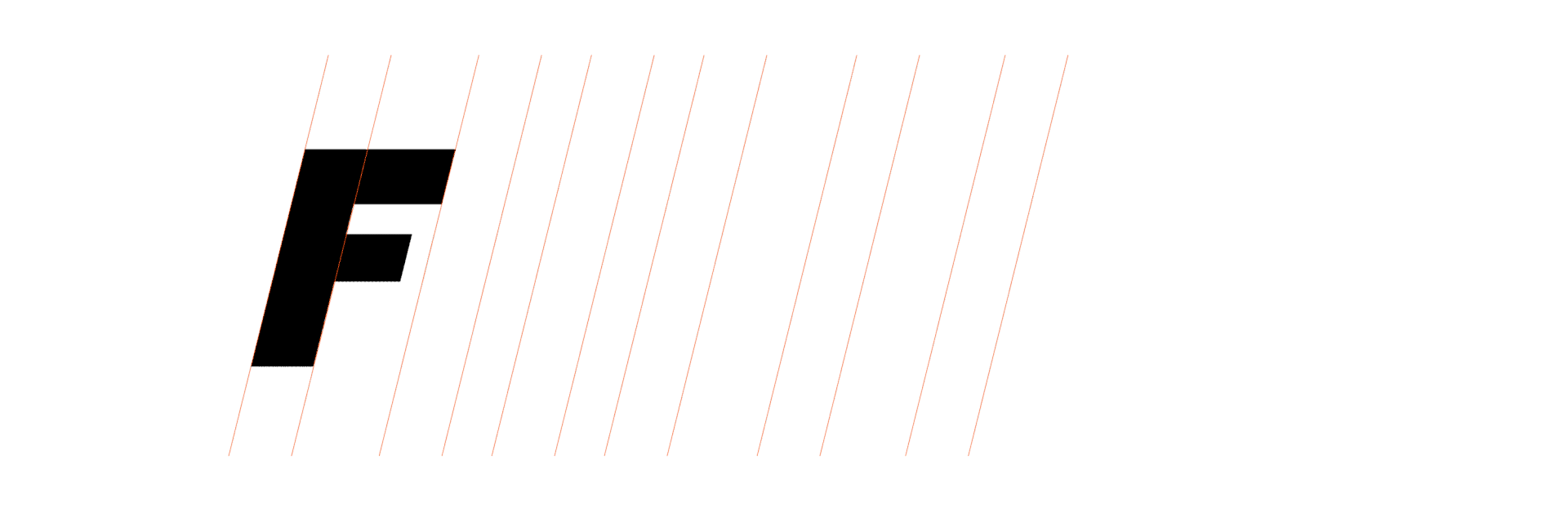
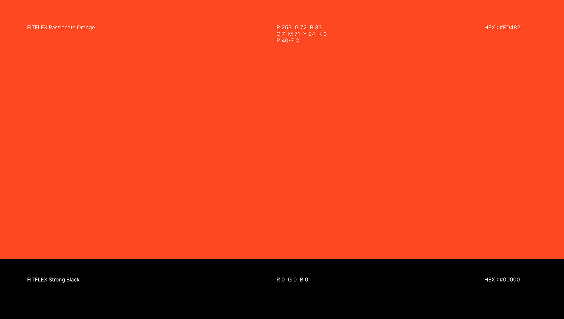
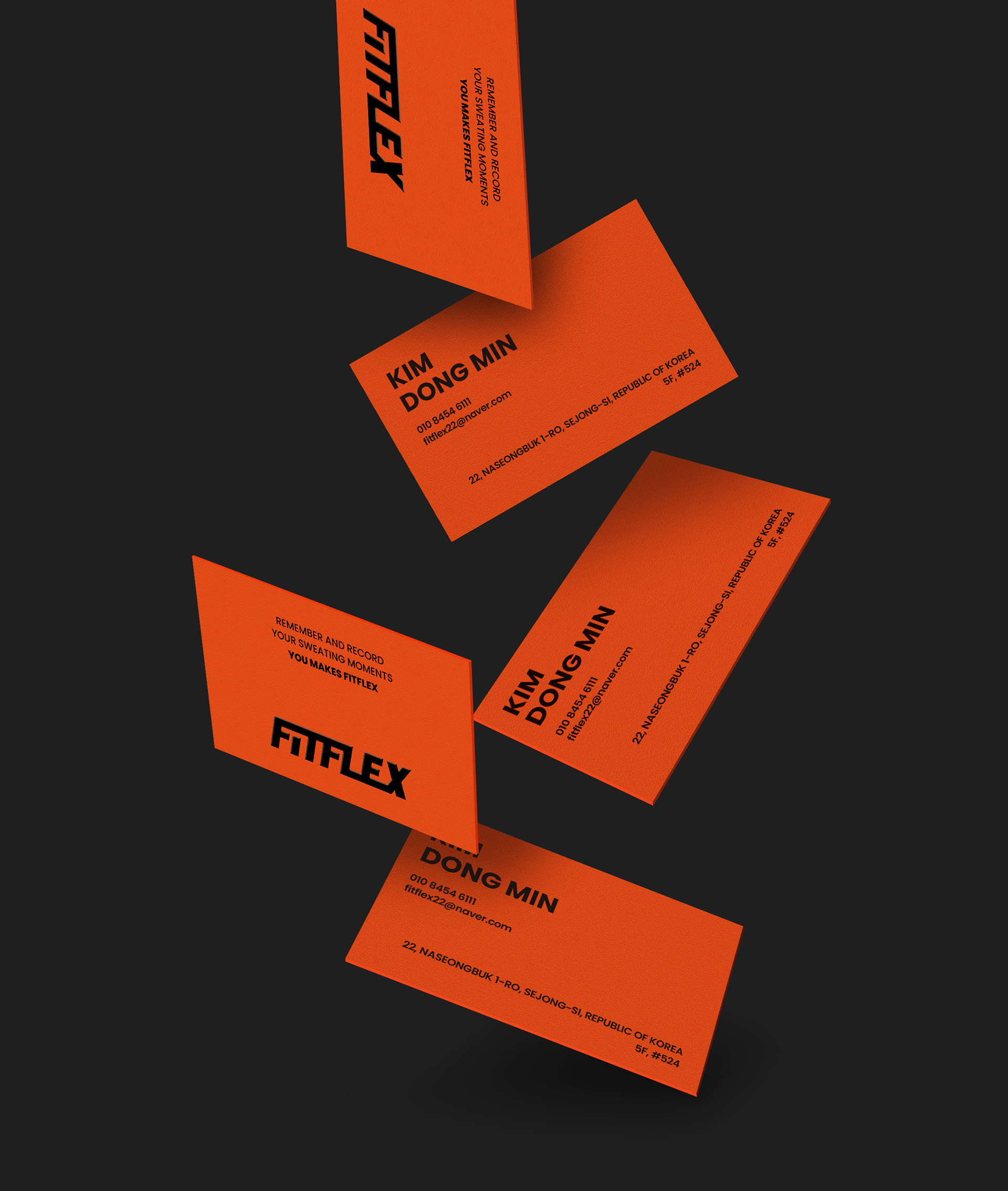
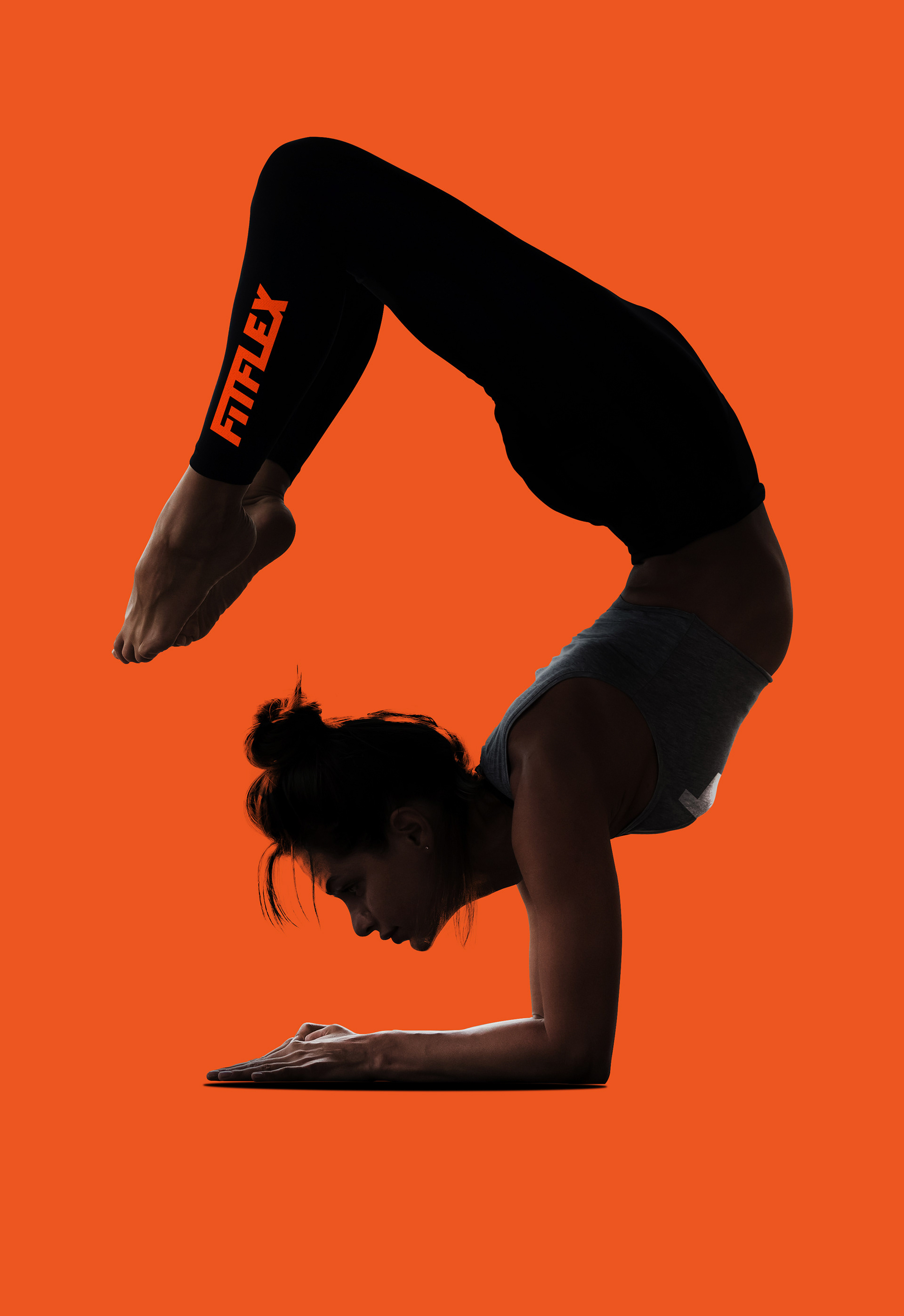
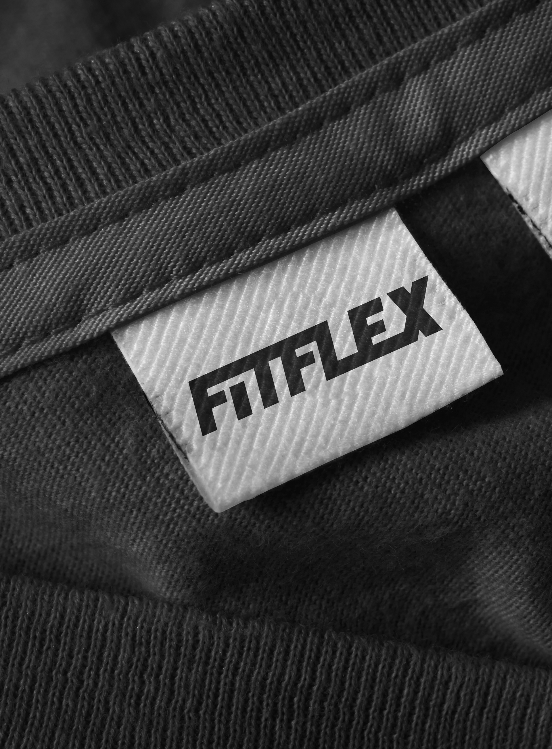
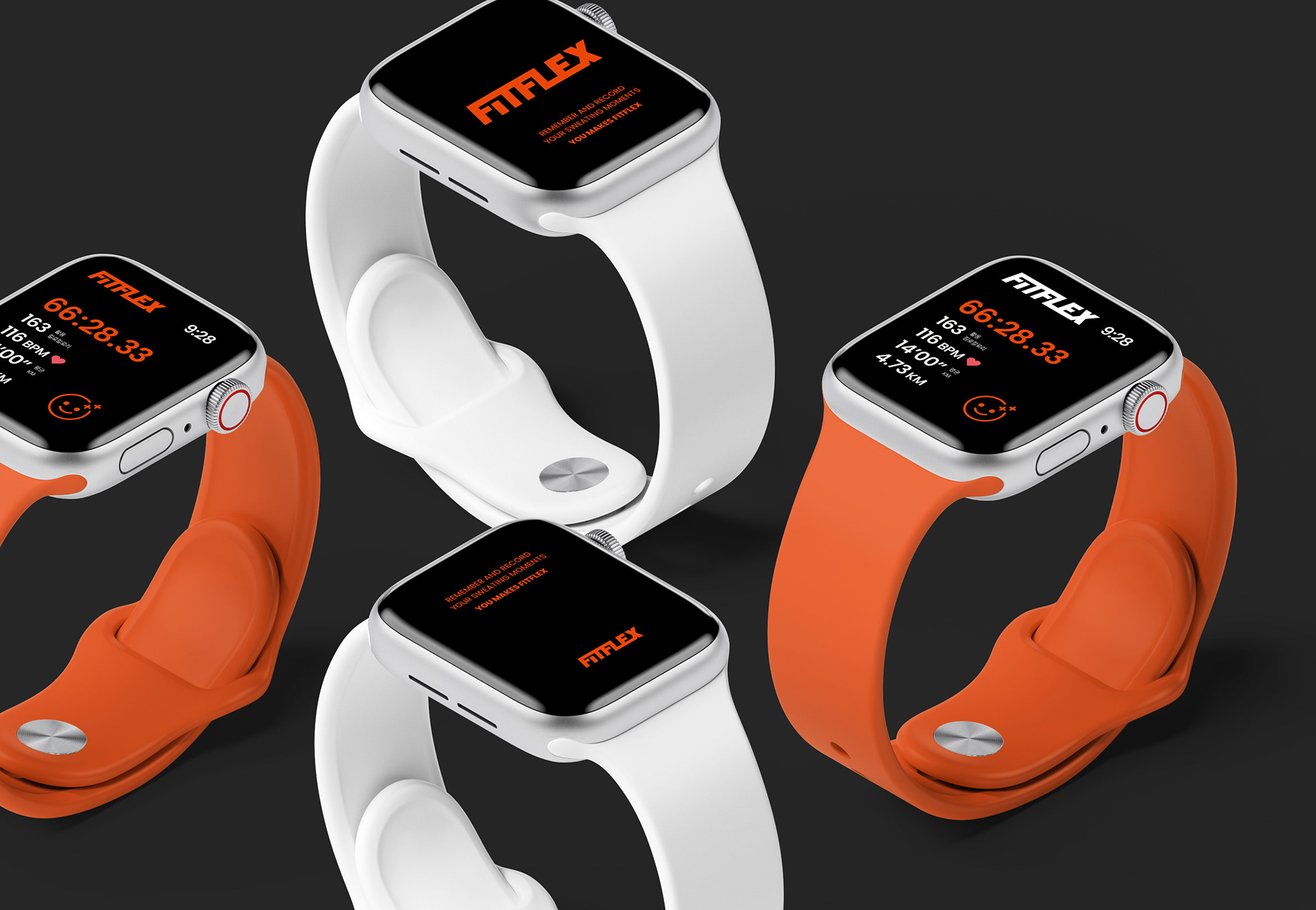
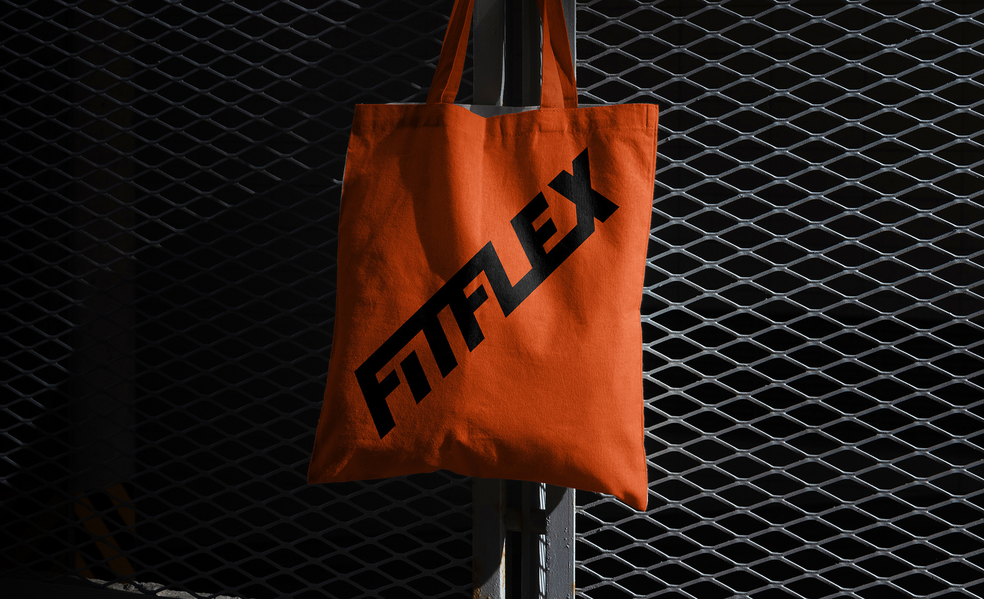
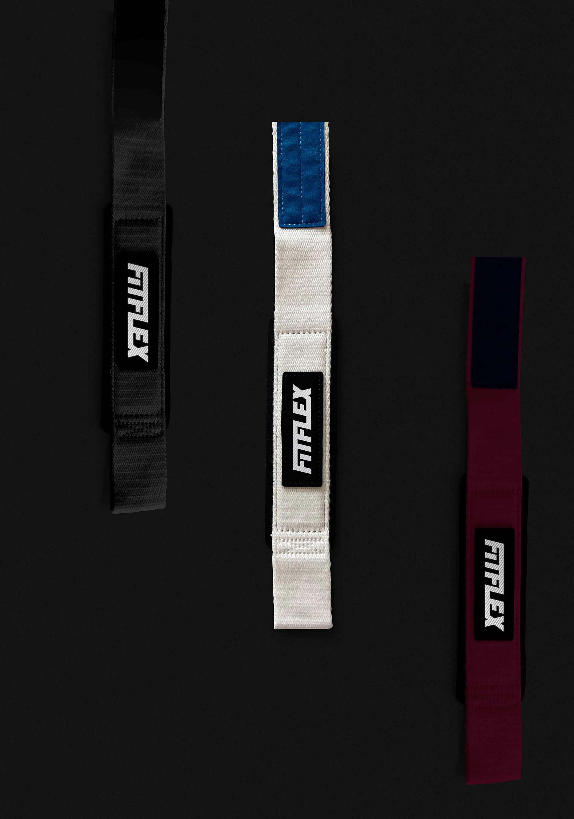
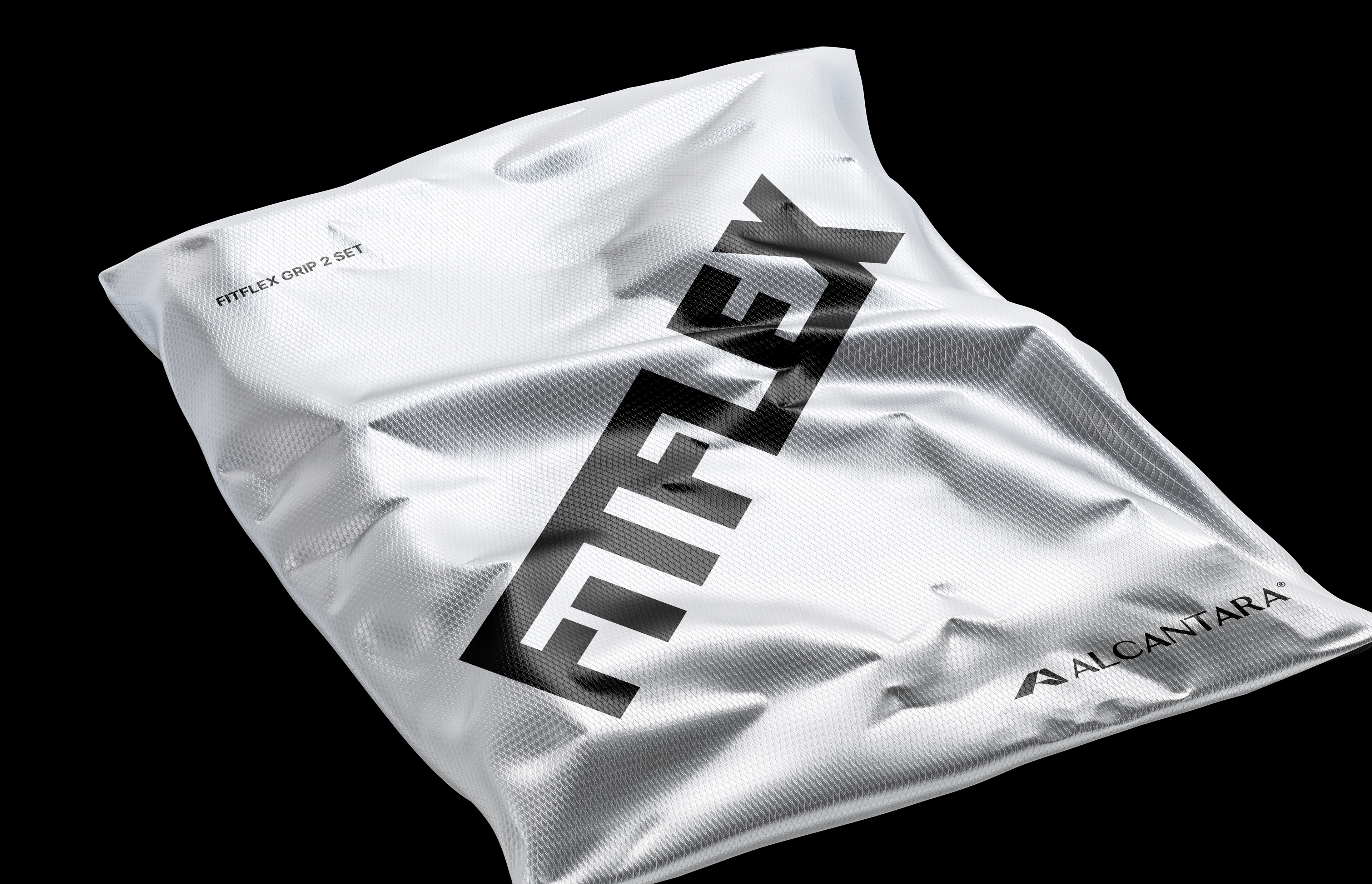
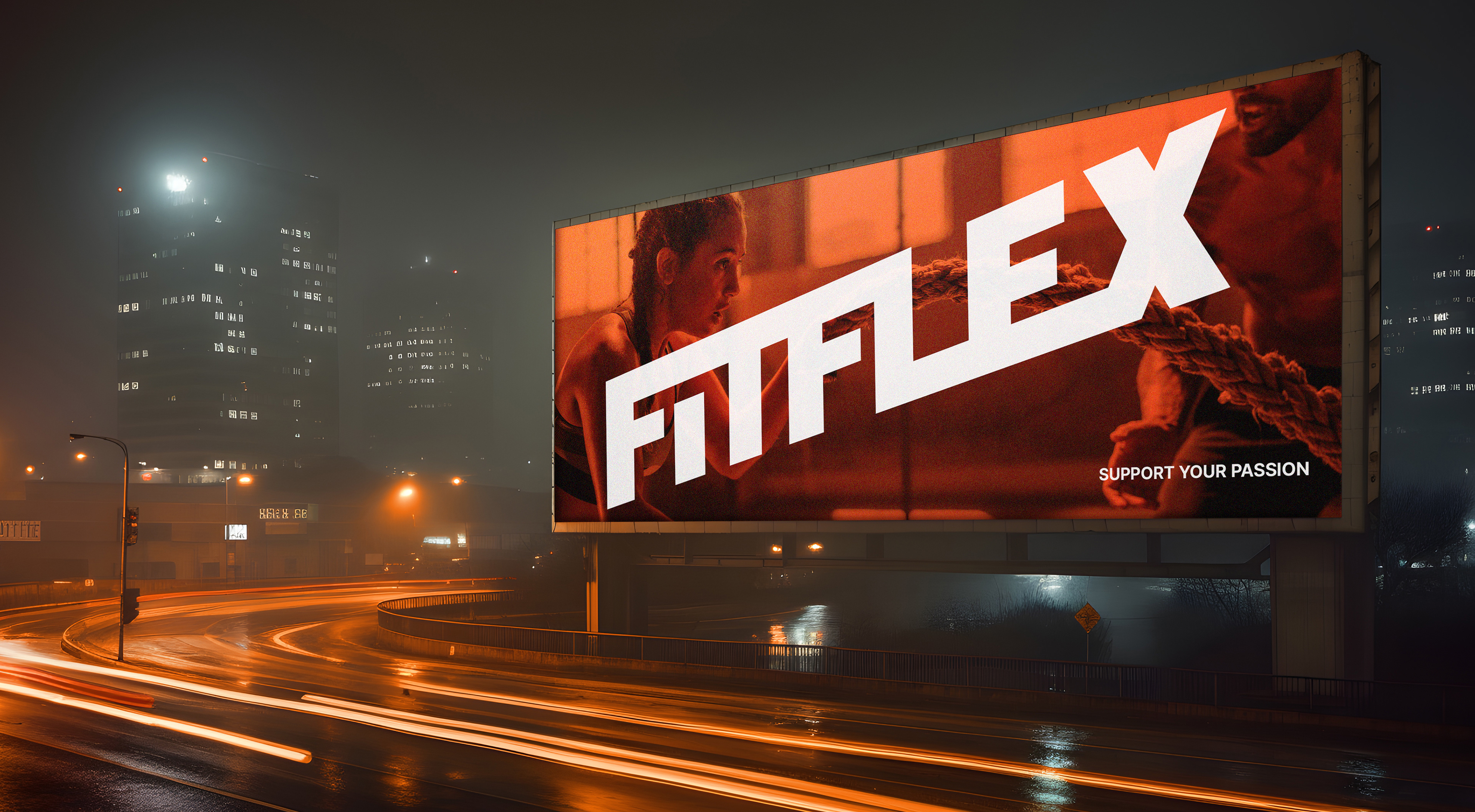
새로운 소재에 대한 끊임없는 연구와 소비자와의 소통을 위한 디자인에 대한 과감한 투자, 시대의 흐름을 읽는 기업가 정신이 조화된 브랜드가 바로 핏플렉스입니다. 때로는 플렉서블한 태도를 보이면서 때로는 가치 추구에 대한 고집스러운 성격을 갖고 있습니다. 이탤릭체로 기울어진 워드마크는 핏플렉스의 유연함을 상징하고, 두툼하고 무겁게 자리한 이미지는 탄탄한 기능성과 안전성에 대한 가치를 담고 있습니다. 자신을 단련하고 건강을 관리하는 사람들의 건전한 정신과 신체의 이미지를 형상화하였습니다.
Fitflex is a brand that combines continuous research into new materials, bold investment in design to communicate with consumers, and an entrepreneurial spirit that reads the trends of the times. Sometimes they have a flexible attitude, and sometimes they have a stubborn nature in pursuing values. The italic, slanted wordmark symbolizes the flexibility of FitFlex, and the thick and heavy image embodies the value of solid functionality and safety. It symbolizes the image of a healthy mind and body of people who train themselves and manage their health.


FITFLEX Branding&Packaging Project
Client: FITFLEX
-
Check Real!
-
Design Area
#Brand Design #Brand Identity #Package Design #Fitness Brand
-
Project Team
FITFLEX + FDG Design B Team
-
Art Direction by HoSoo Nam
Design by HeeSun Kim
www.fouroclock.kr