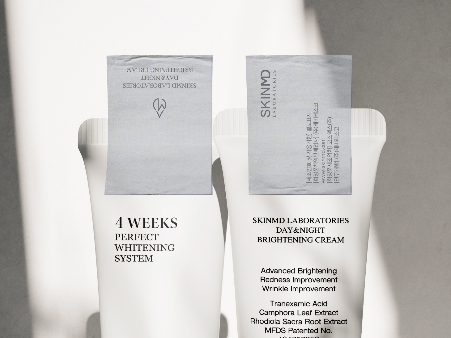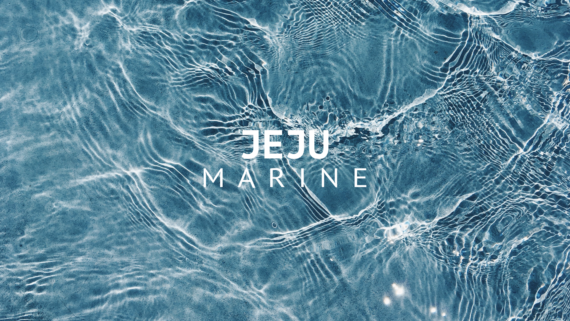
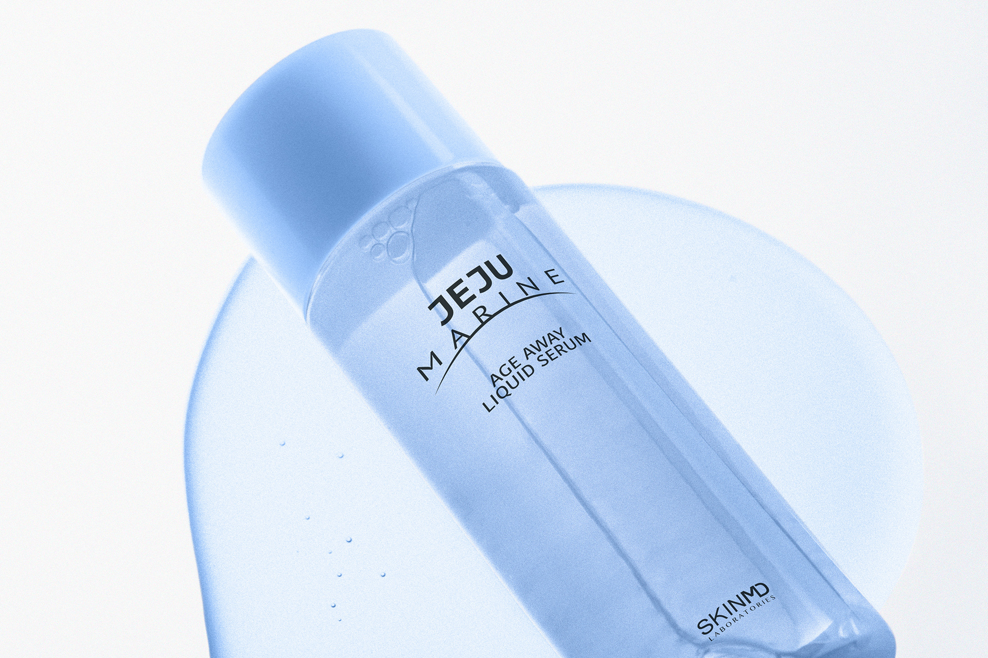
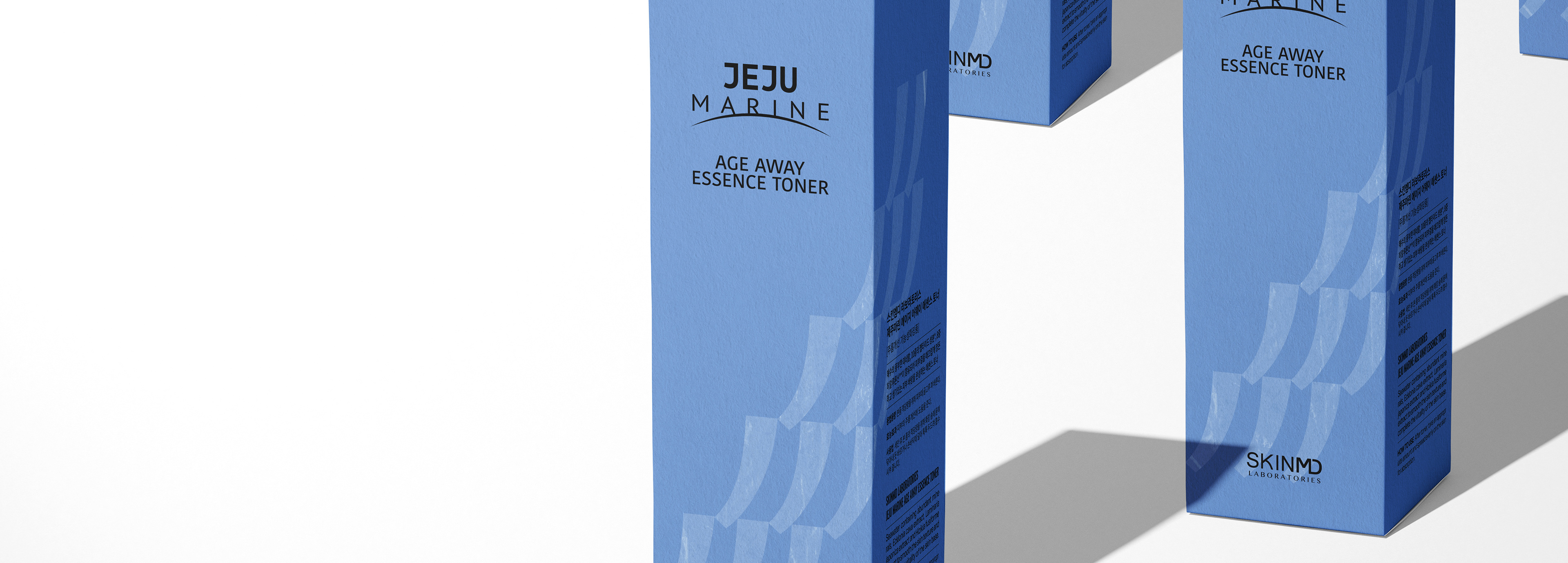
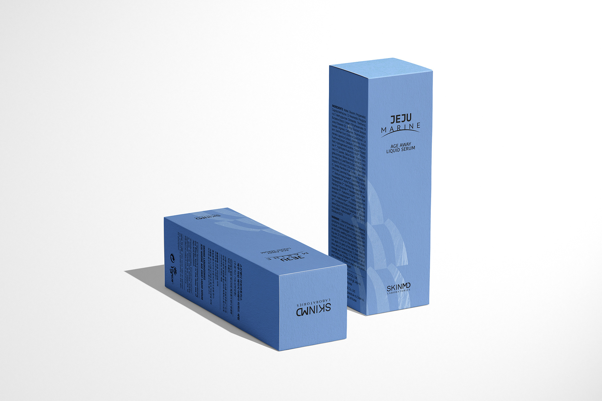
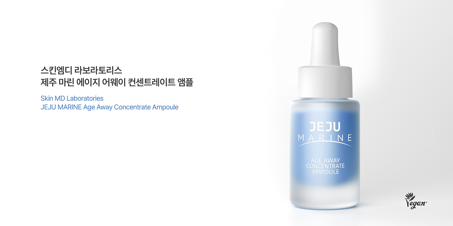
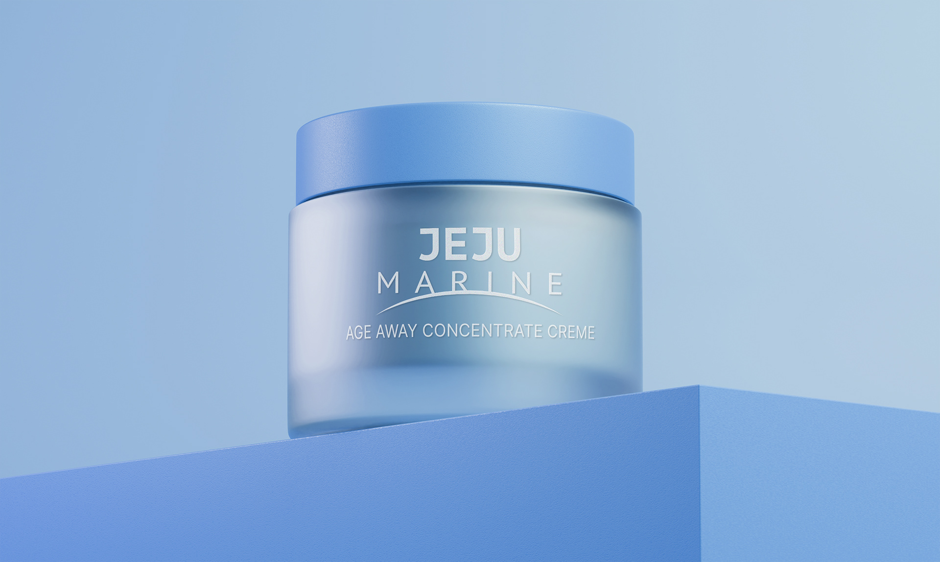
제주도를 나타내는 가장 미니멀한 표현. 코스메틱스 분야의 언어와 레이아웃에 가장 적합할 수 있는 브랜드 로고의 개발. 단촐하지만 유려한 곡선은 제주도의 자연이 주는 부드러움과 청량감을 나타냅니다. 라인업 제품에 표현된 부분 코팅의 패턴은 제주 바다에서 느낄 수 있는 파도를 형상화하여 바다의 역동성을 담아 내었습니다. 제주의 바람과 바다를 느낄 수 있게 하는 브랜드 디자인과 패키지 디자인으로 '제주마린'이라는 브랜드 스토리를 함축하여 소비자에게 그대로 전달합니다. 다양한 기업과 제품이 제주도의 이미지를 차용하지만, 본 디자인 개발로 인해 스킨엠디는 제주도의 이미지를 가장 잘 활용하는 대표 기업으로서 선도적 위치를 누리게 되었습니다.
The most minimalistic expression of Jeju Island. Development of a brand logo that best suits the language and layout of the cosmetics sector. The simple yet elegant curves represent the softness and refreshing feel of Jeju Island’s nature. The partial coating pattern expressed in the lineup products embodies the waves that can be felt in the Jeju sea, capturing the dynamism of the sea. The brand story of ‘Jeju Marine’ is encapsulated and conveyed to consumers through brand design and package design that allow users to feel the wind and sea of Jeju. Although various companies and products borrow the image of Jeju Island, through the development of this design, SkinMD has enjoyed a leading position as a representative company that best utilizes the image of Jeju Island.


JEJU MARINE Cosmetics Branding&Packaging Design Project
Client: SKINMD
-
Check Real!
-
Design Area
#Brand Design #Brand Identity #Package Design #Cosmetics Brand #Cosmetics Package Design
-
Project Team
SKINMD + FDG Design A Team
-
Art Direction by WooSang Yoon
Design by WooSang Yoon
www.fouroclock.kr