말똥말똥 프로젝트는 한의학을 중심으로 원료에 대한 깊은 공부와 연구를 통해 제조한 숙취해소제의 브랜드 디자인과 패키지 디자인을 포함하고 있습니다. 주요 타겟 고객 세대는 20~40대까지의 세대로 알코올로 인해 기억력의 손상을 걱정하는 소비자에게 주효하게 접근하고자 기획된 제품입니다.
The 'Malddong Malddong' project includes the brand design and package design of a hangover reliever manufactured through in-depth study and research on raw materials centered on oriental medicine. The main target customer generation is those in their 20s to 40s. This product is designed to effectively reach consumers who are concerned about memory damage due to alcohol.
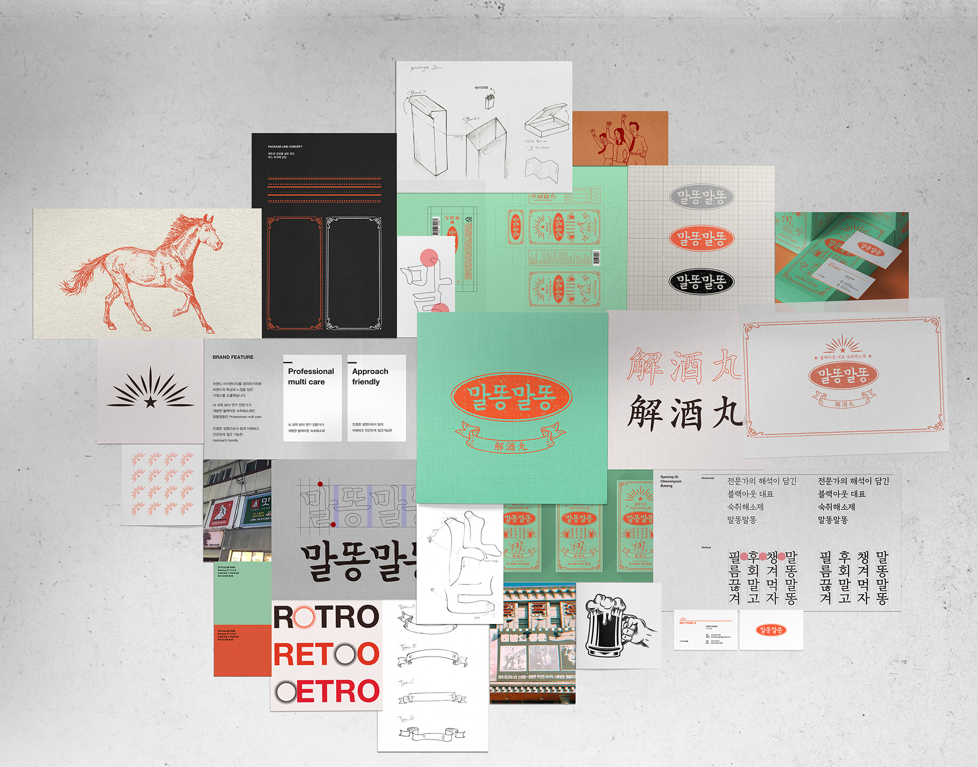

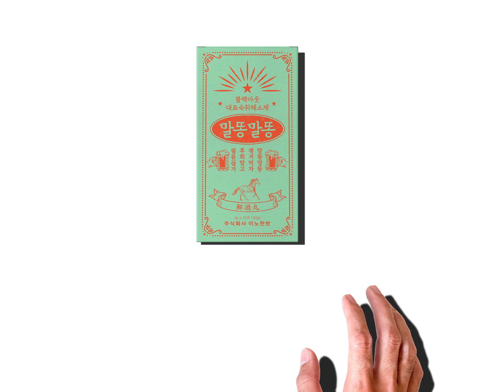
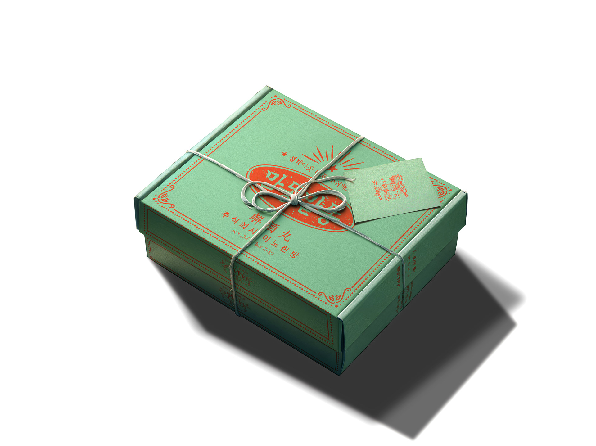
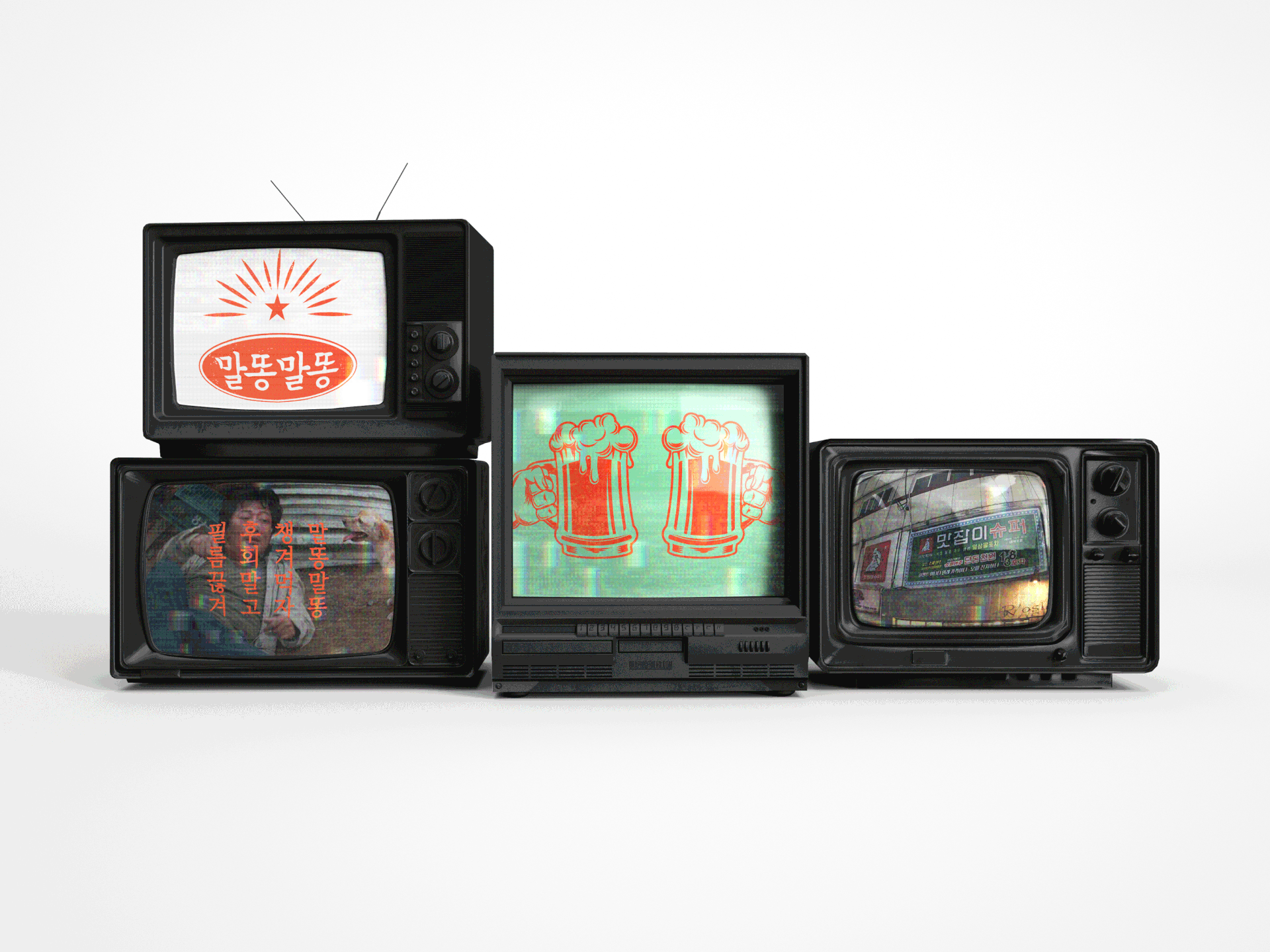
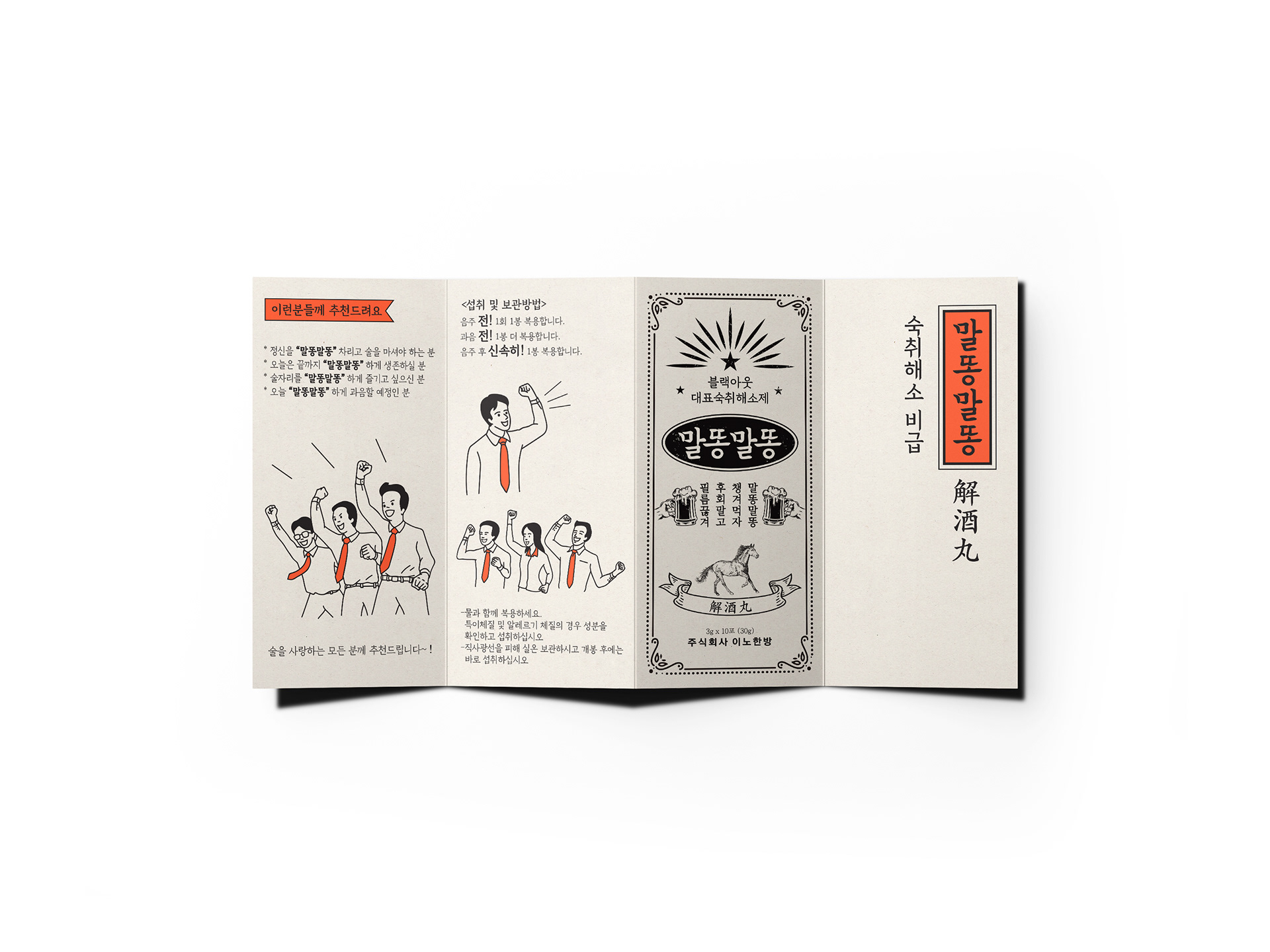
젊은 세대뿐만 아니라 중,장년층까지의 고객에게도 어필할 수 있는 디자인을 위해 중,장년층에게는 추억의 소환을, 젊은 세대에게는 복고에 대한 재미있는 이미지를 전달하기 위해 레트로 디자인 언어를 차용하여 디자인을 전개해 나갔습니다. 고객사에서 네이밍한 '말똥말똥'이라는 제품명에 생명력을 불어넣고 재미있는 스토리를 만들어 나가기 위해 복고풍의 디자인 오브젝트와 슬로건 등을 개발하였습니다.
In order to create a design that appeals not only to the younger generation, but also to middle-aged and older customers, we developed a design by borrowing retro design language to recall memories for the middle-aged and older generation and to convey an interesting image of retro to the younger generation. . We developed retro design objects and slogans to breathe life into the product name 'Malddong Malddong', which was named by our client, and create an interesting story.
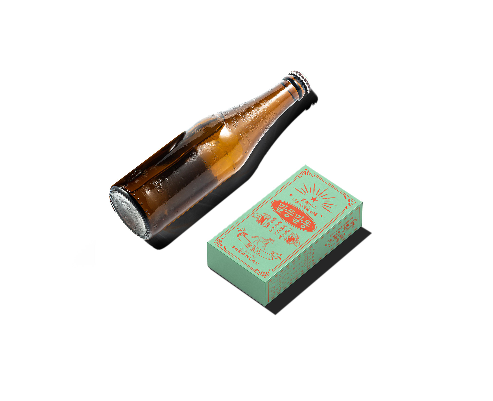
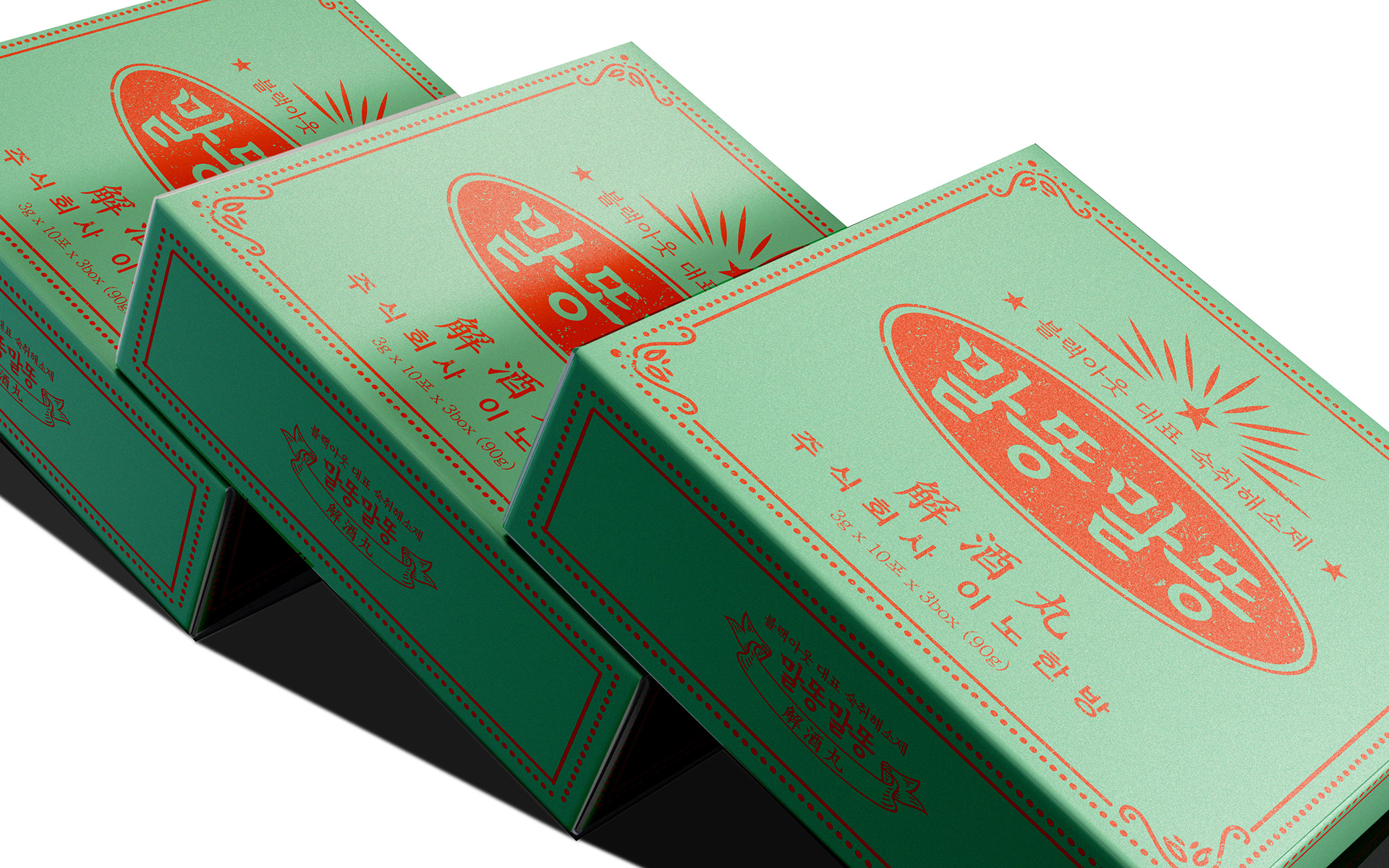
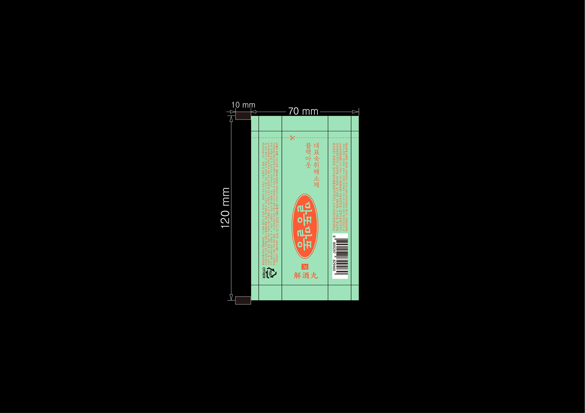
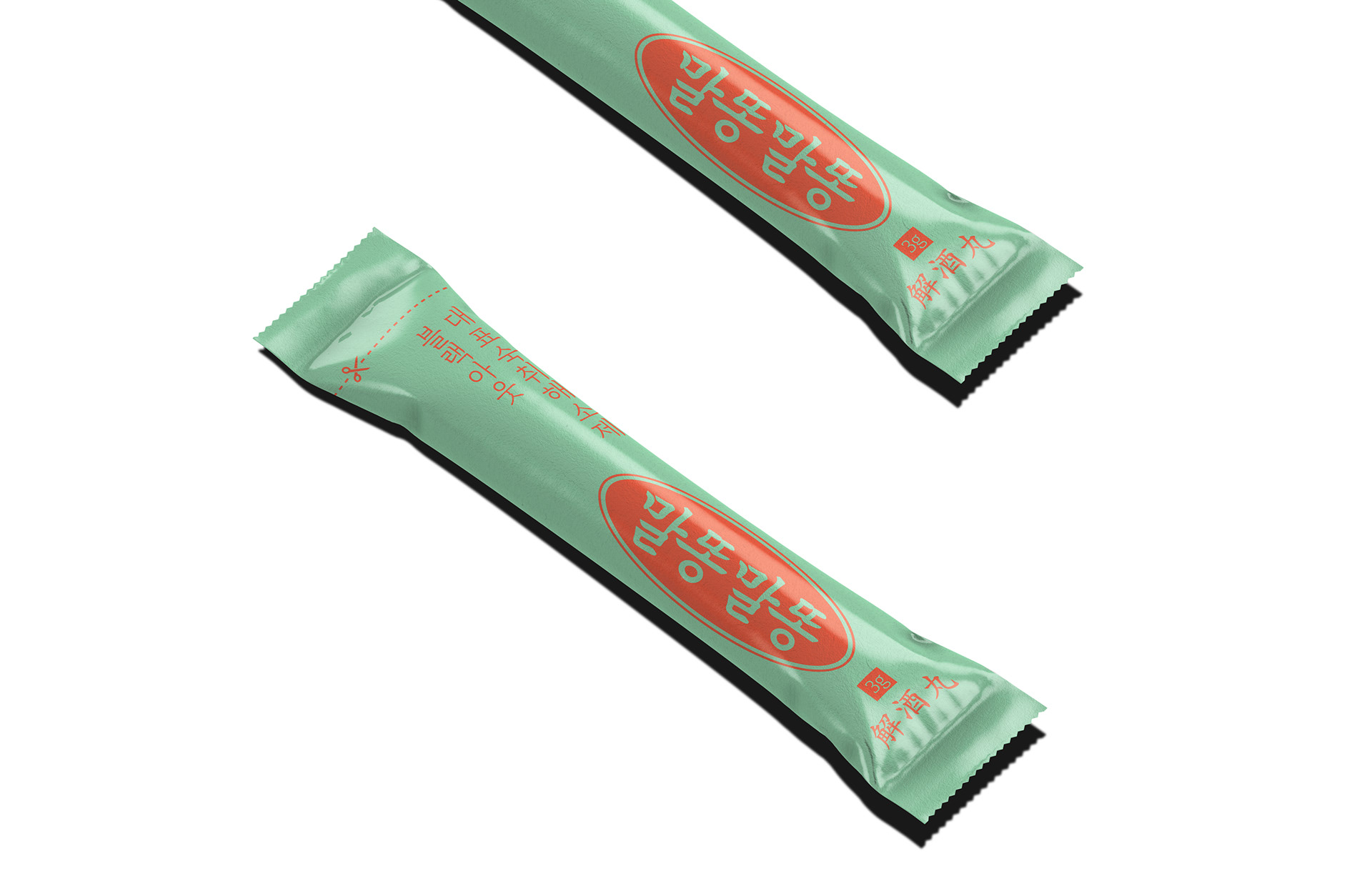
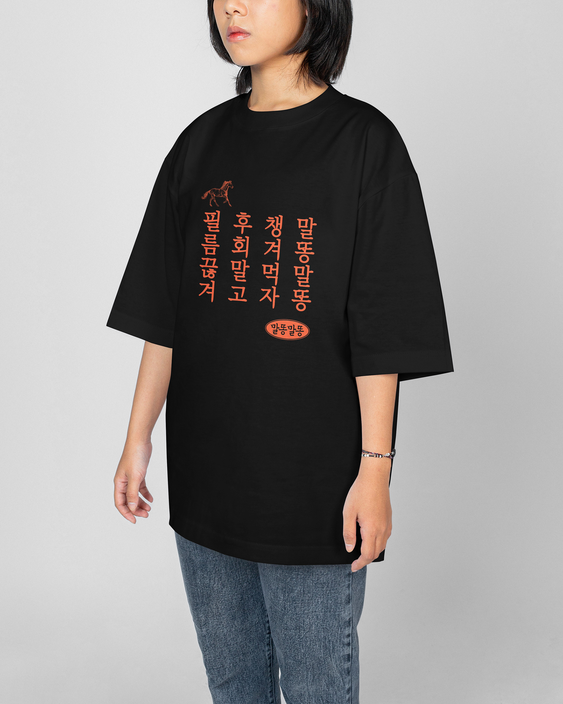
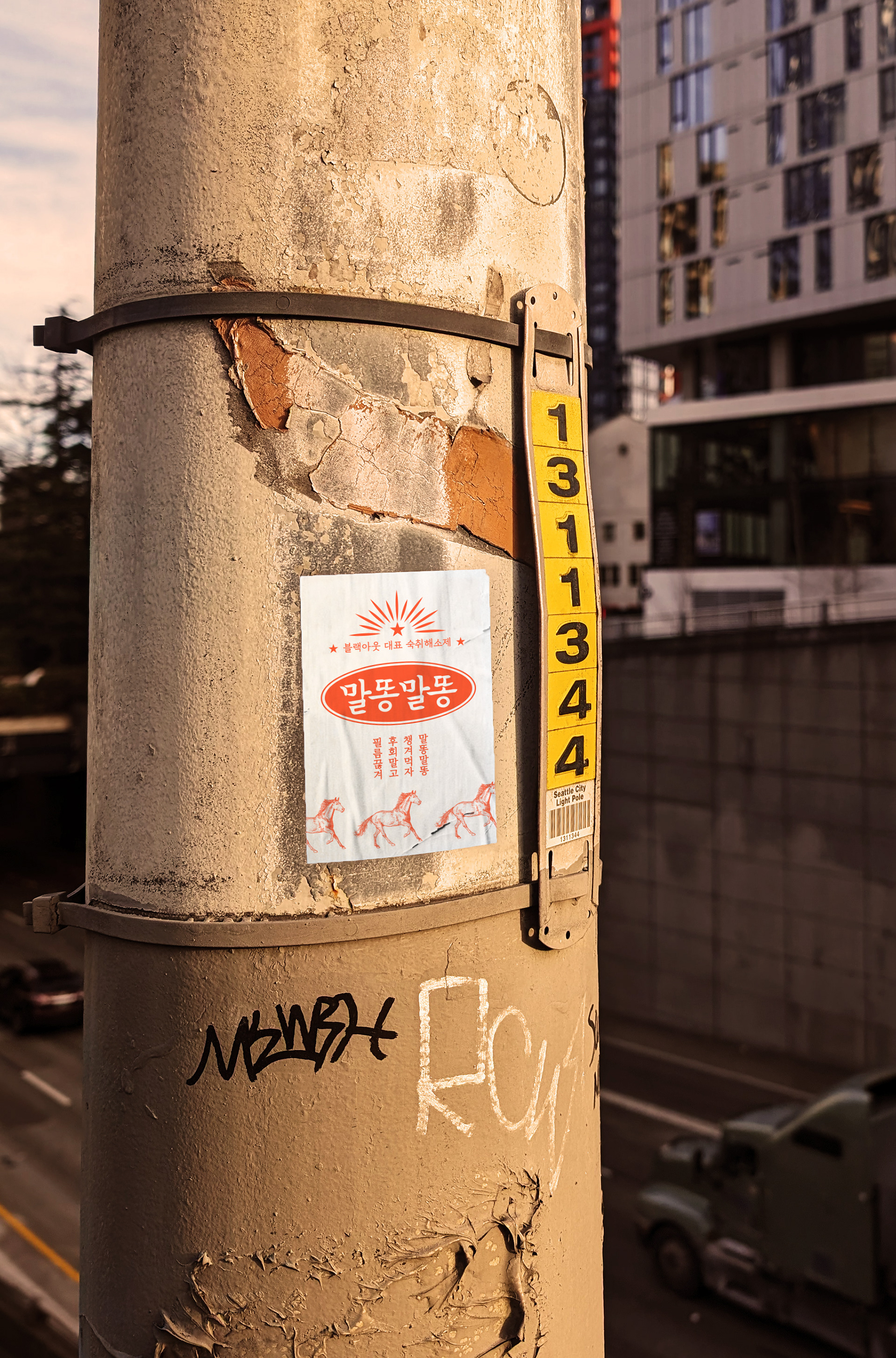
크게 과장된 말똥말똥의 브랜드는 가시성과 더불어 기획된 복고풍의 전략을 보여주는 주요한 오브젝트로서 제품의 단상자, 스틱포 등의 포장 단위에 크게 인쇄되어 있습니다. 하단에 말의 이미지를 위치시켜 쌩쌩한 말의 기운을 차용하여 제품의 기능성 측면을 교묘하게 과장시켜 소비자에게 어필하고자 하였습니다. 본 전략은 '말똥말똥'을 좀 더 확실하게 고객에게 인식시키고 장기적인 포지셔닝을 해나감에 있어 유리한 역할을 수행하게 됩니다. 본 디자인의 독창적인 포지셔닝을 통해 '뿔근뿔근', '또랑또랑'등의 후속 제품의 출시를 선도할 수 있었습니다.
The greatly exaggerated brand of 'Malddong Malddong' is a major object that shows visibility and the planned retro strategy, and is printed in large print on packaging units such as product boxes and stick pouch. By placing an image of a horse at the bottom, we borrowed the lively energetic image of a horse and cleverly exaggerated the functional aspects of the product to appeal to consumers. This strategy will play an advantageous role in making customers more clearly aware of ‘Malddong’ and achieving long-term positioning. Through the unique positioning of this design, we were able to lead the launch of follow-up products such as 'Bbulggun Bbulggn' and 'Ttorang Ttorang'.


Malddong Malddong Branding&Packaging Design Project
Client: (주)생활한방연구소
-
Check Real!
-
Design Area
#Brand Design #Brand Identity #Package Design #Hangover Reliever
-
Project Team
FDG Design A Team
-
Art Direction by WooSang Yoon
Design by WooSang Yoon / HeeSun Kim
www.fouroclock.kr