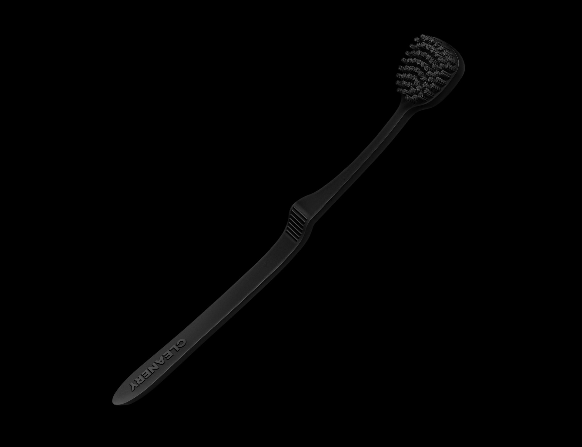
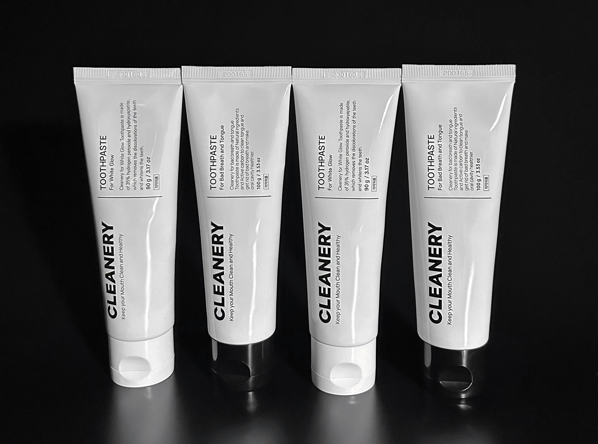
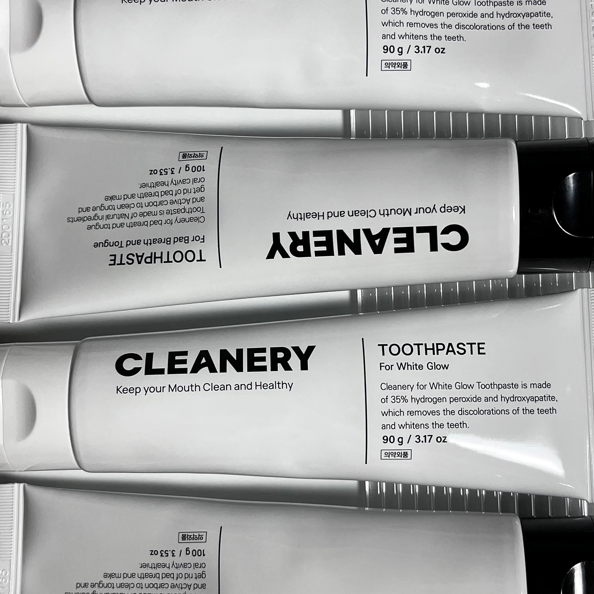
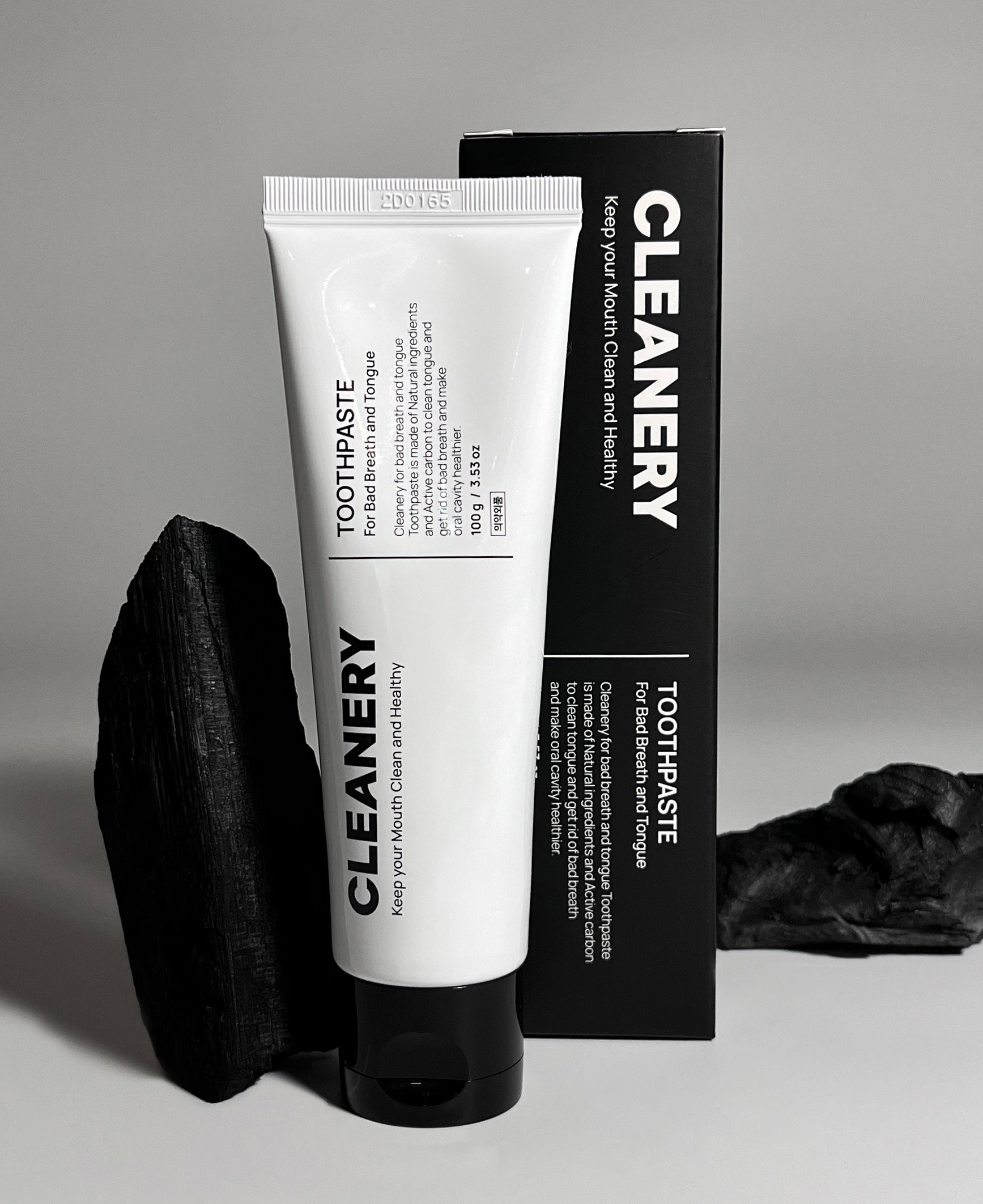
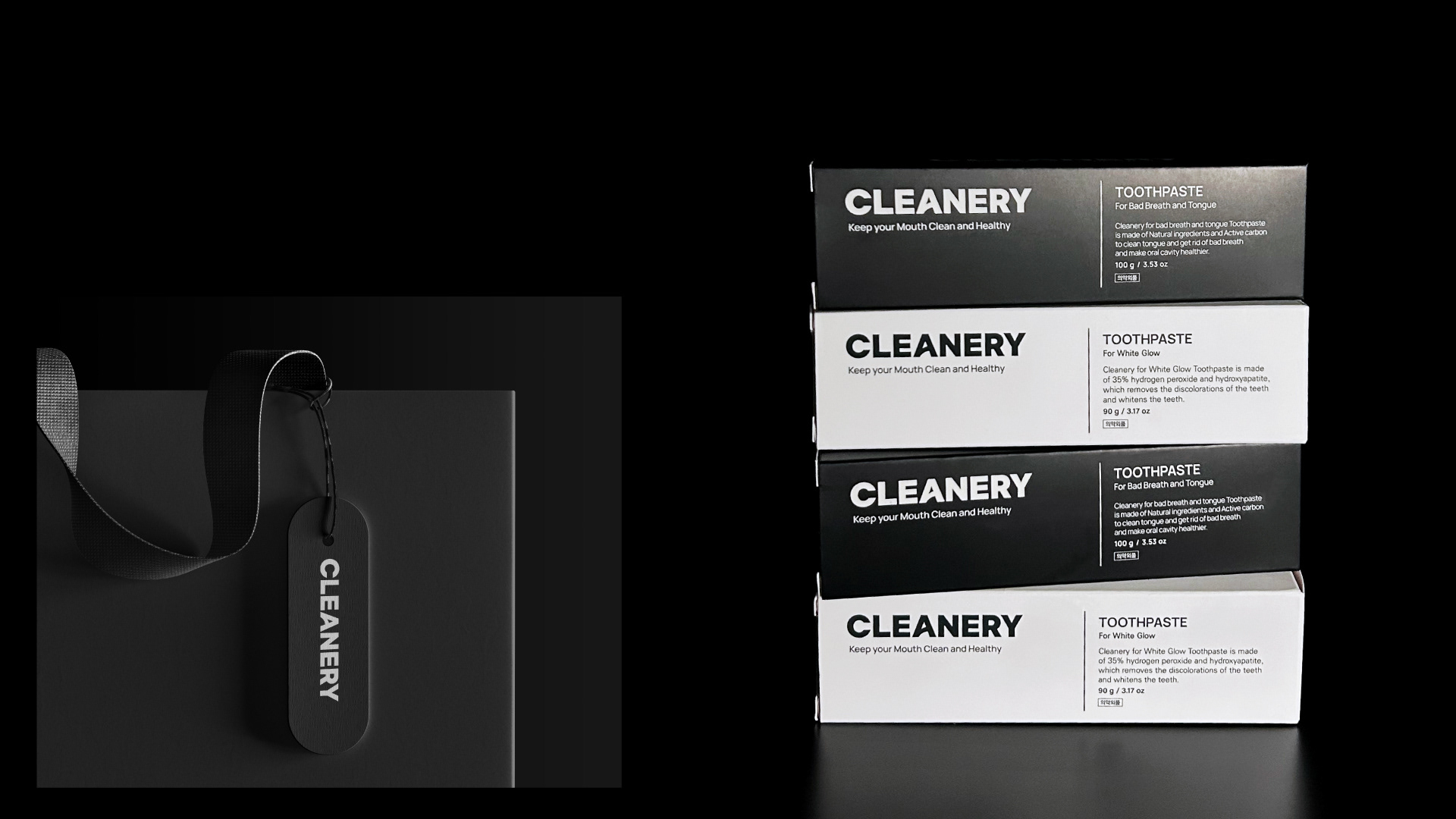
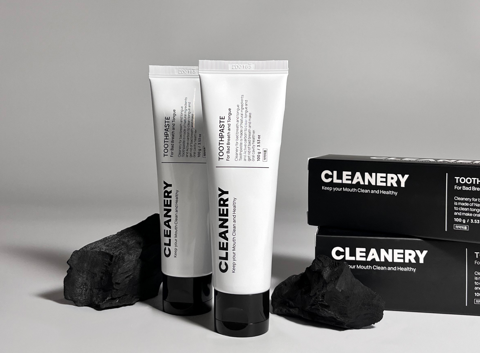
단순한 철자로만 구성된 CLEANERY 철자에 중심에 위치한 A에 유연한 곡선만을 부여하여 Active한 브랜드 활동력을 생산하고 통통 튀는 생명력을 부여하는 디자인은 단순한 경험의 축적만으로 개발되는 것은 아닐 것 입니다. 위생용품으로서 깔끔한 정독성과 20-30세대의 트렌디함을 동시에 담은 패키지 디자인은 누구나 부담없이 접근할 수 있는 가장 개성있는 보편적 이미지입니다. 브랜드로서 장기적인 가치를 정립하기 위한 디자인 기획, 제품 디자인 설계, 패키지 디자인까지 포어클락디자인그룹과 고객사가 함께 개발하여 성공적인 결과를 만들어낸 프로젝트, [클리너리 Cleanery] 입니다.
A design that produces active brand activity and gives a vibrant vitality by giving only a flexible curve to the A in the center of the 'CLEANERY' spell, which consists of only simple letters, couldn't be developed through simple accumulation of experience. As a sanitary product, the package design combines the neat and clean look of the product with the trendiness of the 20s and 30s generation, making it the most unique and universal image that anyone can easily access. [Cleanery] is a project that produced successful results by developing design planning, product design, and package design together with Fouroclock Design Group and the client '이삼오구' to establish long-term value as a brand.