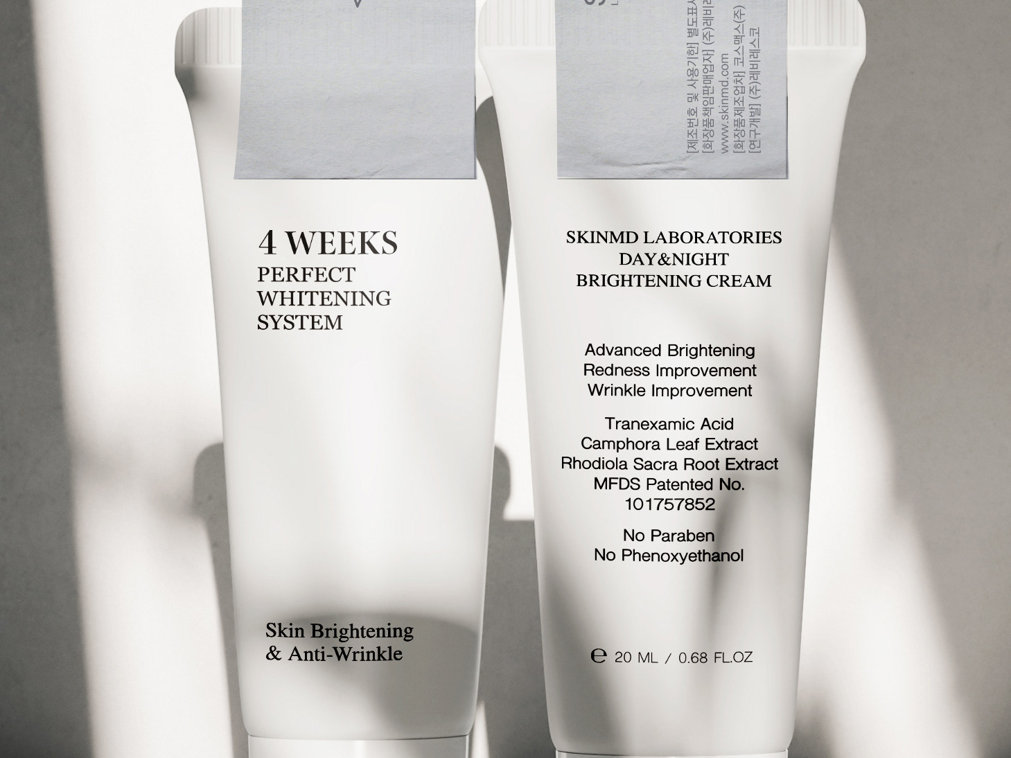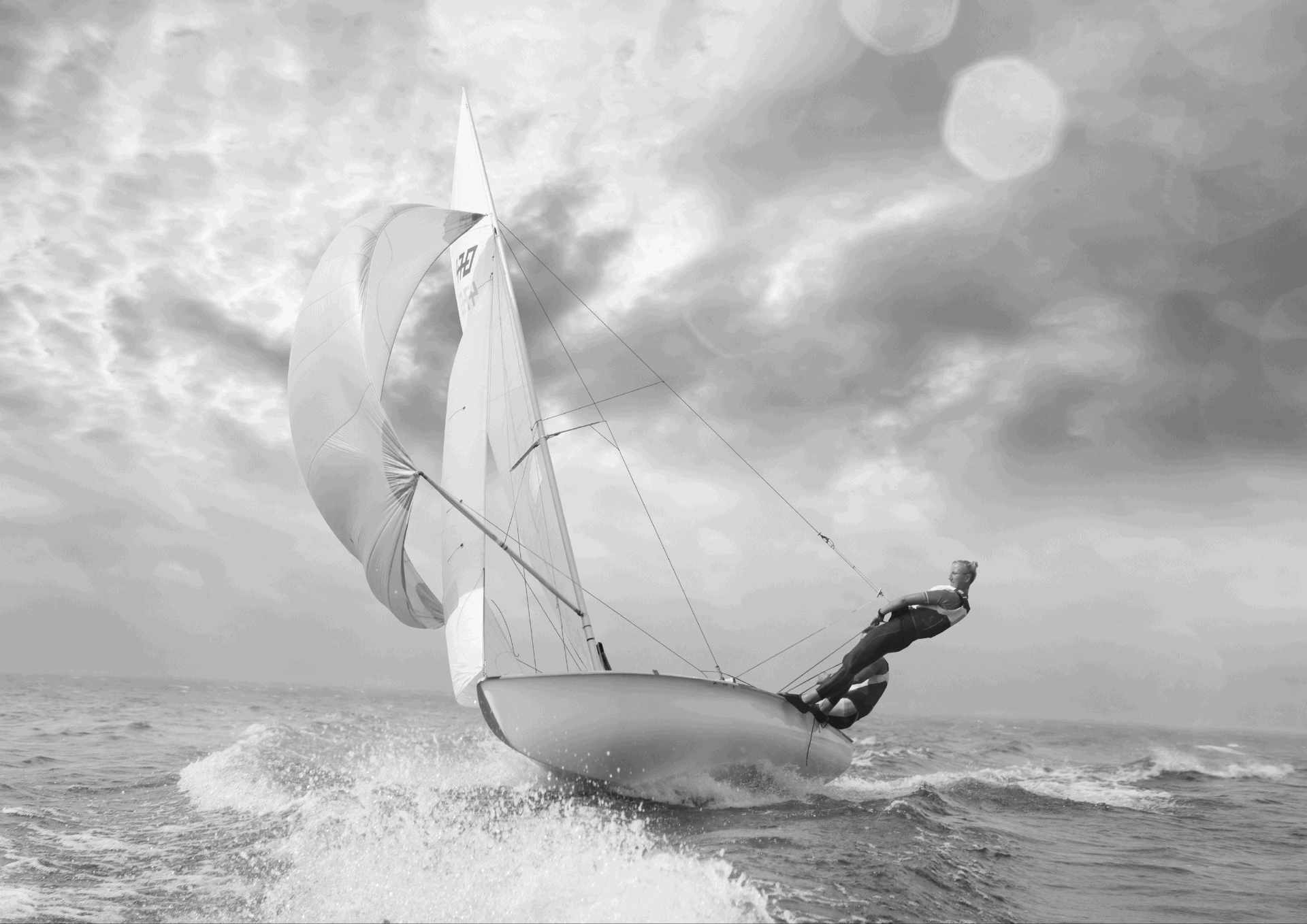

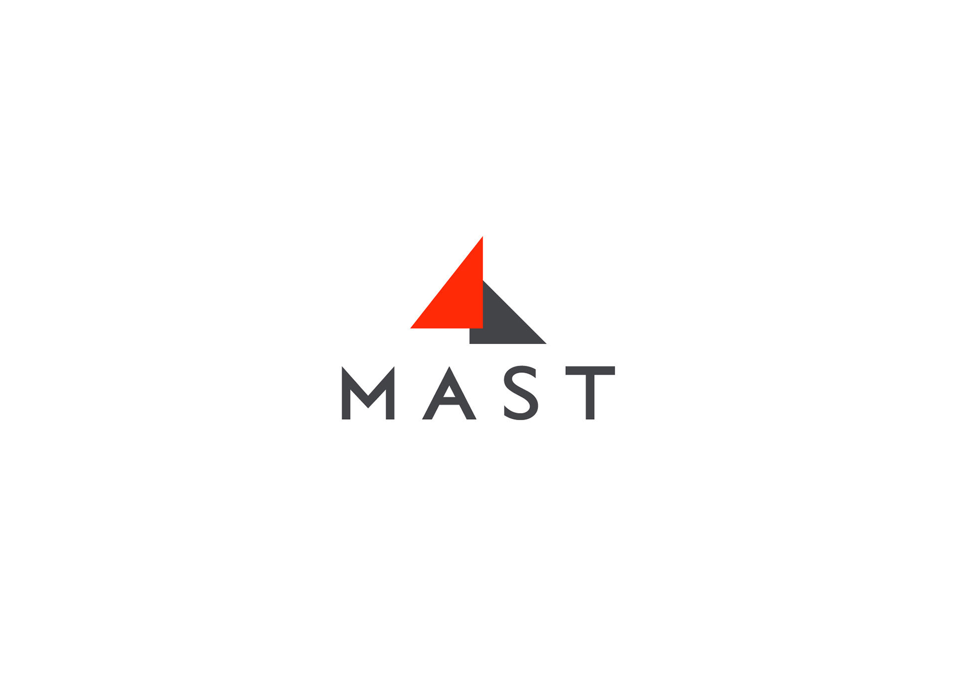
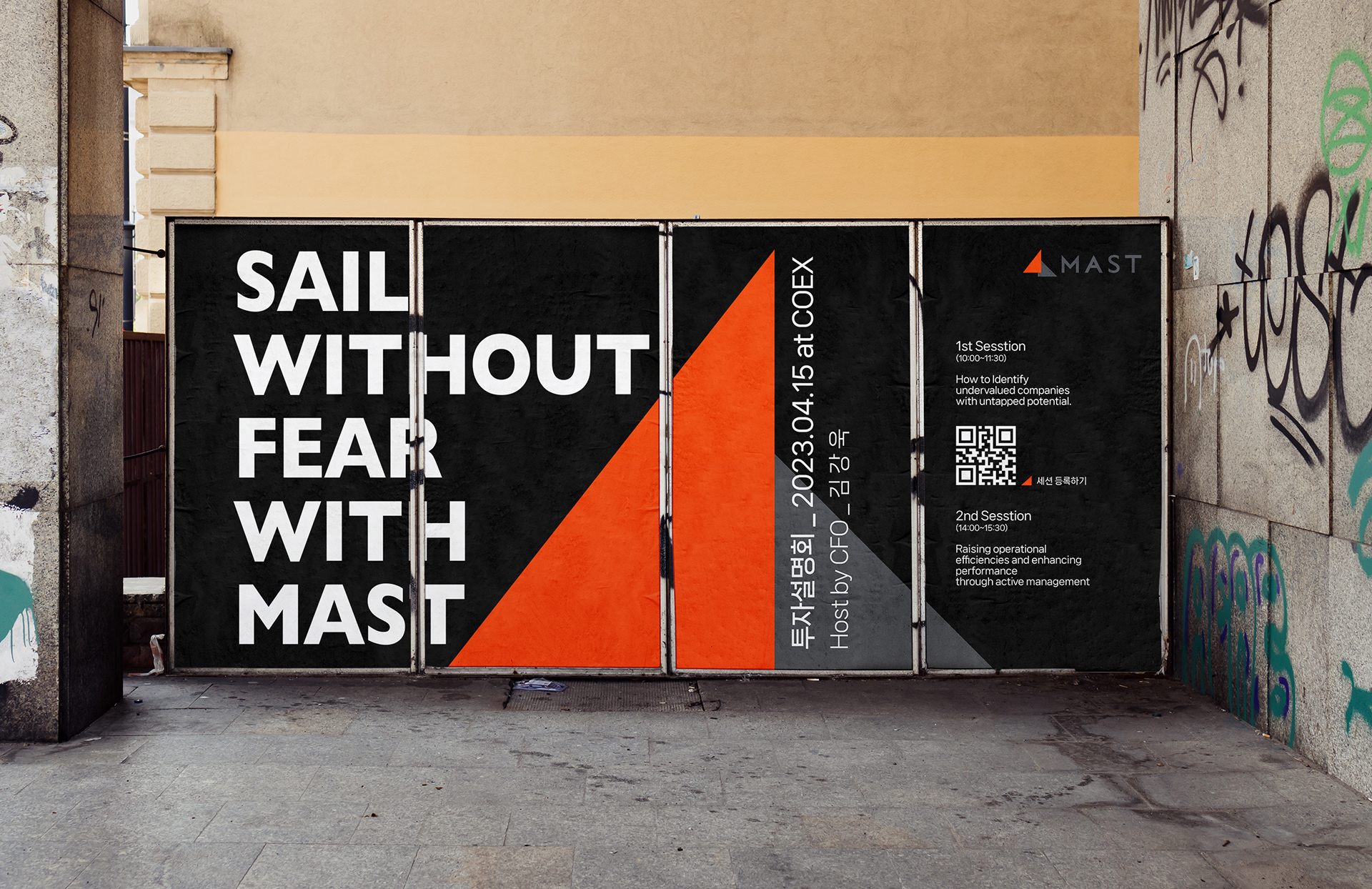
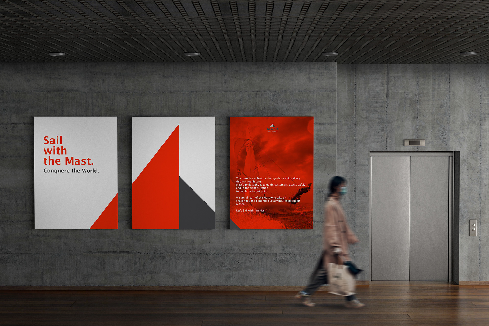
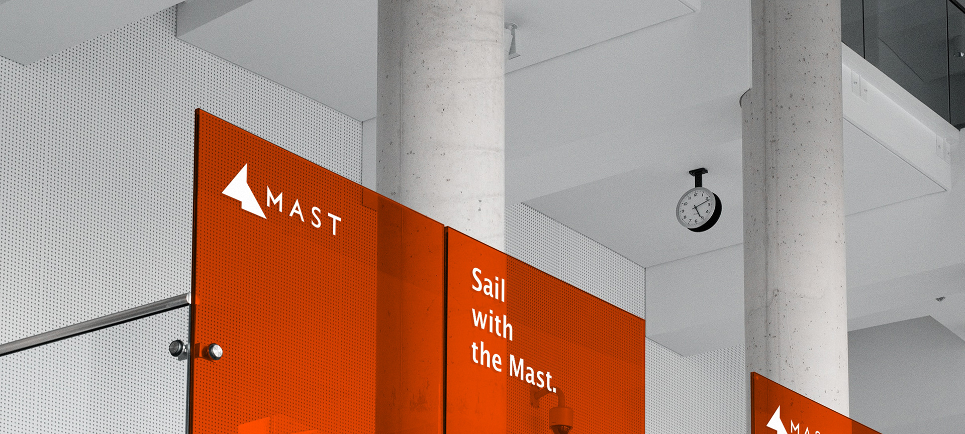
거친 바다를 항해하는 저 돛단배를 보아라. 거친 풍랑에도 굴하지 않고 파도에 몸을 부딫히는 저 배와 같은 기상이 마스트자산운용에도 깃들길...마스트는 자산운용사로서 예측하기 어려운 금융 시장에서 자신들만의 포트폴리오 구성 기술과 예측 시스템으로 다양한 수익을 창출하고 있는 회사입니다. 금융 업계는 변수가 많고 다양한 위험이 도사리고 있는 곳으로 유명하지만, 마스트의 인재들은 두려워하여 후퇴하기 보다는 위험에 맞서고 넘어서서 목표 지점을 향해가길 원합니다. 이러한 도전 정신은 배의 돛을 의미하는 '마스트 mast'로서 회사명을 정하게 만들었고 포어클락디자인그룹은 미니멀한 오브젝트의 불균형한 조화를 구축하여 이들의 열정넘치는 항해를 응원하였습니다. 레드 컬러는 이들의 열정을 의미하며, 무채색으로 겹쳐진 또 다른 삼각형은 이들의 이성을 의미합니다. 이성이 바탕이 된 열정, 마스트자산운용의 가치입니다.
Look at that sailboat sailing the rough seas.
I hope that Mast Asset Management will also have the same spirit as that ship that struggles against the waves without giving in to the rough winds...
I hope that Mast Asset Management will also have the same spirit as that ship that struggles against the waves without giving in to the rough winds...
As an asset management company, Mast is generating a variety of profits with its own portfolio composition technology and forecasting system in the financial market, which is difficult to predict. The financial industry is famous for being a place with many variables and various risks, but the staff of Mast want to face and overcome the risks and move towards the goal rather than retreating in fear.
This spirit of challenge led to the company's name being 'MAST', which means the sail of a ship, and Pound Pulse supported their passionate voyage by building an unbalanced harmony of minimal objects.The red color represents their passion, and another triangle overlapped with an achromatic color represents their rationality. Passion based on rationality is the value of Mast Asset Management.
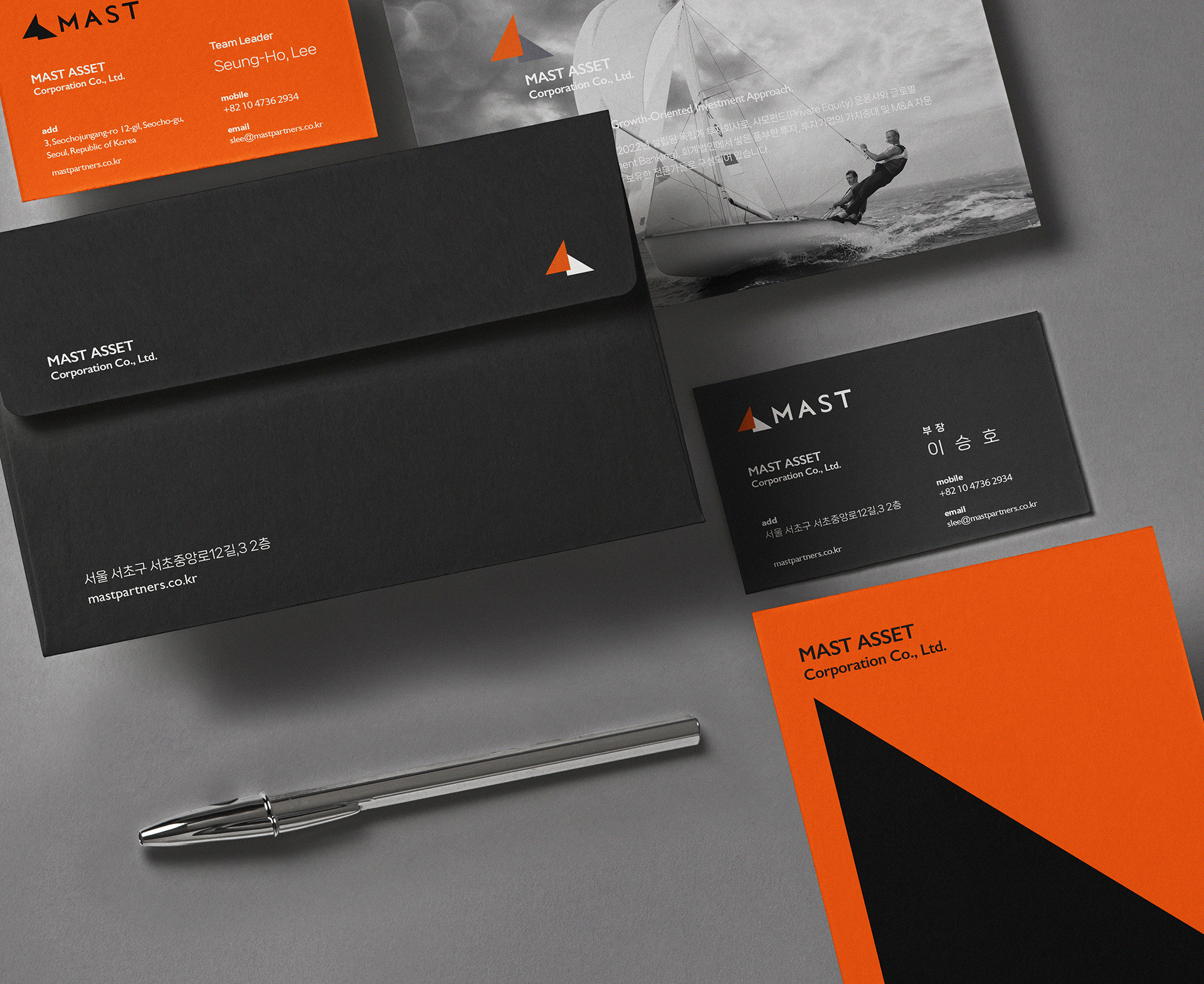


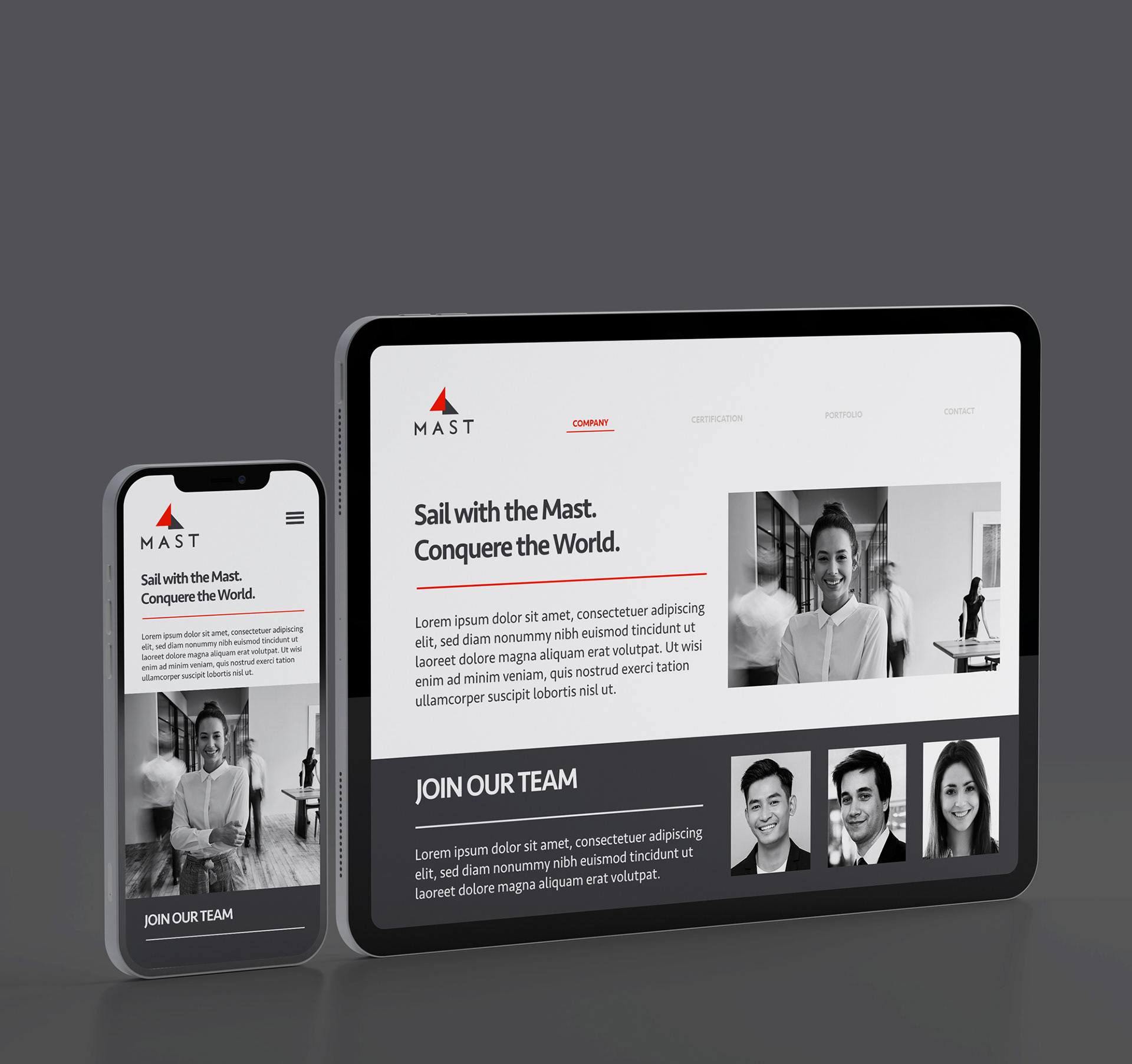
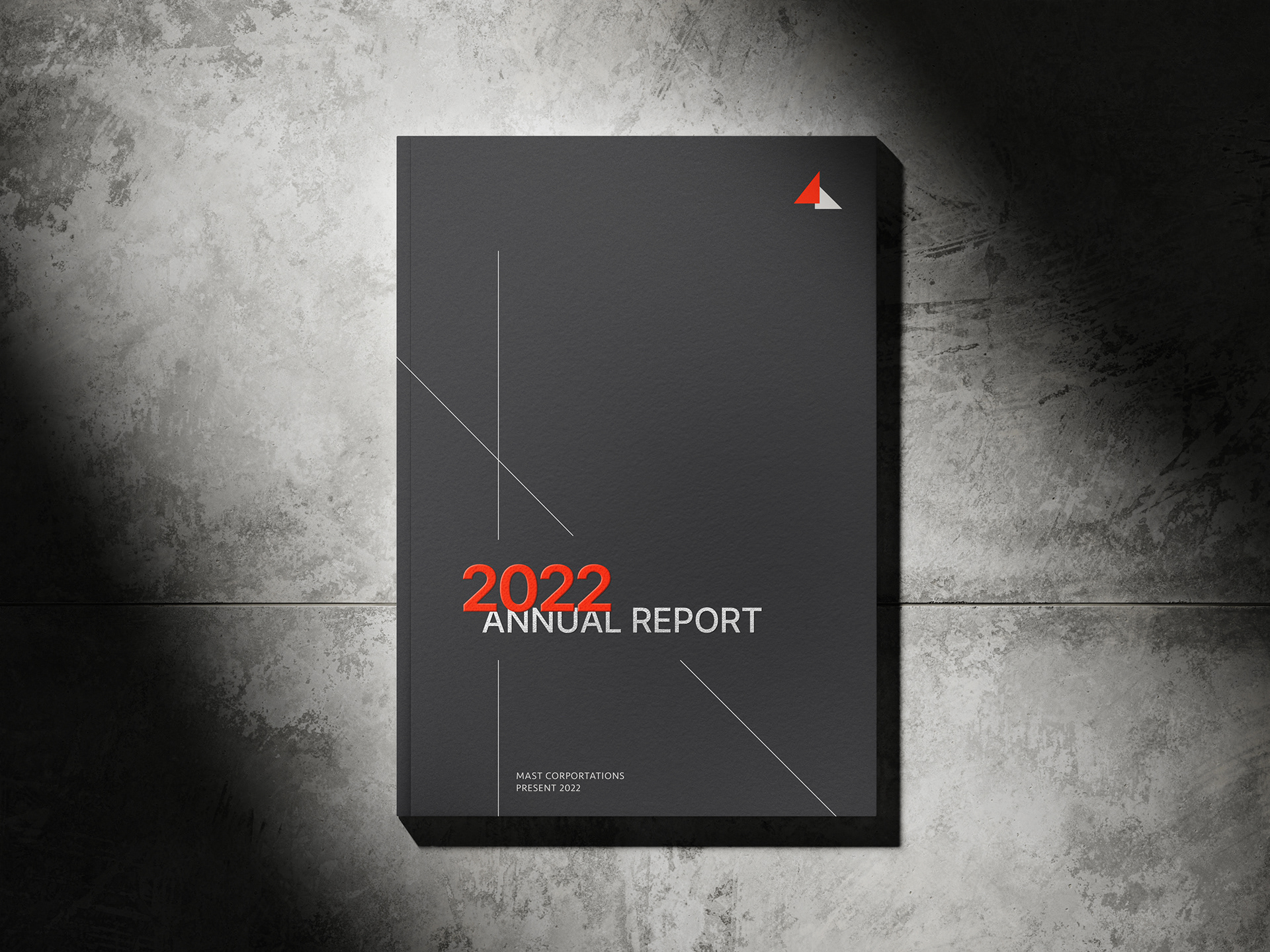
MAST ASSET Branding Project
Client: 마스트자산운용
-
Design Area
#Corporate Identity Design #Brand Design #Logo Design #Mast Symbol
-
Project Team
MAST + FDG Design A Team
-
Art Direction by WOO SANG YOON
Design by CHAE IN KANG
www.fouroclock.kr