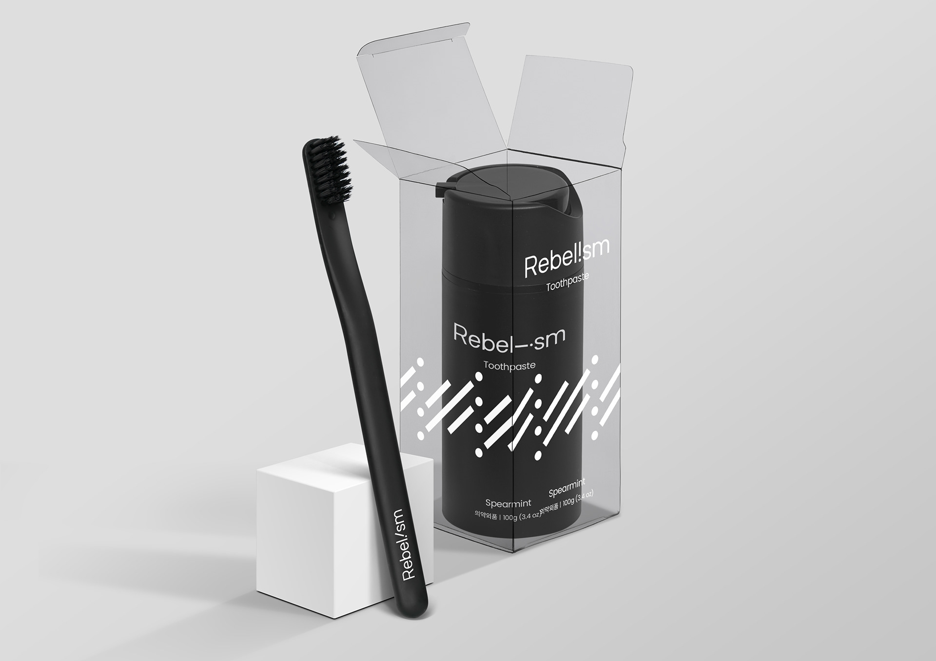
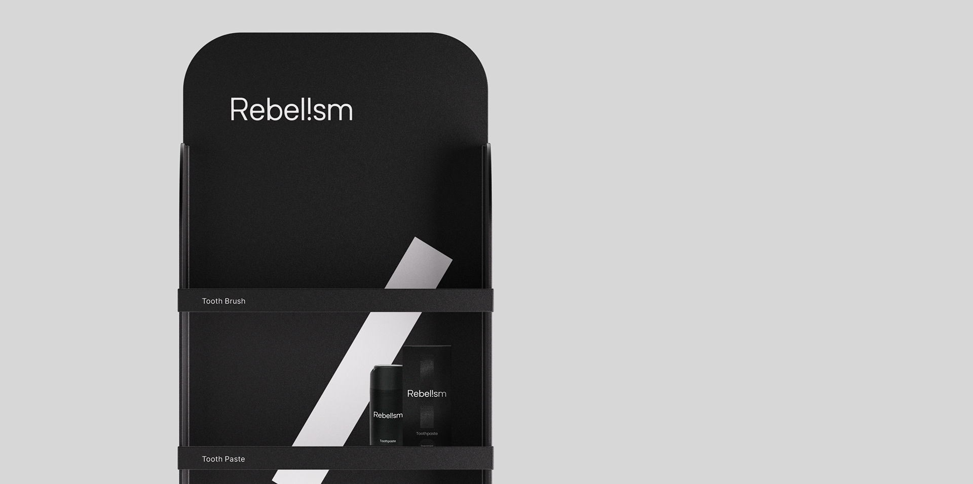
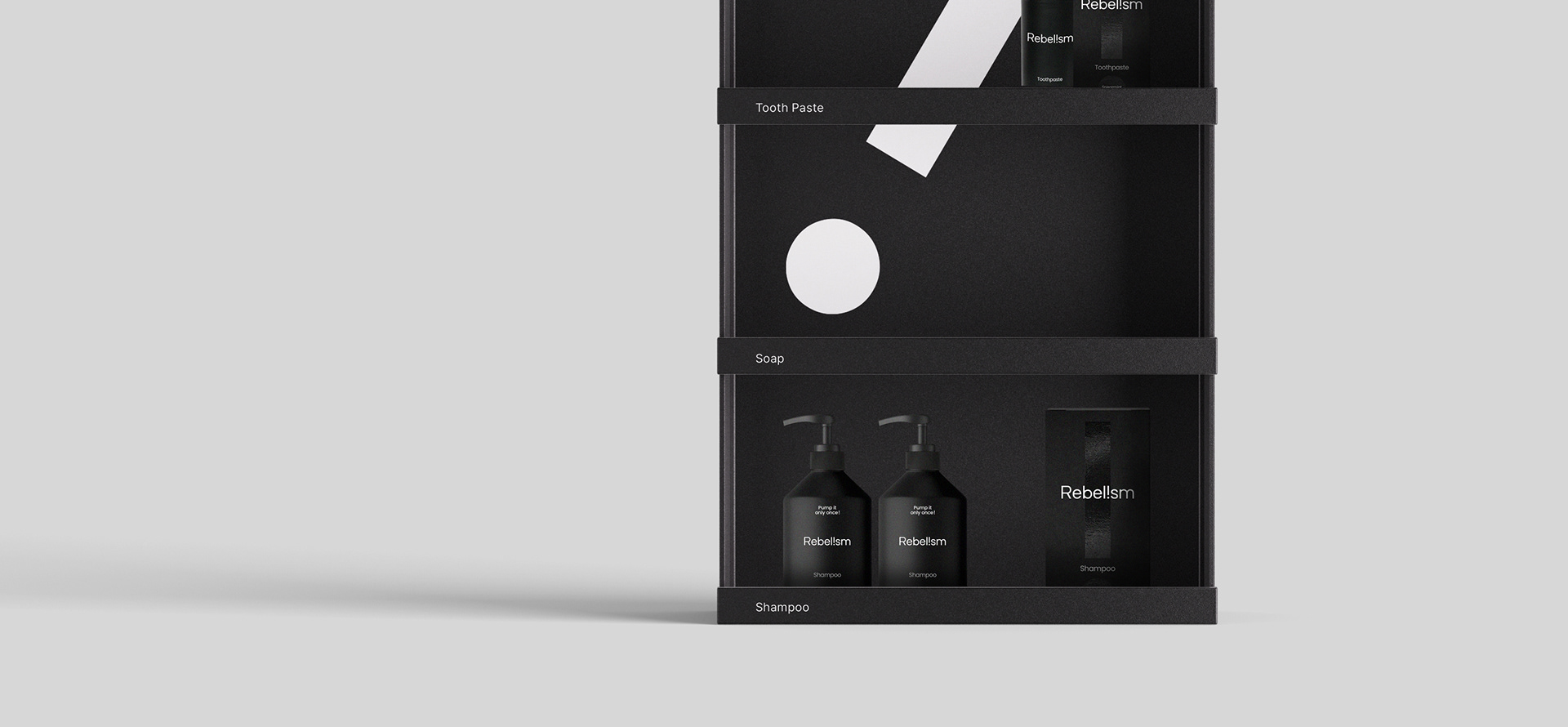
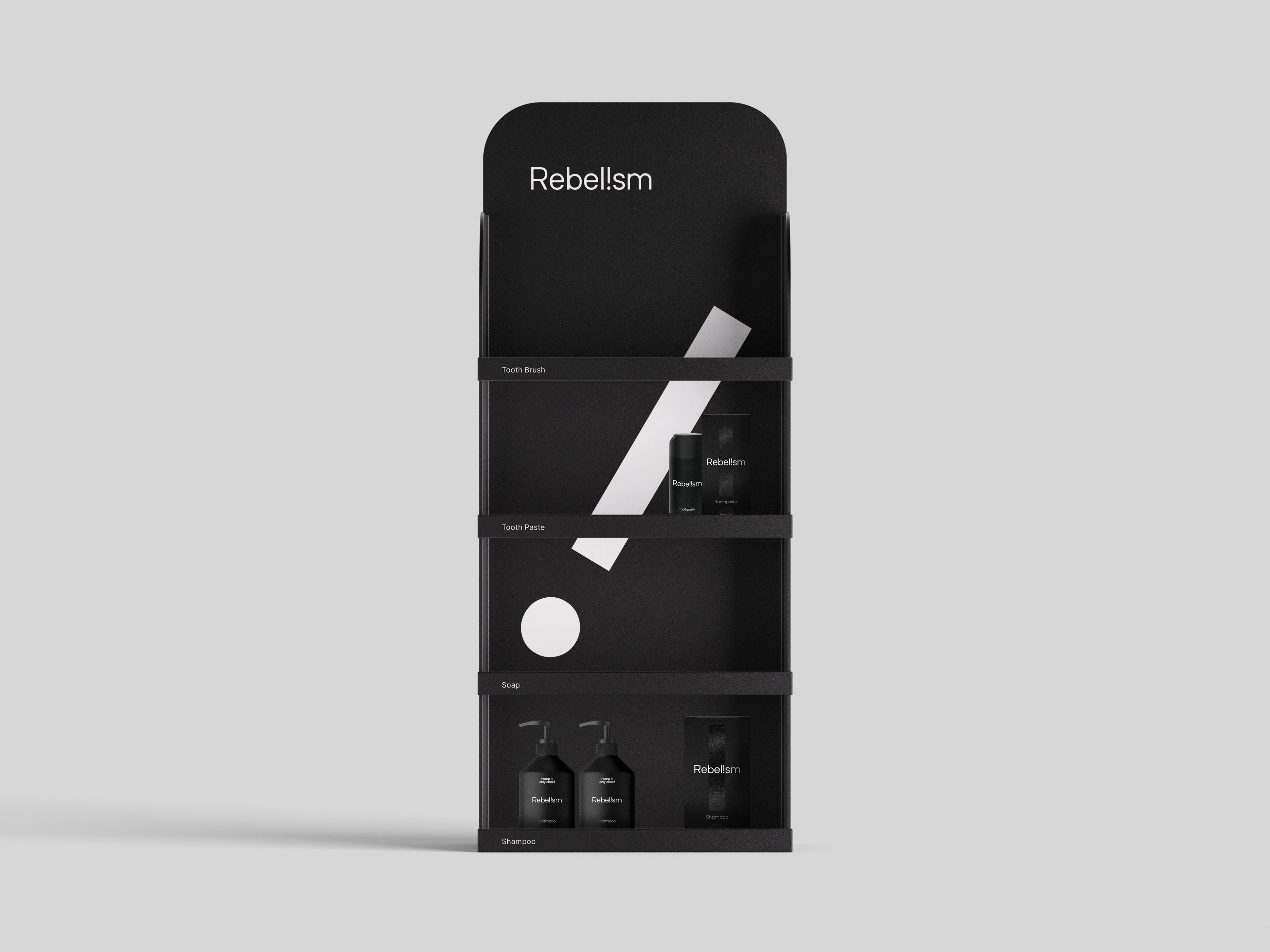
리벨리즘은 '반항'이라는 뜻을 갖고 있는 Rebel을 어원으로 탄생한 브랜드입니다. '반항주의'라고 해석이 될 수 있지요. 기존에 상식으로 알고 있던 많은 보편적 의식에 물음표를 던지고 개성에 대한 열렬한 지지와 존중을 보여주는 브랜드가 바로 리벨리즘입니다. 리벨리즘은 위생과 청결 용품의 브랜드로서 샴푸, 비누 등의 제품을 선보이고자 합니다. 포어클락과는 브랜드 디자인과 첫 번째 라인업이 될 칫솔, 치약 제품의 패키지 디자인을 함께 진행하였습니다.
Rebelism is a brand created from the etymology of rebel, which means 'rebellion'. It can be interpreted as ‘rebellionism’. Rebelism is a brand that questions many common senses and shows passionate support and respect for individuality. Rebelism is a brand of hygiene and cleaning products such as shampoo and soap. We Worked on brand design and package design for the toothbrush and toothpaste products that will be its first lineup.
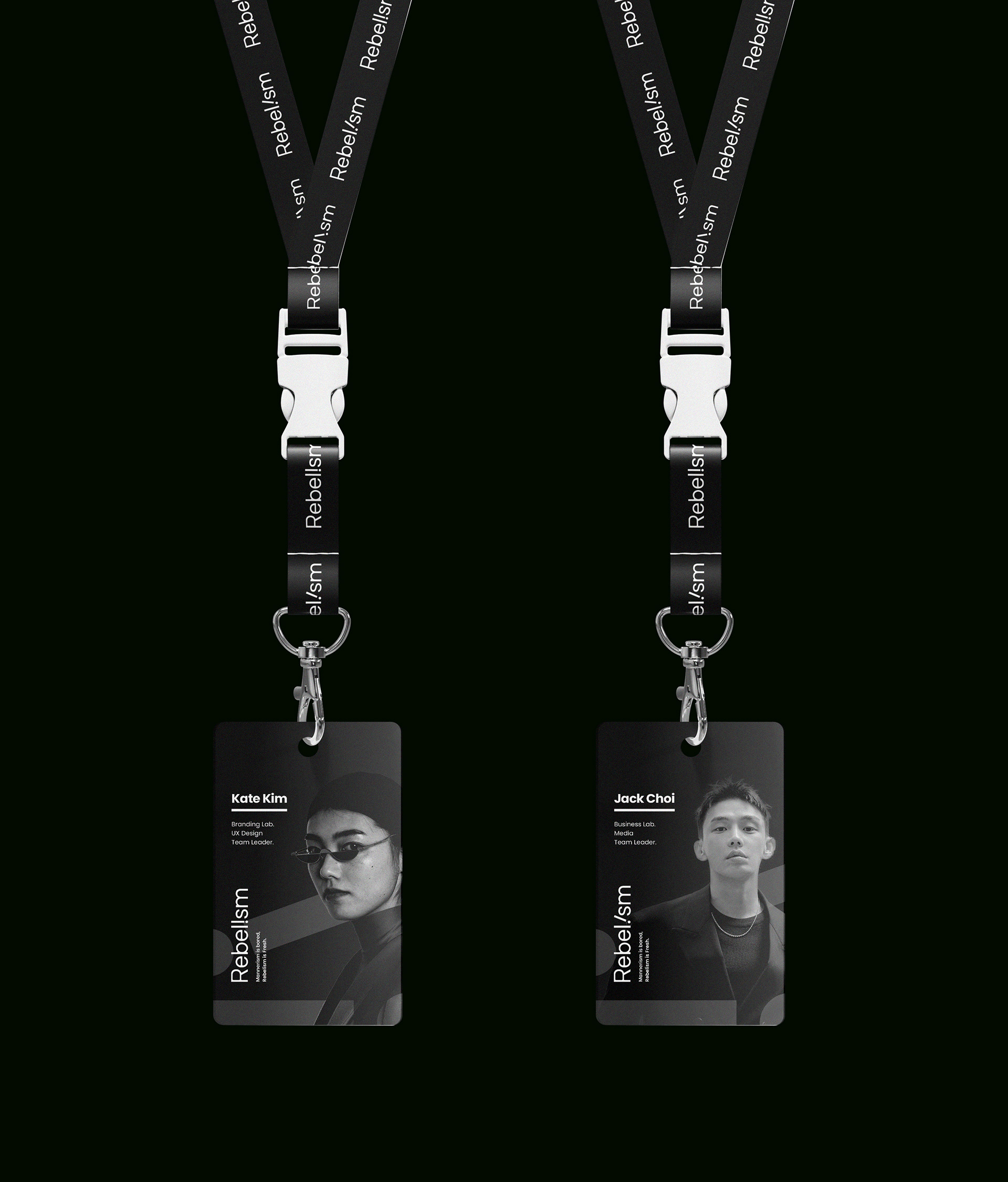
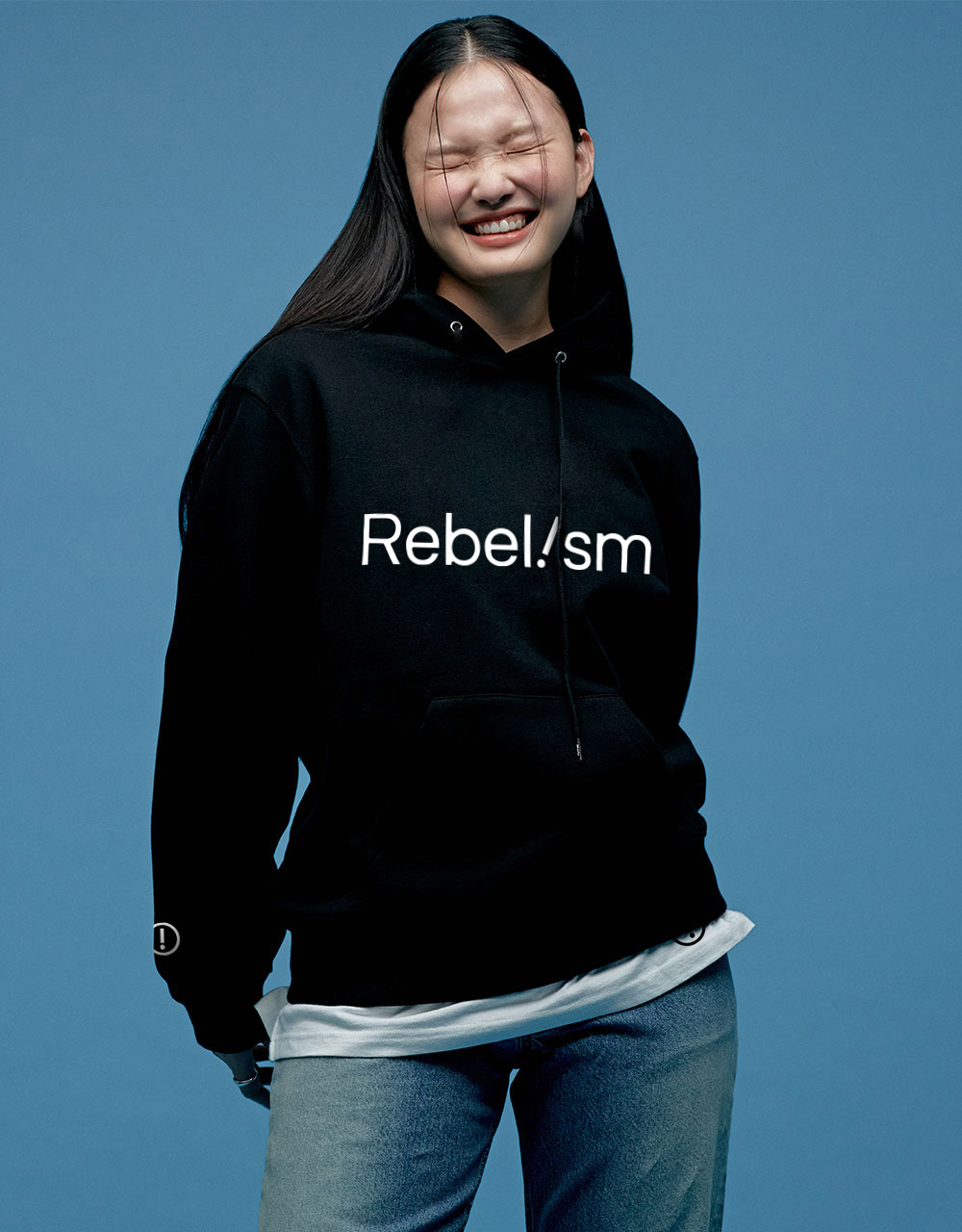
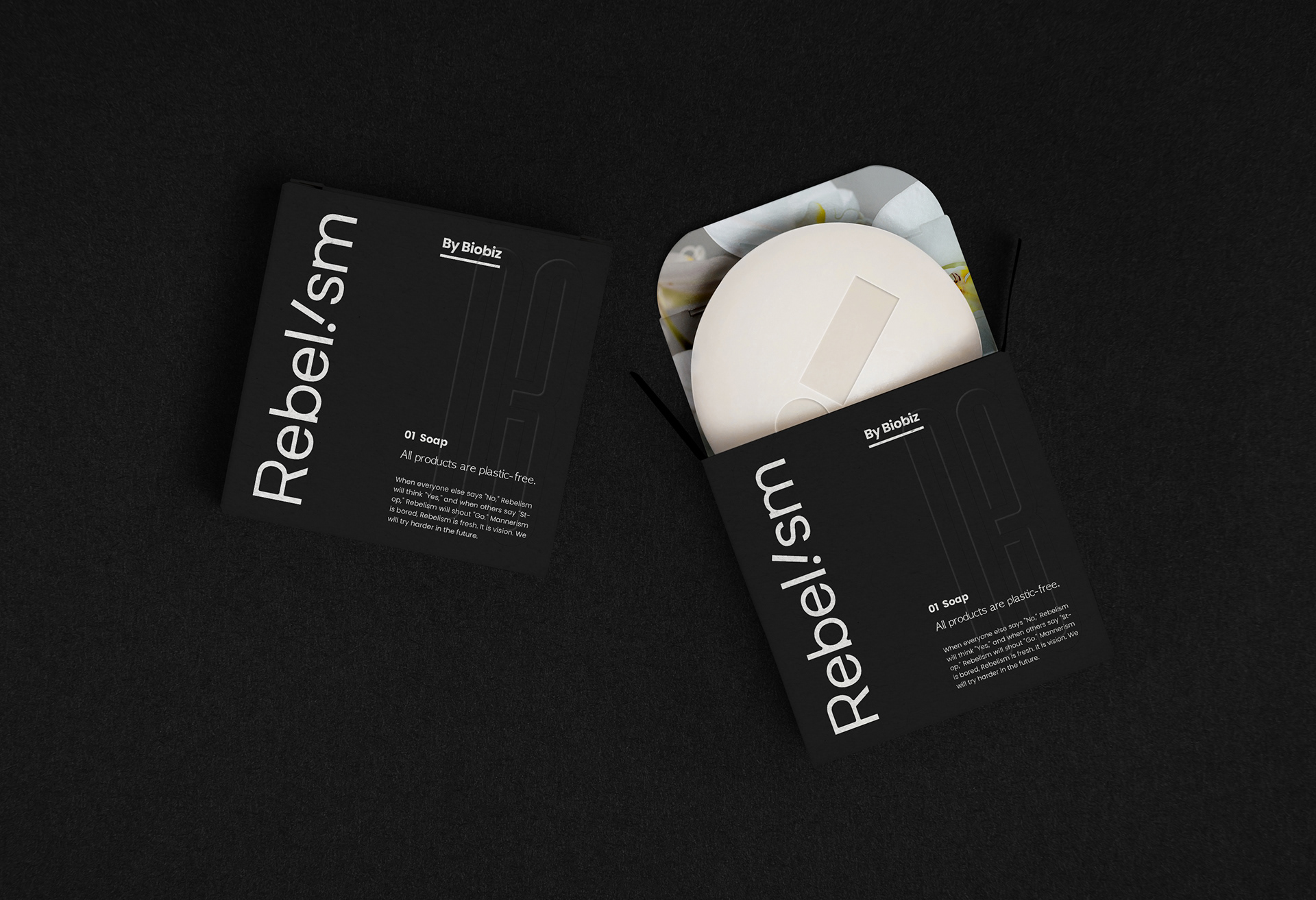
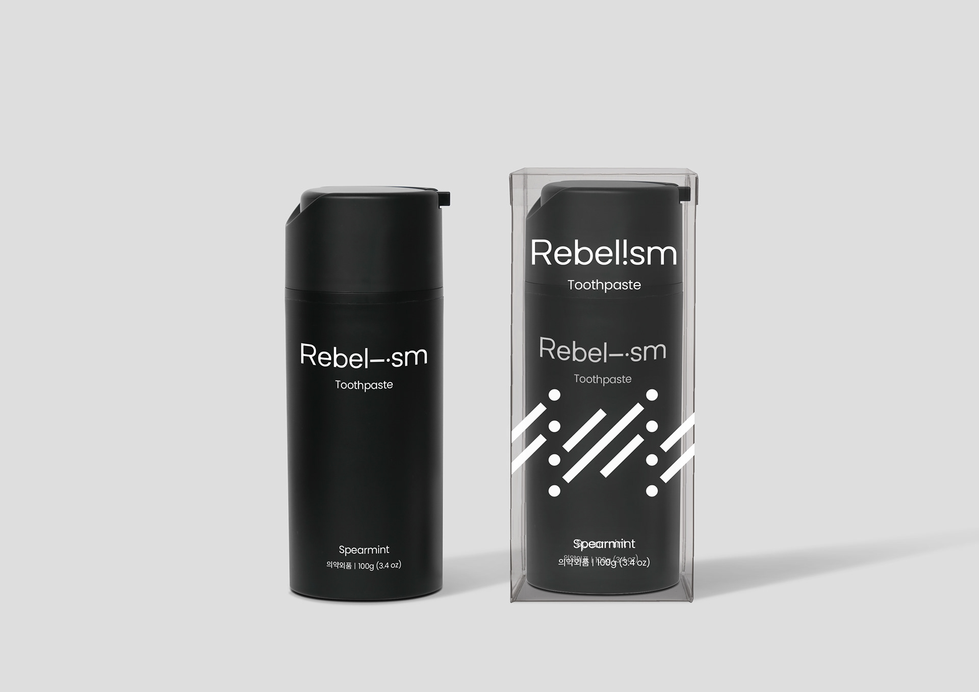
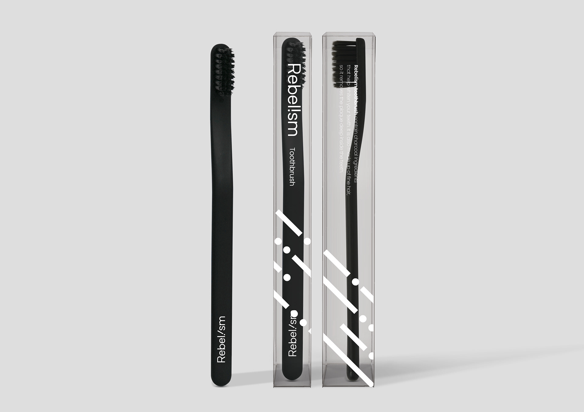
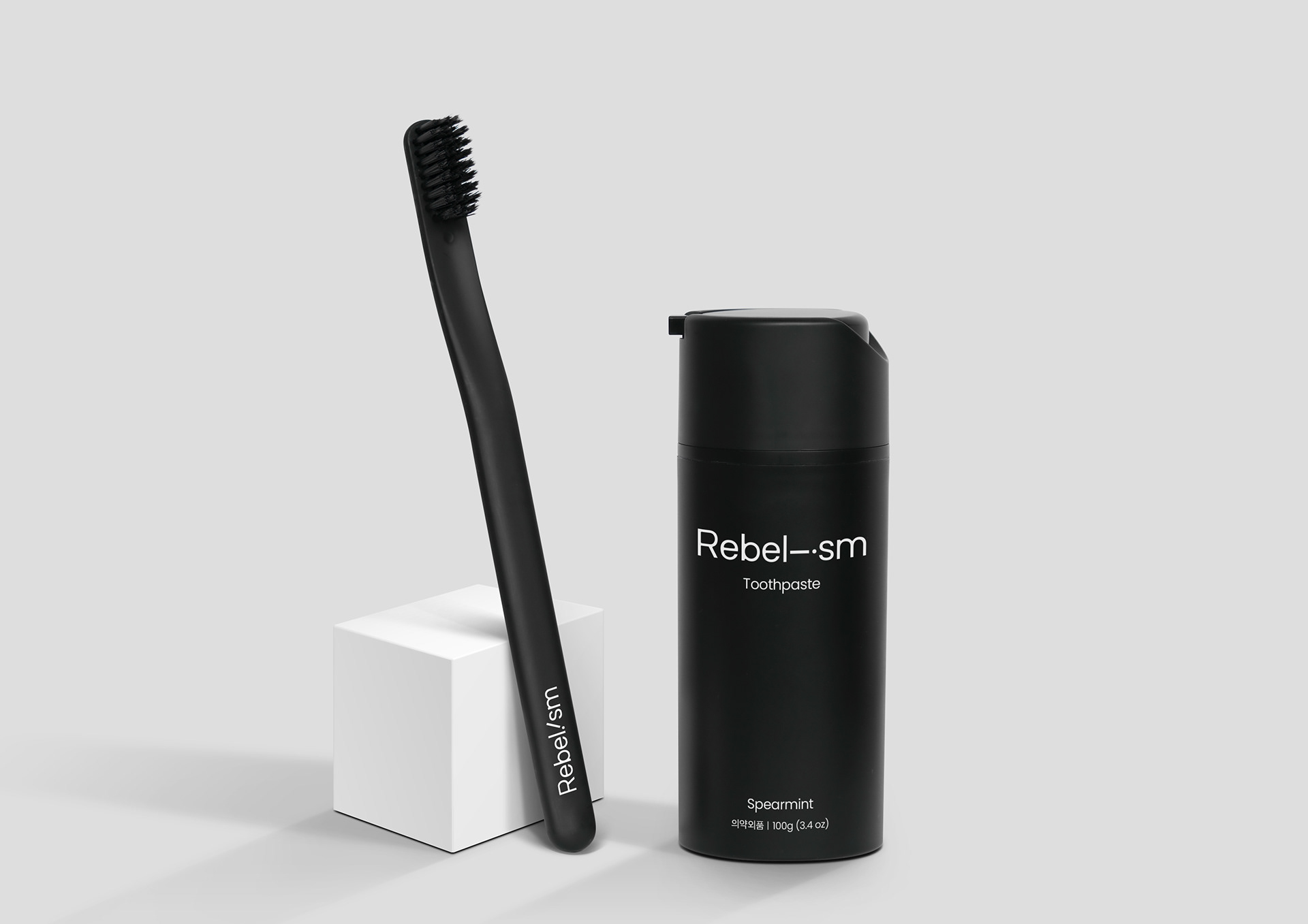
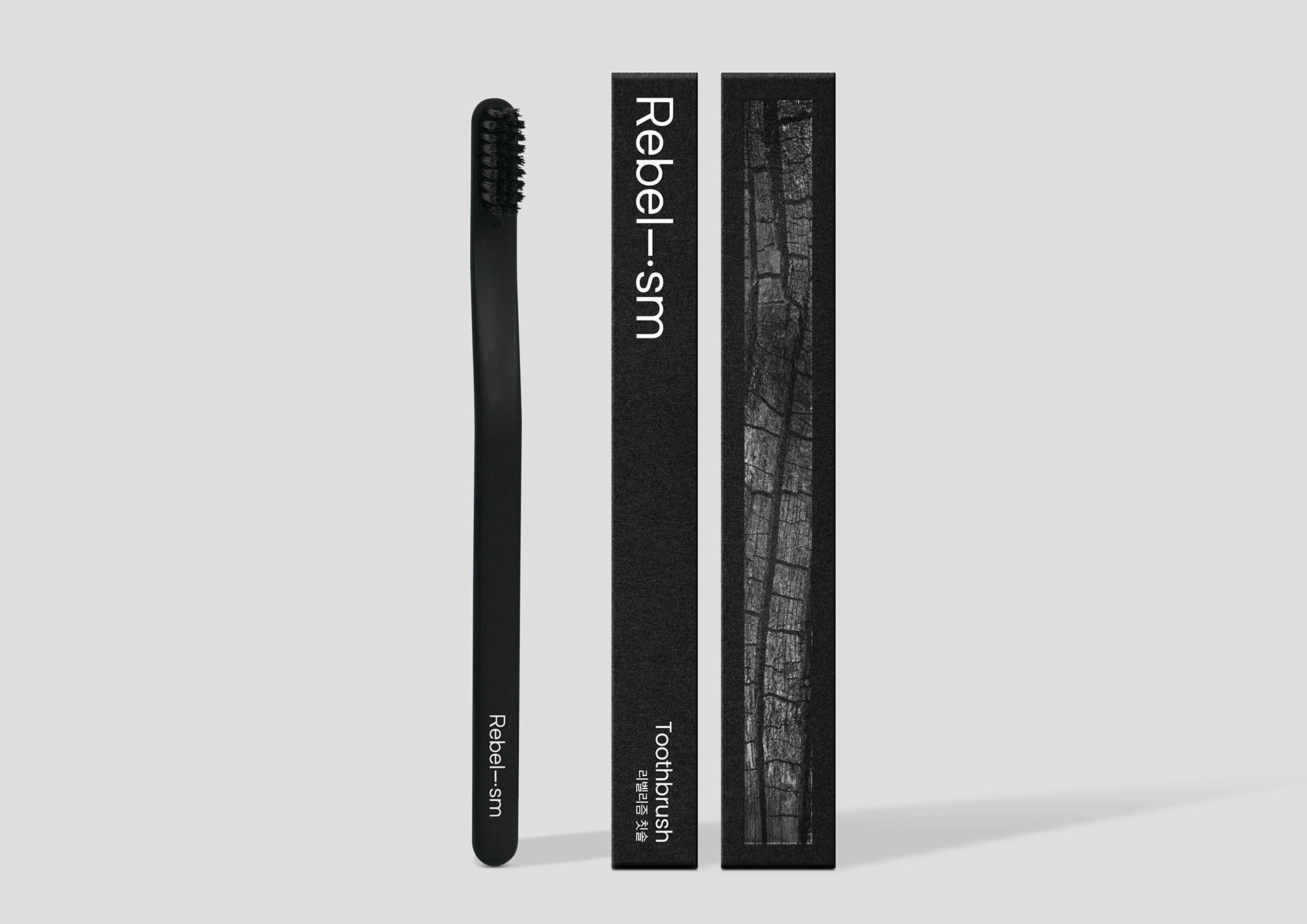
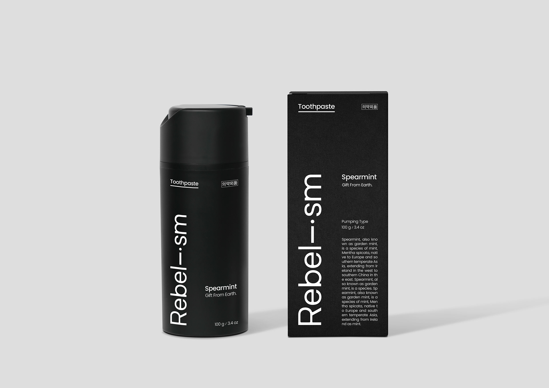
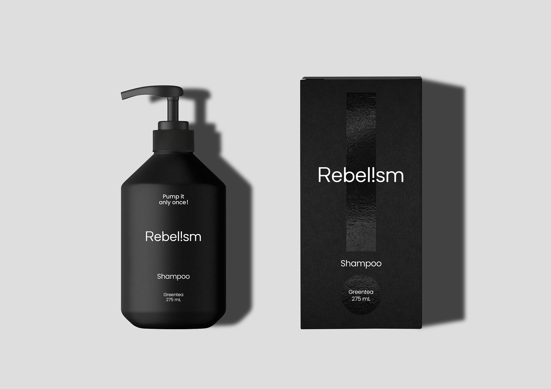
브랜드 디자인은 철자 i를 느낌표로 바꾸어 리벨리즘이 지향하는 당연한 것에 대한 지양 의식을 반영하고자 하였습니다. 리벨리즘이 전개할 새로운 언어와 함께 새로운 세대에게 새로운 임팩트를 보여주고자 하는 목표를 브랜딩에 녹였습니다. 자연스럽게 위치하고 배치되는 느낌표는 정형화되지 않은 브랜드로서 생소한 플레이를 보여줍니다. 디자인에서부터 반항적인 모습을 보여주지만 불편하지 않는 선에서 자유로운 레이아웃을 선보이고 있습니다.
The brand design changed the letter 'i' into an exclamation point to reflect the spirit of avoiding the obvious that Rebelism aims for. The product that Rebelism will develop incorporates the goal of showing a new impact to a new generation along with a new language in its branding. The naturally positioned and arranged exclamation point shows an unfamiliar play as an unstructured brand. Although the design shows a rebellious appearance, it presents a free layout without causing inconvenience.
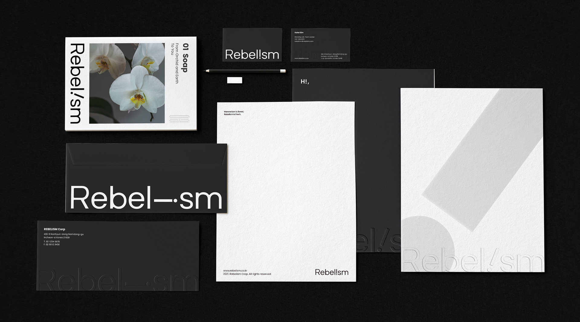
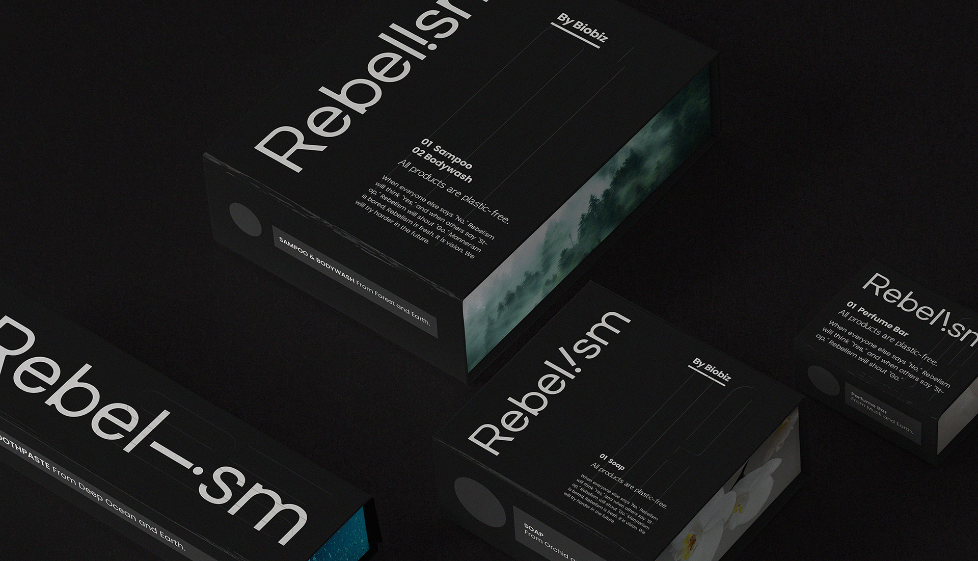
먹 100으로 진행되는 과감한 블랙 컬러의 전개는 숯 성분을 메인으로 하는 리벨리즘의 제품 특징을 내포합니다. 코팅을 하지 않은 매트한 포장의 질감은 친환경 이슈와 함께 건강한 위생용품으로서의 브랜드 기능을 표현합니다. 브랜드 스토리를 건강하게 확장하는 디자인 기획과 표현이 돋보이는, 마치 제임스 딘과 같은 퇴폐적 아름다움을 갖추게 된 리벨리즘입니다.
The development of a bold black color with 100 ink contains the characteristics of Rebelism's products, which mainly use charcoal. The matte packaging texture without any coating expresses the brand's function as a healthy hygiene product along with eco-friendly issues. Rebelism has a decadent beauty like James Dean, highlighting design planning and technology that healthily expands the brand story.


Rebelism Branding&Packaging Design Project
Client: 주식회사 원디맨즈
-
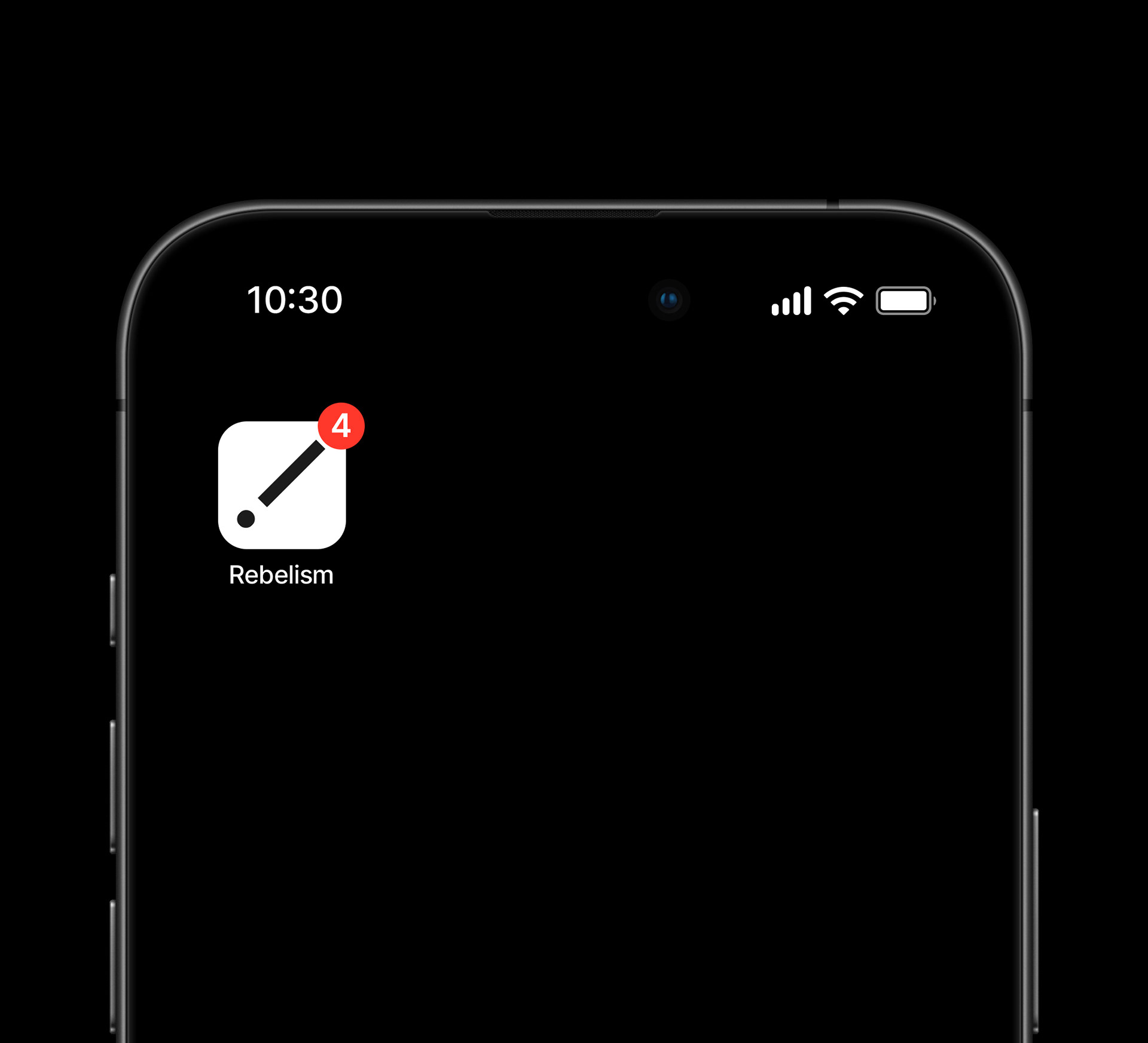
Check Real!
Design Area
#Brand Design #Brand Identity #Package Design #Dental Brand #Dental Brush
-
Project Team
FDG Design B Team
-
Art Direction by HoSoo Nam
Design by HeeSun Kim / ChaeIn Kang
www.fouroclock.kr