규리인터내셔널은 고급 초콜릿 제품을 중심으로 다양한 식자재를 공급하는 기업입니다. 세계적으로 유명한 프리미엄 초콜릿 브랜드 '레더라(Läderach)' 매장을 운영하고 있으며, '쇼코엘(XOCOEL)' 등 다양한 브랜드를 전개하고 있습니다. 규리인터내셔널의 임직원들은 부드럽고 온화한 인성과 함께, 상대방을 편안하게 하는 품격 있는 매너를 지니고 있습니다. 이러한 태도는 단순한 개인 특성을 넘어, 기업의 역사와 문화 속에 깊이 뿌리내린 가치라고 생각합니다. 포어클락은 이번 C.I 리뉴얼 프로젝트를 통해, 규리인터내셔널이 지닌 고급스러운 기품과 책임감 있는 프로페셔널 정신을 시각적으로 담아내고자 했습니다.
Qulee International is a company that supplies various food materials, focusing on chocolate products. It operates a store called Ledera, which is famous for its high-end chocolate brand, and operates various brands such as XOCOEL. Qulee International's employees are gentle and kind, and have the virtue of making others feel comfortable. We think these manners come from the company's culture and history. FDG wanted to express the luxurious elegance and responsible professional spirit through this C.I design renewal project.
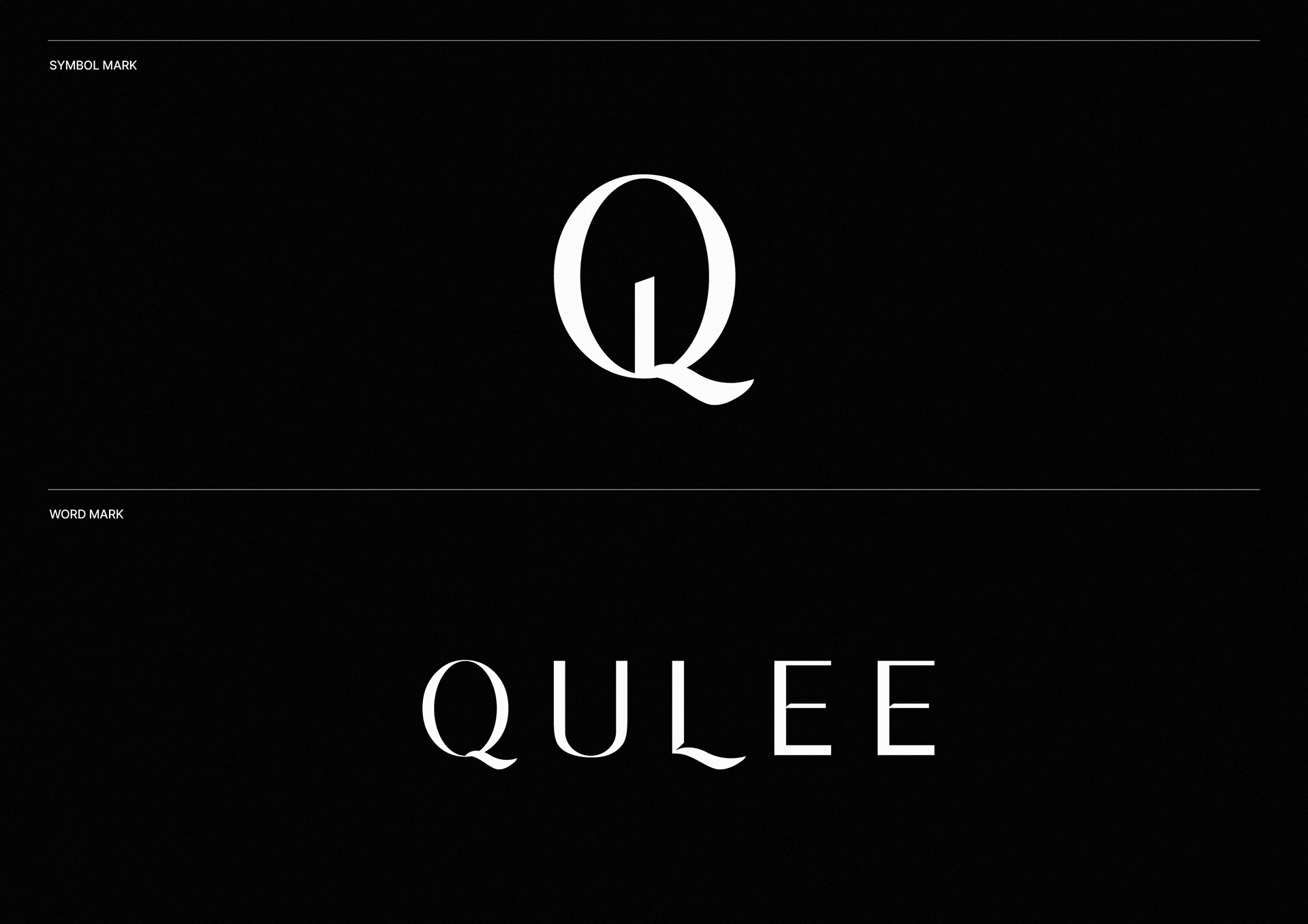

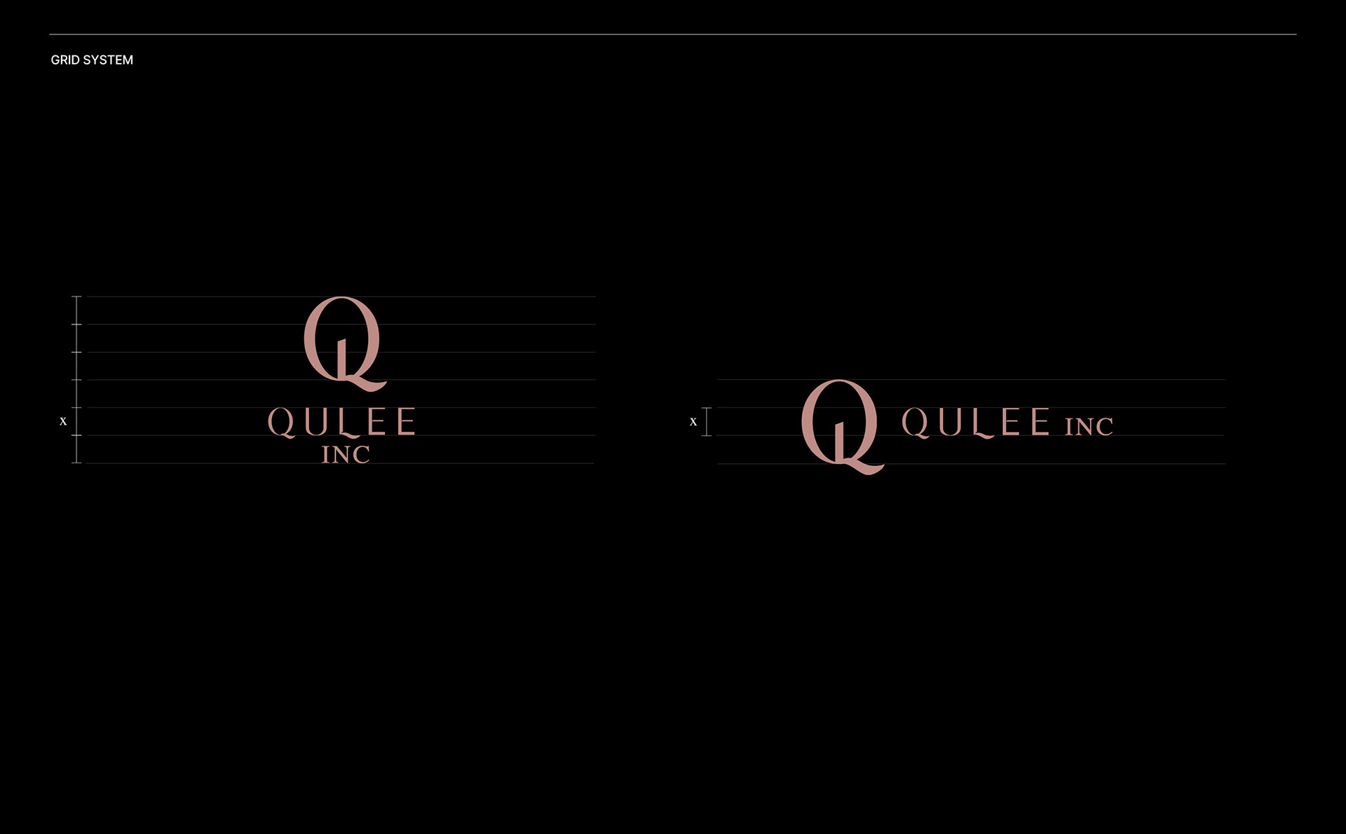
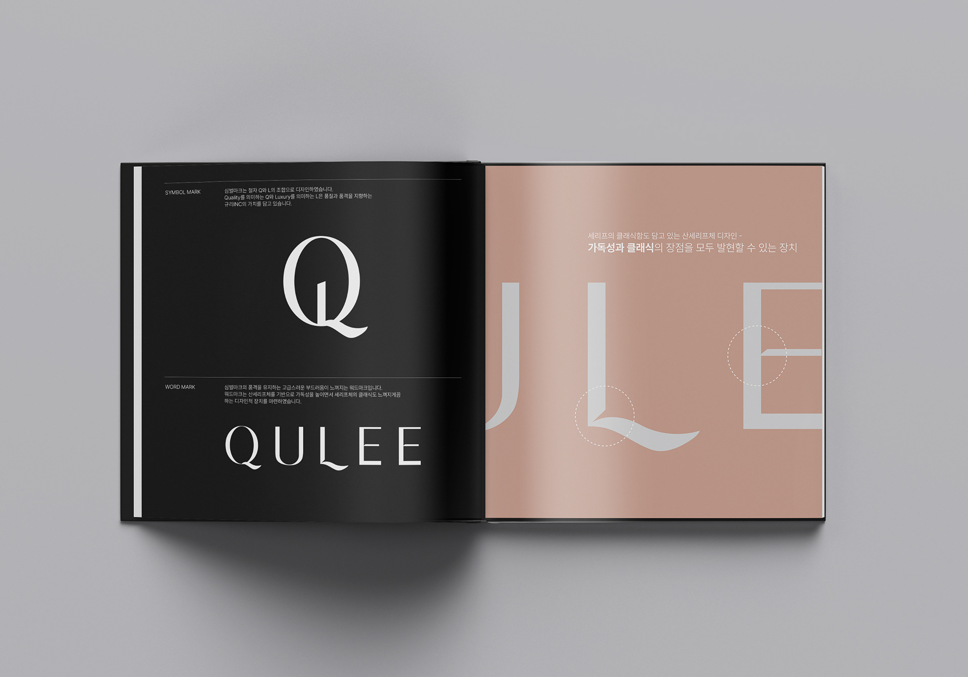
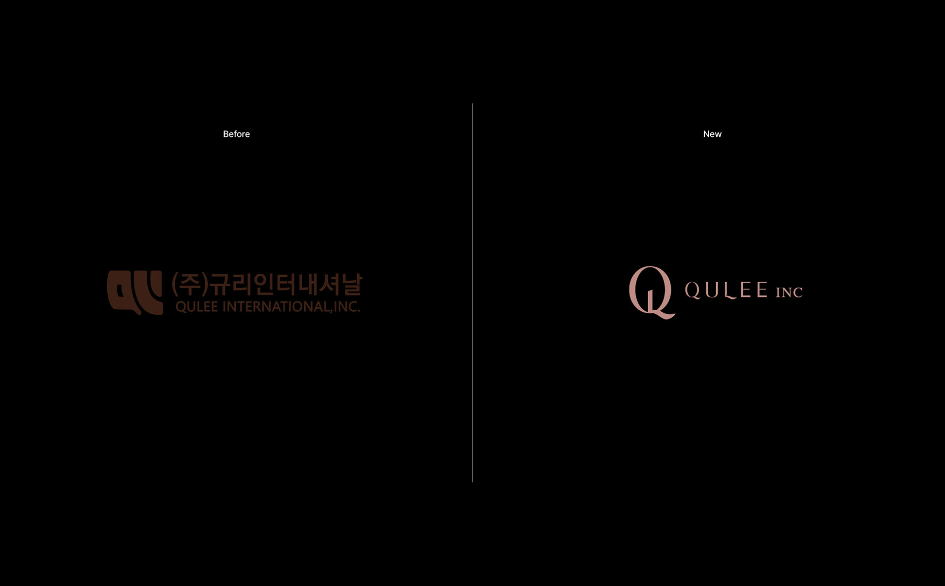
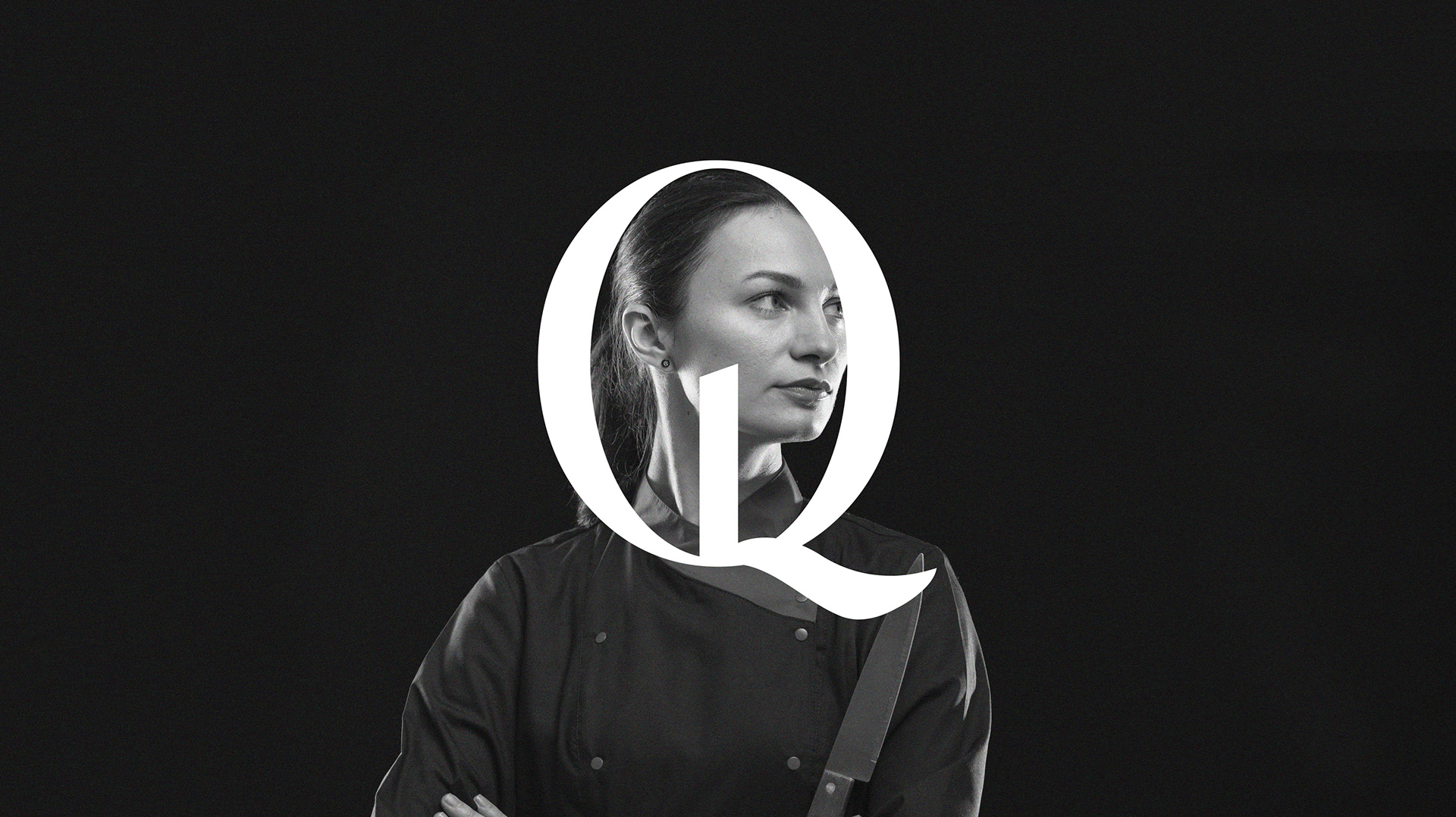
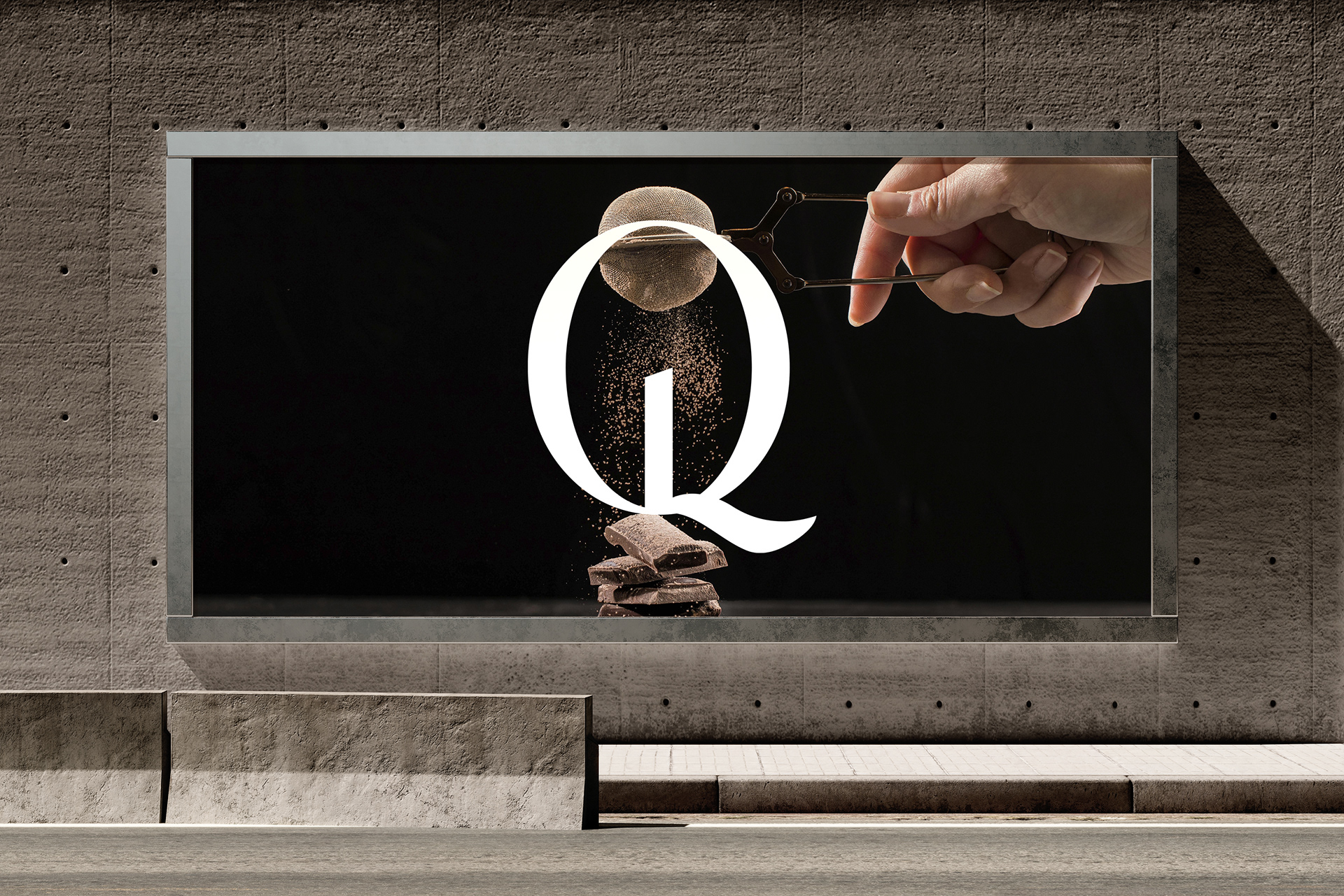
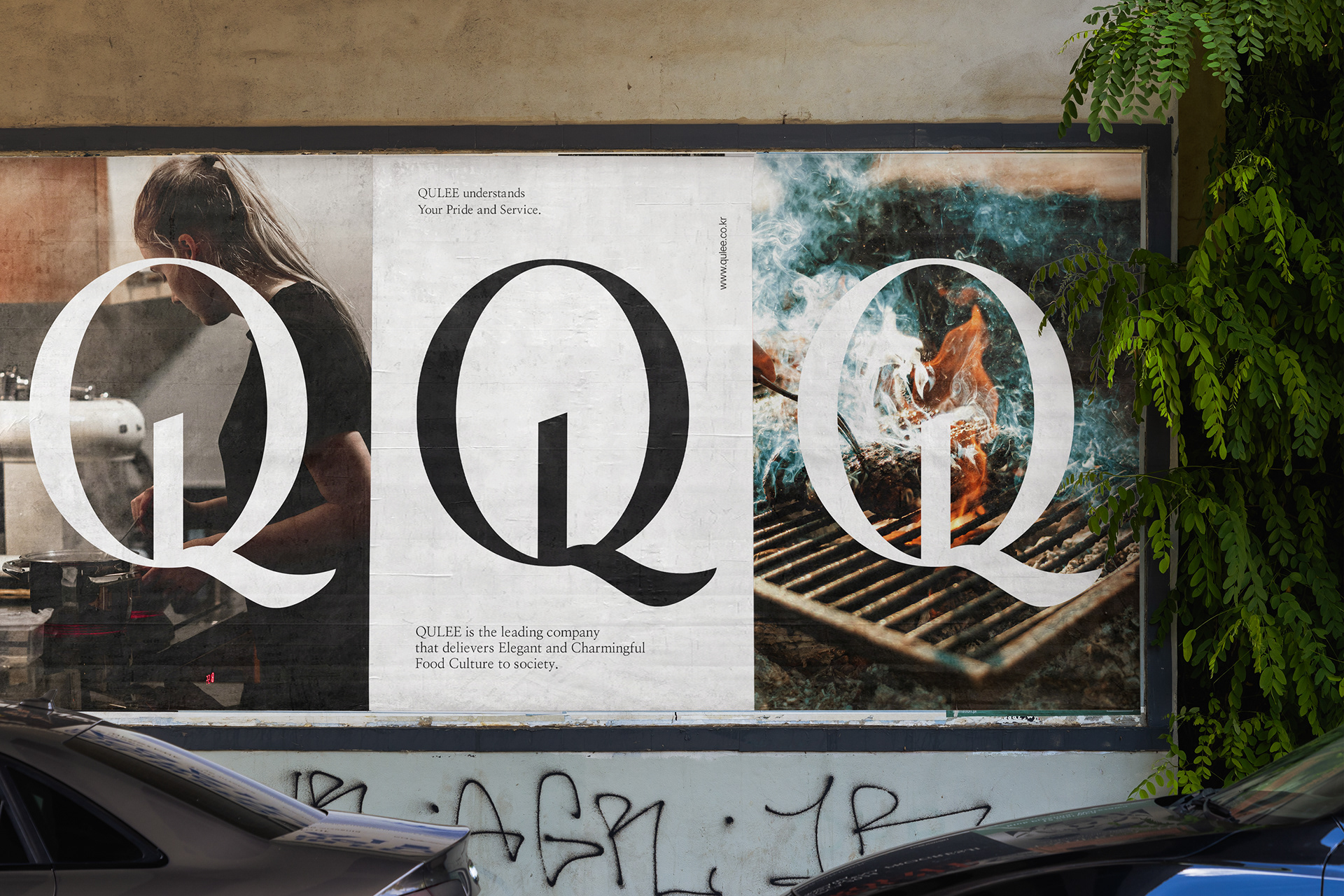
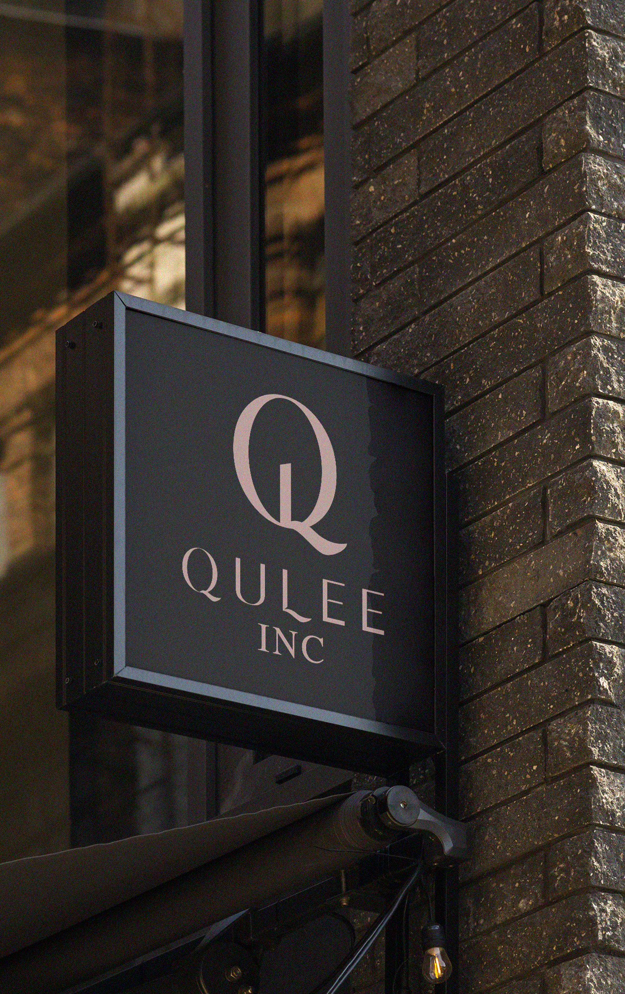
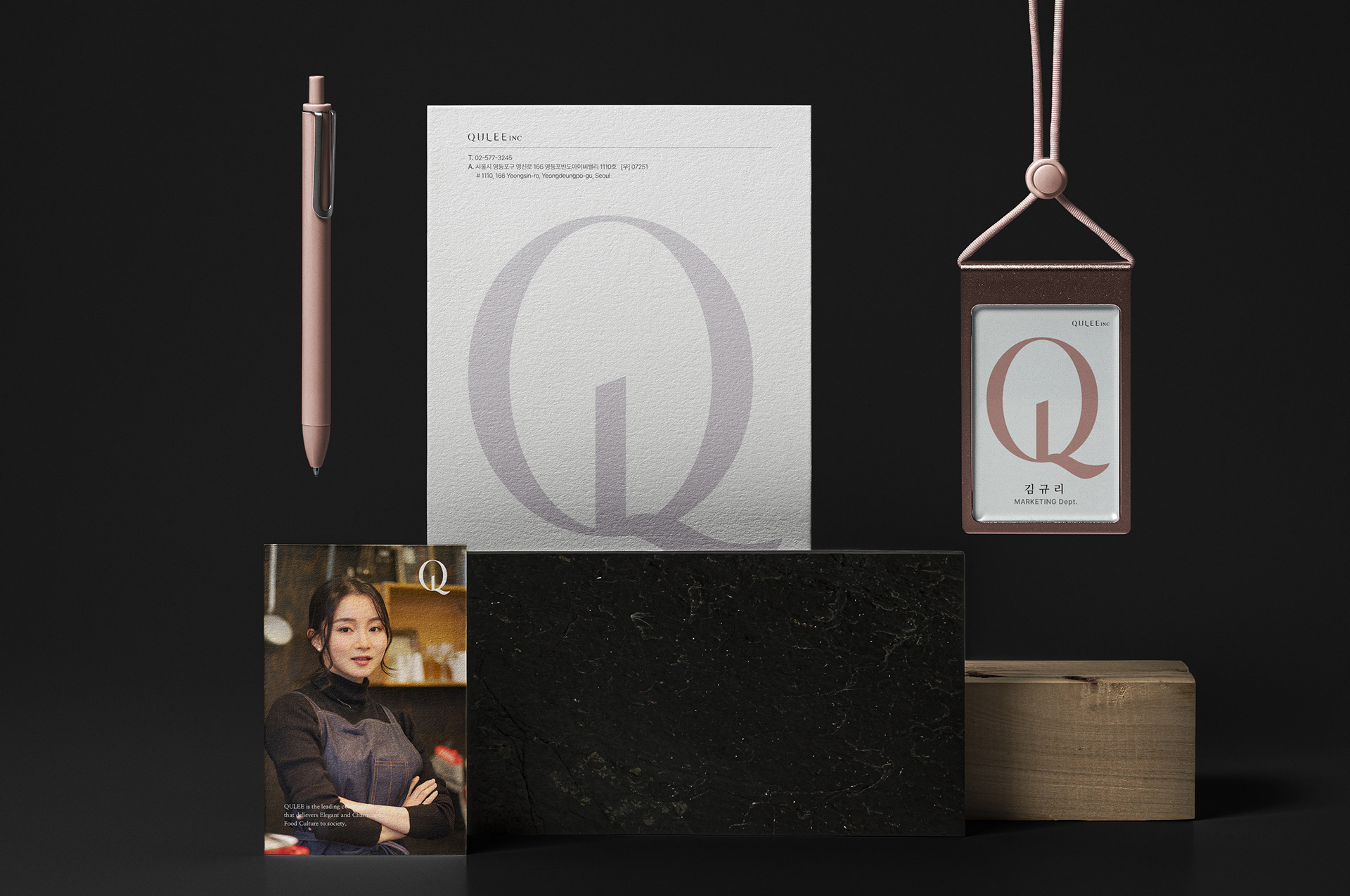
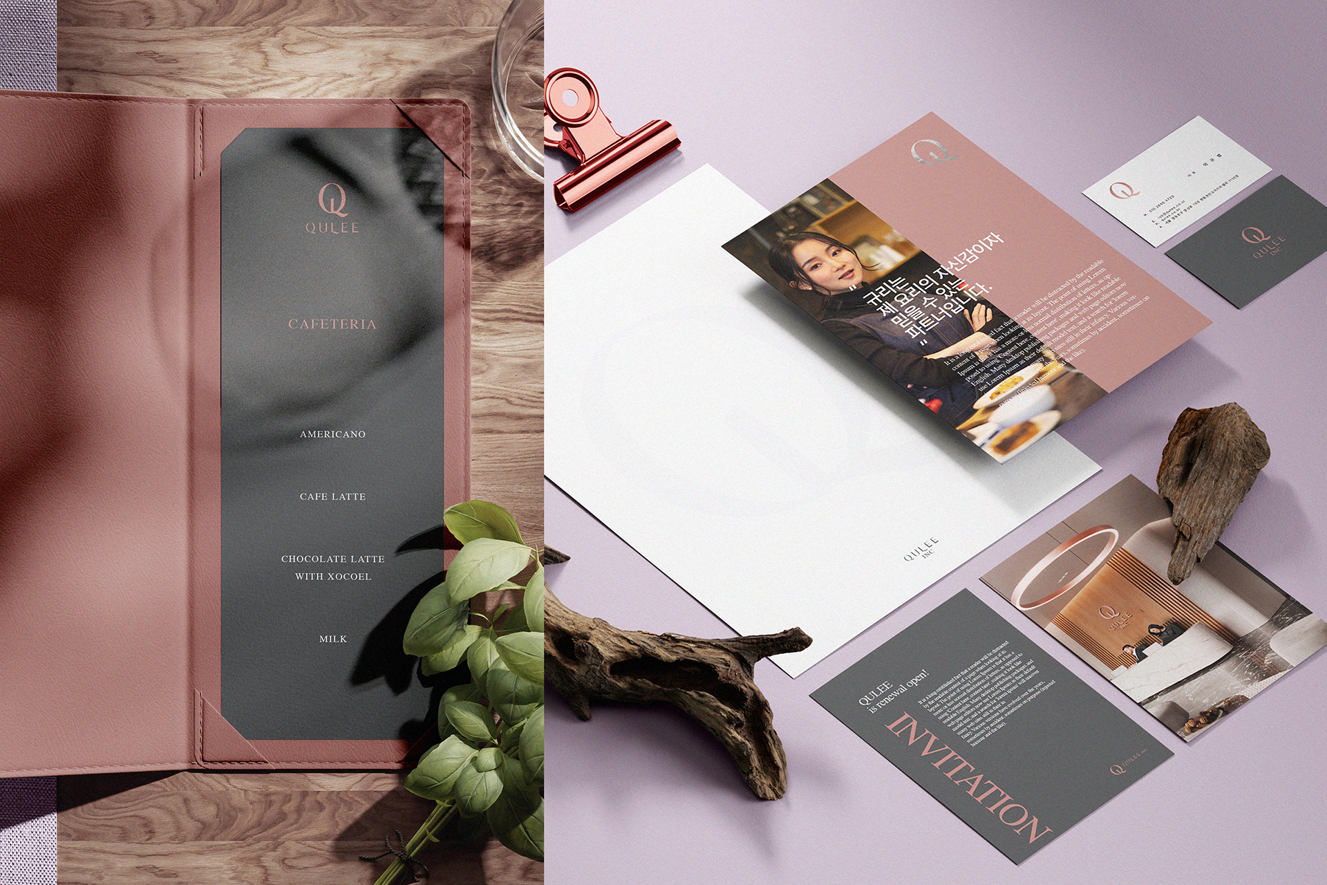
규리인터내셔널의 심벌은 고급 식자재를 개발하고 유통하는 프로페셔널의 자긍심을 상징합니다. ‘퀄리티에 있어 타협이 없다’는 CEO의 경영 철학을 담아, 럭셔리를 지향하는 기업 비전을 심볼에 녹여냈습니다. 완성된 원형 구조의 중심에 곧게 뻗은 기둥은, 기업 철학에 대한 굳은 자긍심을 지키는 동시에 사회와 조화를 이루겠다는 규리인터내셔널의 미션을 표현합니다. 강인함과 부드러움을 동시에 지닌 디자인 언어는, 규리인터내셔널이 지향하는 깊이 있는 가치를 묵직하게 담아내고 있습니다.
The symbol of Qulee expresses the pride of professionals who develop and distribute high-quality food materials. It contains the CEO's management philosophy of no compromise on quality and the vision of a company that pursues luxury. The straight pillar in the center of the circle expresses the company's mission to maintain pride in the corporate philosophy while achieving harmony with society. The expression of a strong yet soft design heavily contains the values of Qulee International.

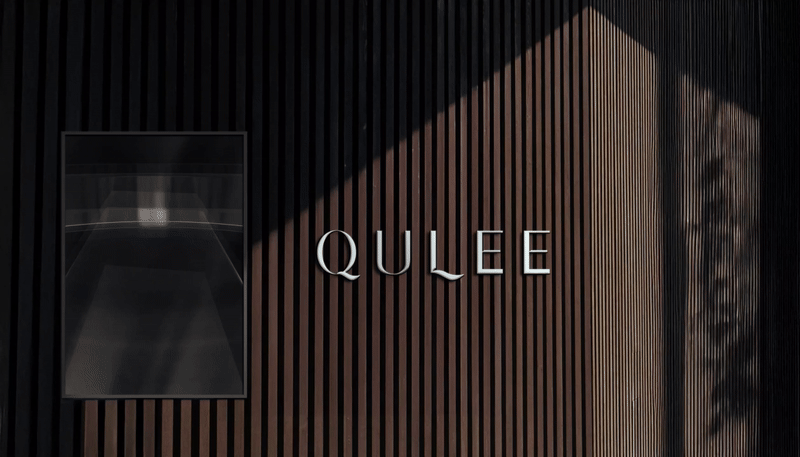
QULEE INTERNATIONAL C.I Renewal Design Project
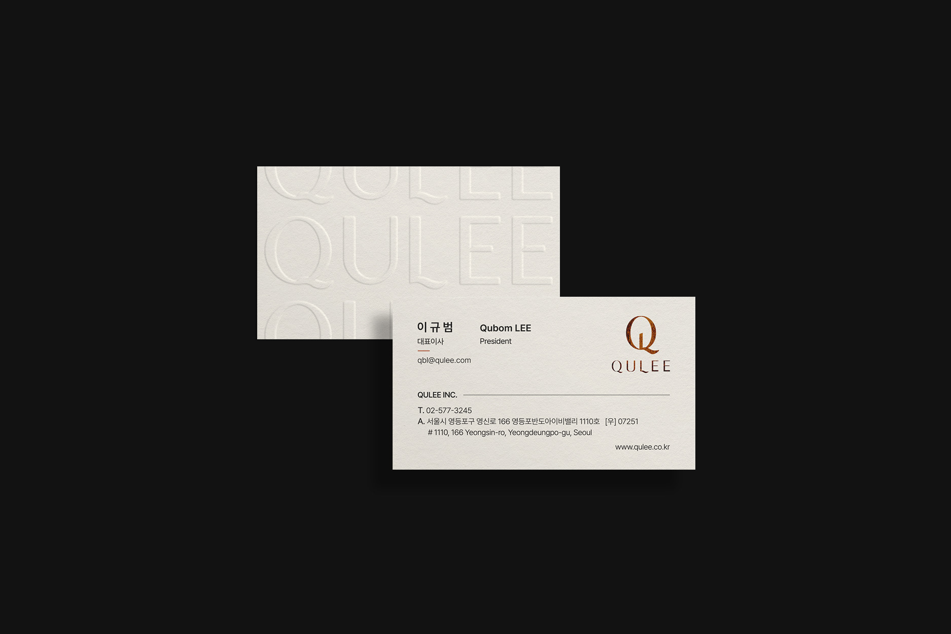
Client: 규리인터내셔널
-
Design Area
#Coporate Identity #C.I Design #Company Logo #회사로고리뉴얼
-
Project Team
규리인터내셔널 마케팅팀 + FDG Design B Team
-
Project Management
FDG / Visual Identity & Application Design Dev.
-
Art Direction by WOO SAGN YOON
Designed by SU JIN SON / UN SOO JUNG
www.fouroclock.kr