포어클락디자인그룹은 숙취해소제 분야에서 독창적이고 강렬한 디자인으로 주목받고 있습니다.
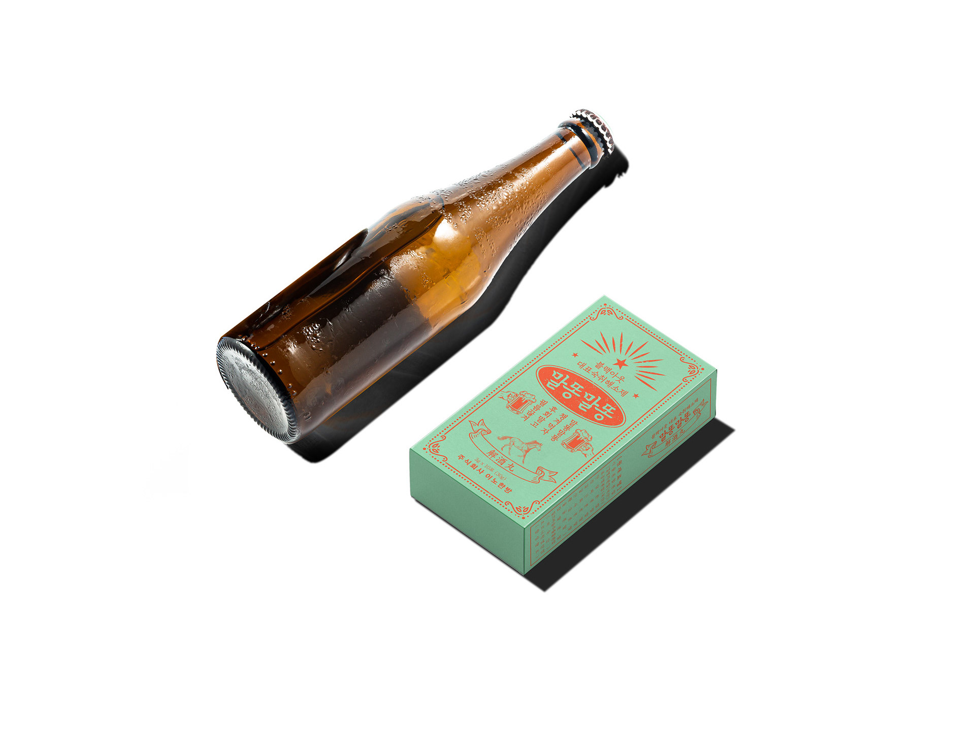
레트로 감성으로 브랜드의 시작을 알린 [말똥말똥]에 이어, 최근에는 미국 시장을 타깃으로 한 [웨이키(Wakie)] 프로젝트를 성공적으로 완수했습니다.
술을 사랑하는 디자이너의 감각과 시장의 니즈가 만난, 반가우면서도 흥미로운 프로젝트였습니다.
[Wakie]는 브랜드 네이밍부터 패키지 디자인까지 전반적인 브랜딩을 포어클락이 주도한 프로젝트로,
글로벌 수출을 고려해 강렬한 첫인상과 지속 가능한 브랜드 이미지를 목표로 기획되었습니다.
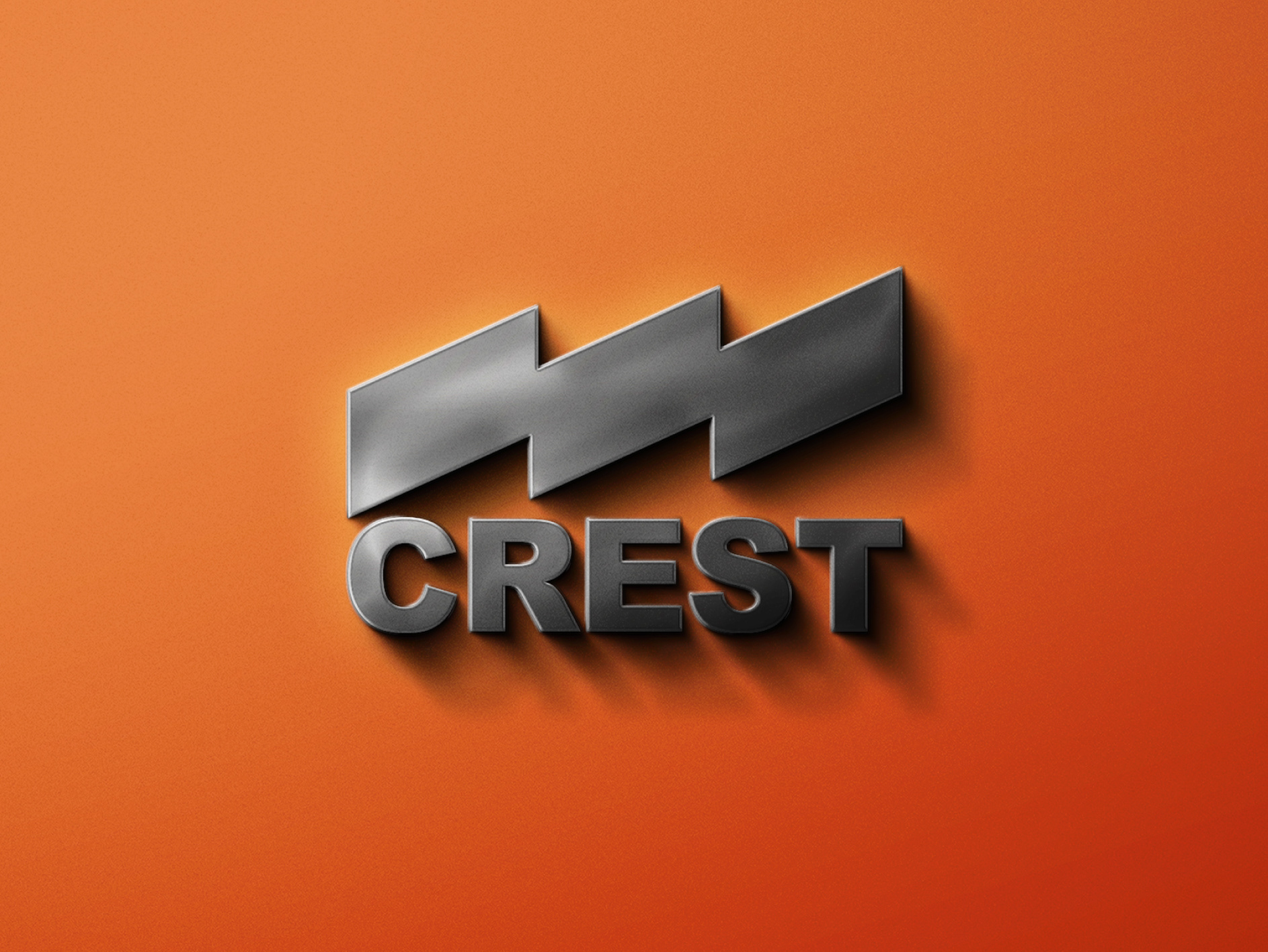
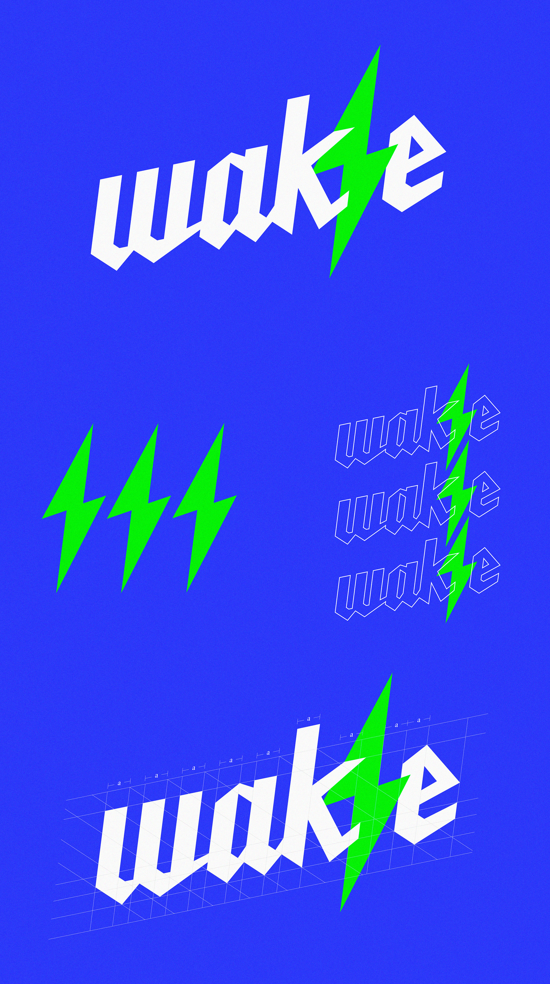
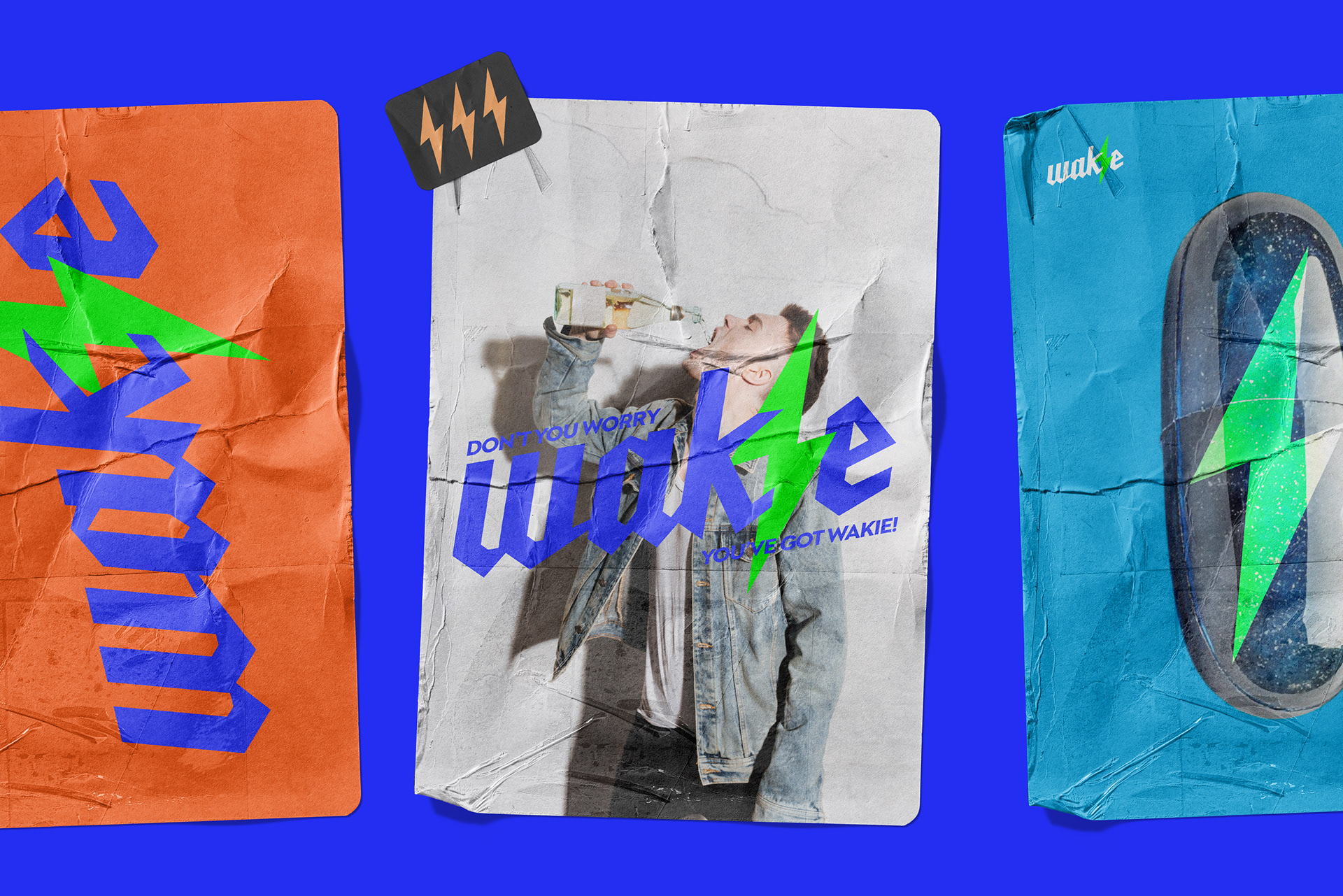
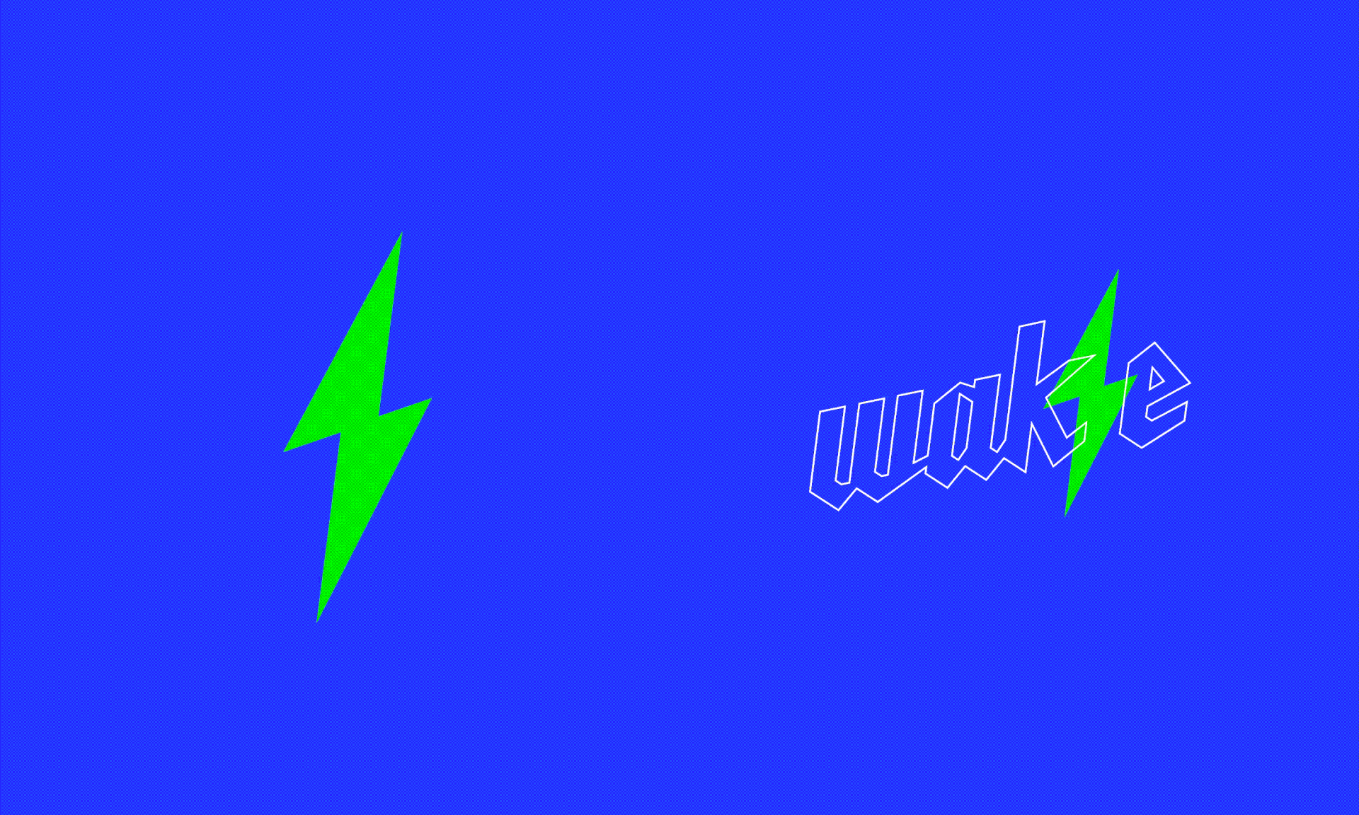
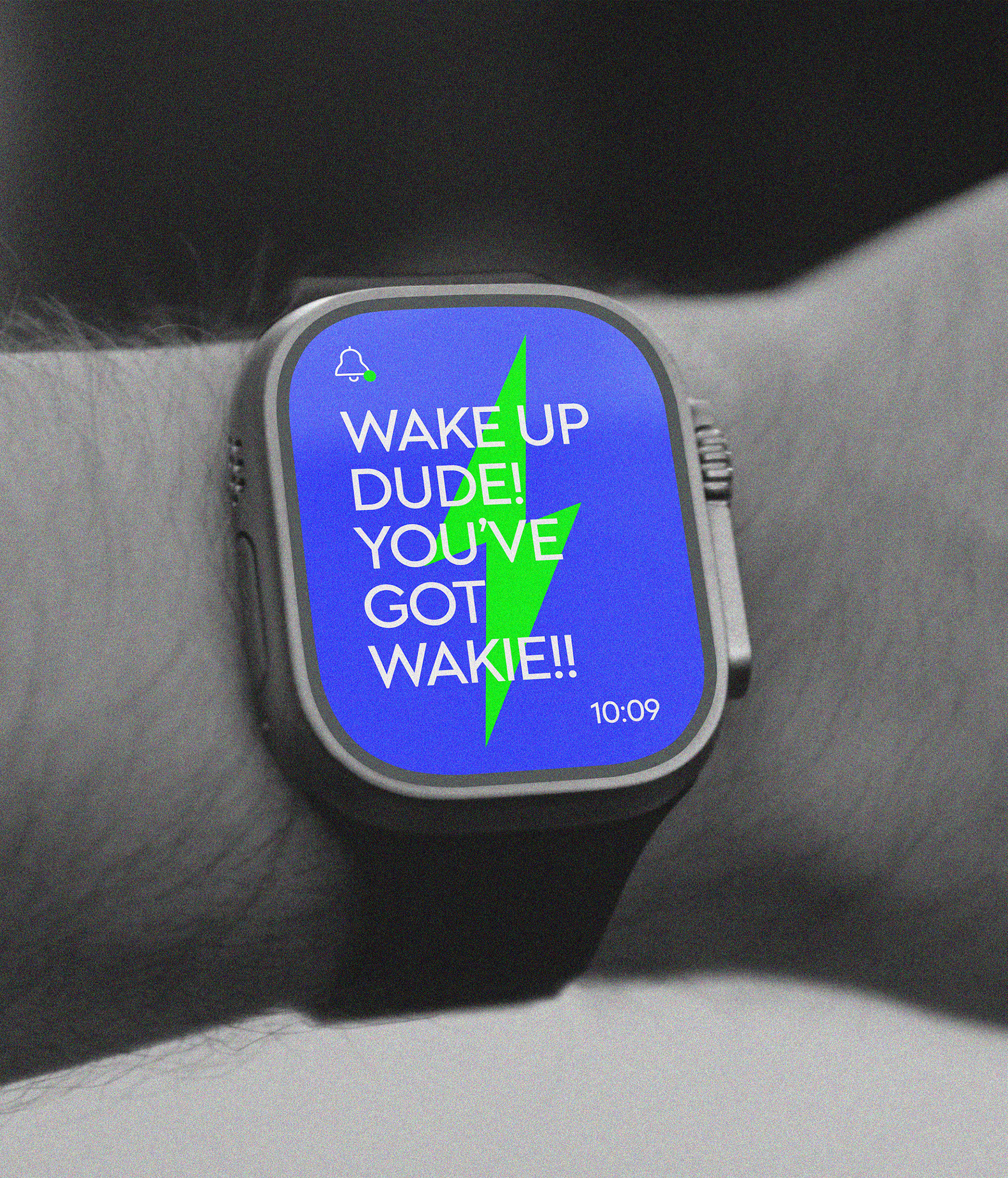
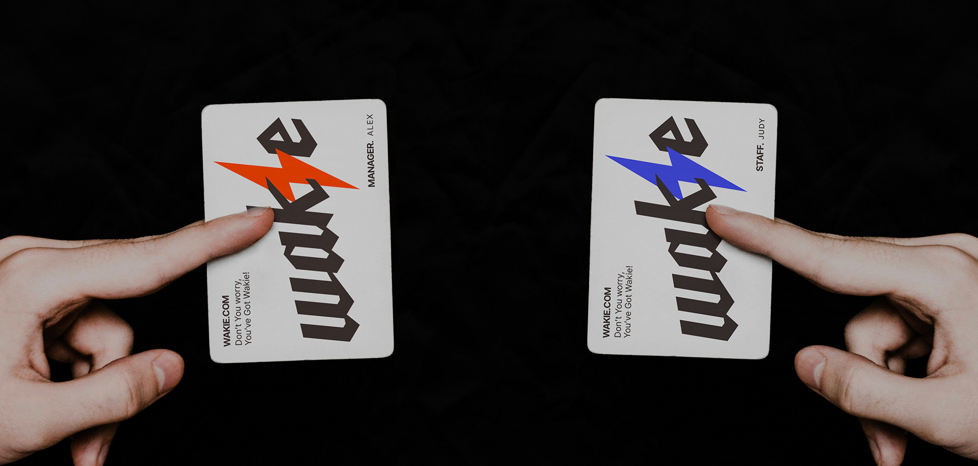
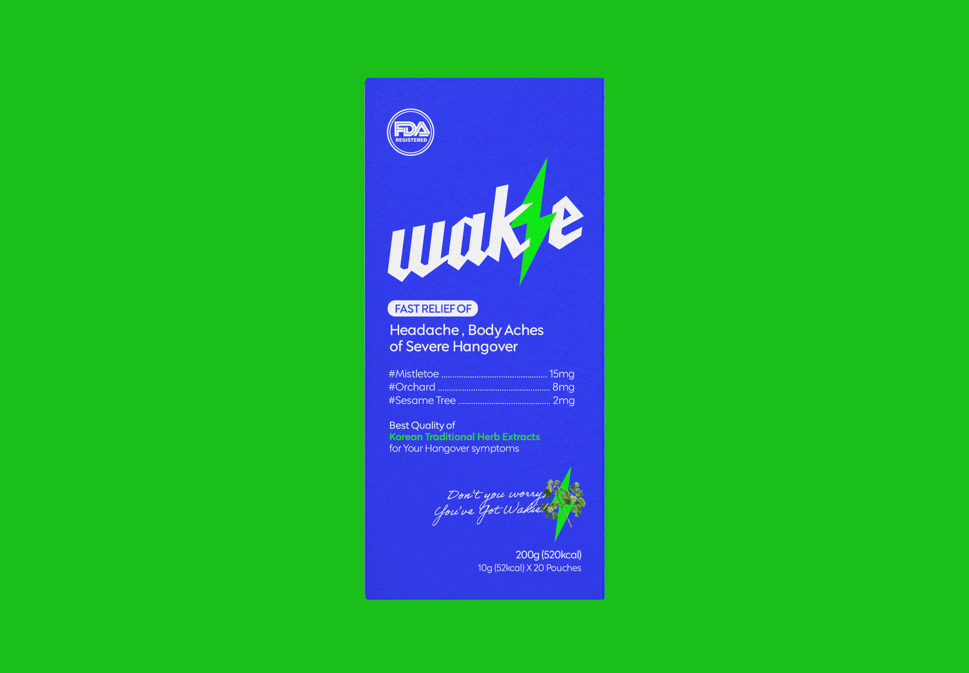
정신이 번쩍 드는 숙취해소제의 기능성과 상품성을 효과적으로 전달하기 위해 ‘번개’ 이미지를 메인 심볼로 고안했고,
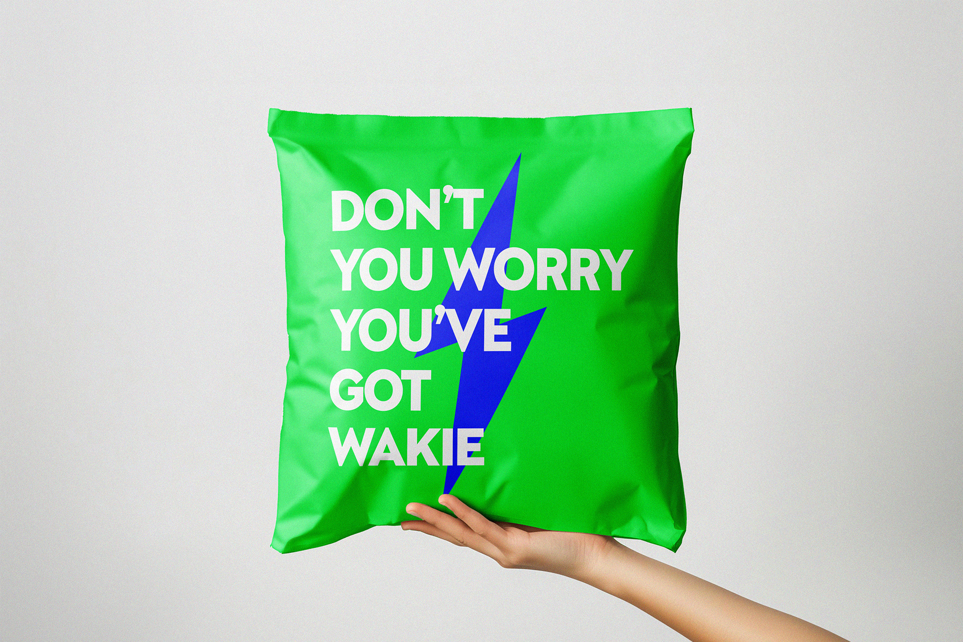
이는 패키지는 물론 마케팅 전반에 걸쳐 일관되게 적용되어 소비자와의 강한 연결고리를 형성합니다.
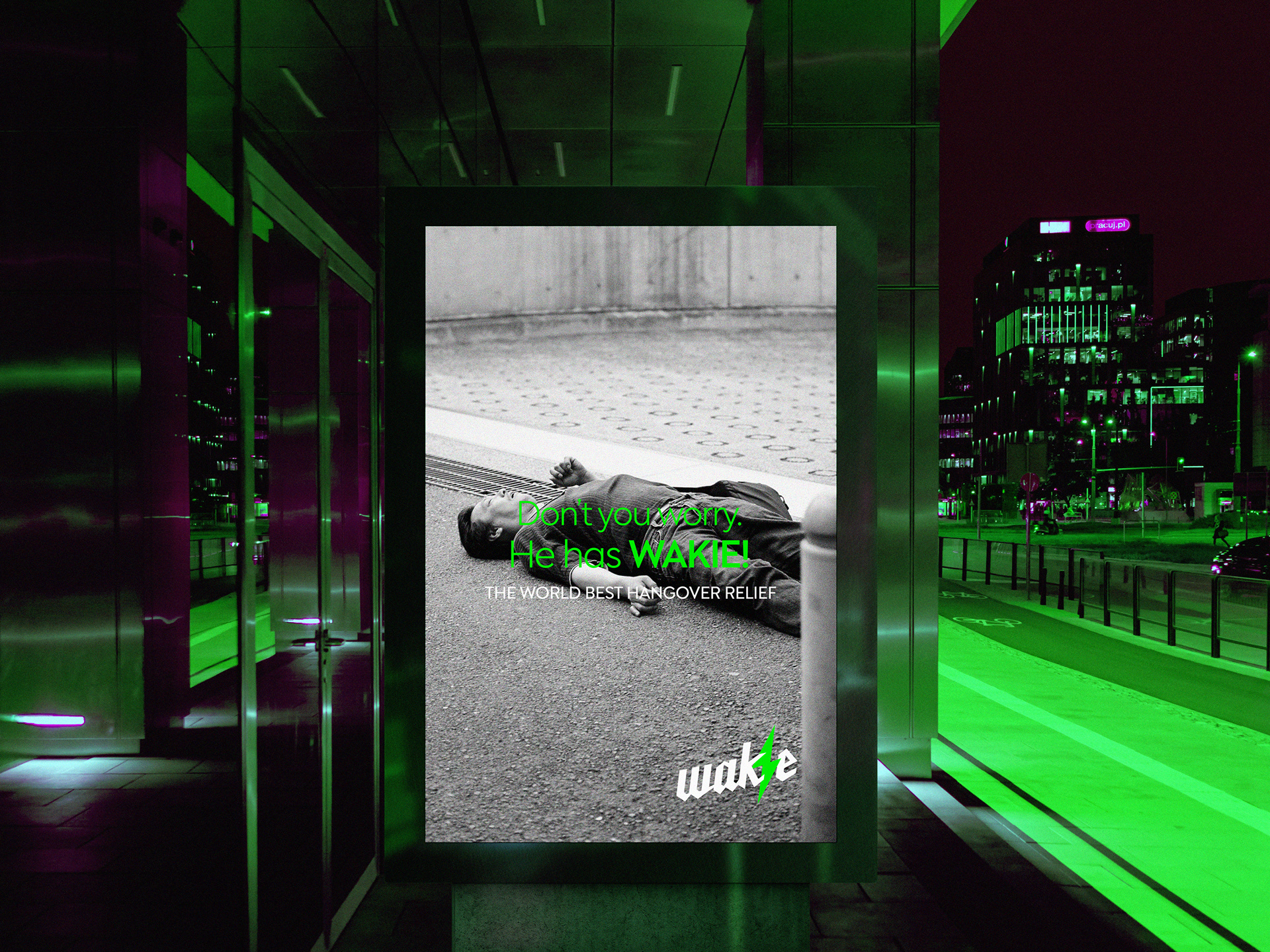
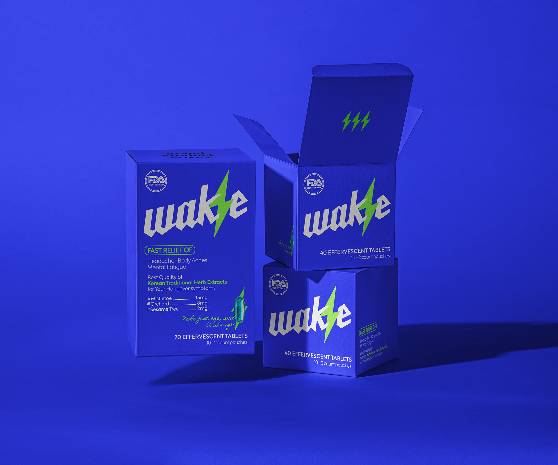
청량한 블루와 허브 성분을 연상시키는 네온 그린의 컬러 조합은 시각적 임팩트를 극대화하며, 기억에 남는 브랜드 경험을 제공합니다.
이는 포어클락이 지향하는 "설명이 필요 없는 디자인, 직관적이고 강력한 스토리텔링"의 철학을 잘 보여주는 사례입니다.
불필요한 장식을 배제하고 브랜드의 핵심 요소만을 극대화하여, 미국은 물론 동남아 시장에서도 스테디셀러로 자리잡을 수 있도록
장기적인 전략 하에 디자인되었습니다.
한 번의 개발로 오랫동안 리뉴얼 없이도 지속 가능한 브랜드 자산으로 기능하도록 설계된 점 또한 이 프로젝트의 큰 강점입니다.
*본 프로젝트는 수출바우처를 활용하여 개발되었습니다.
At FDG, we specialize in creating bold and memorable designs for hangover relief products.
Starting with the retro-inspired [Malttong Malttong], we’ve continued to lead the category with impactful branding
—most recently with our latest project, [Wakie].
As designers who enjoy the occasional drink ourselves, these projects are both exciting and meaningful.
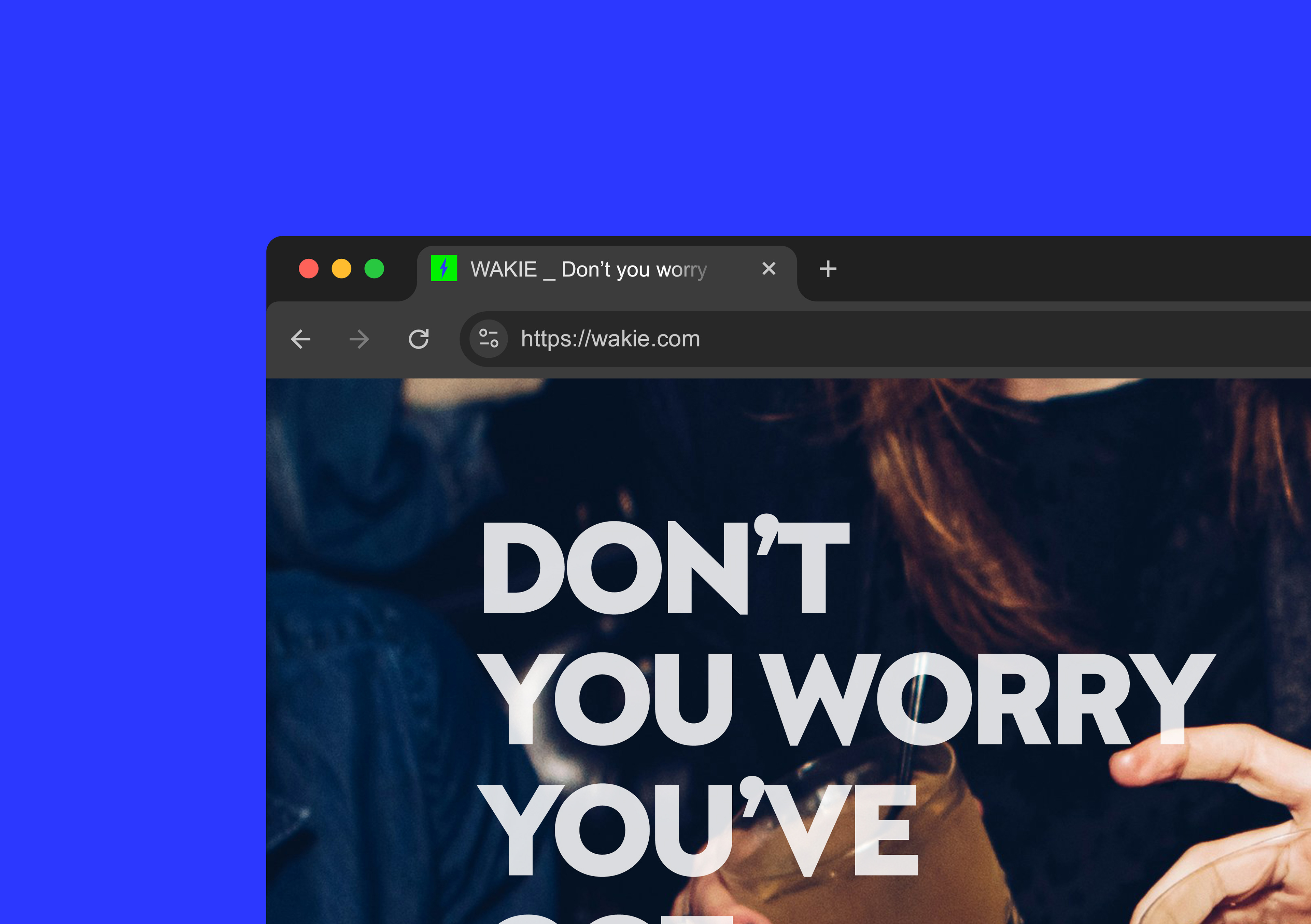
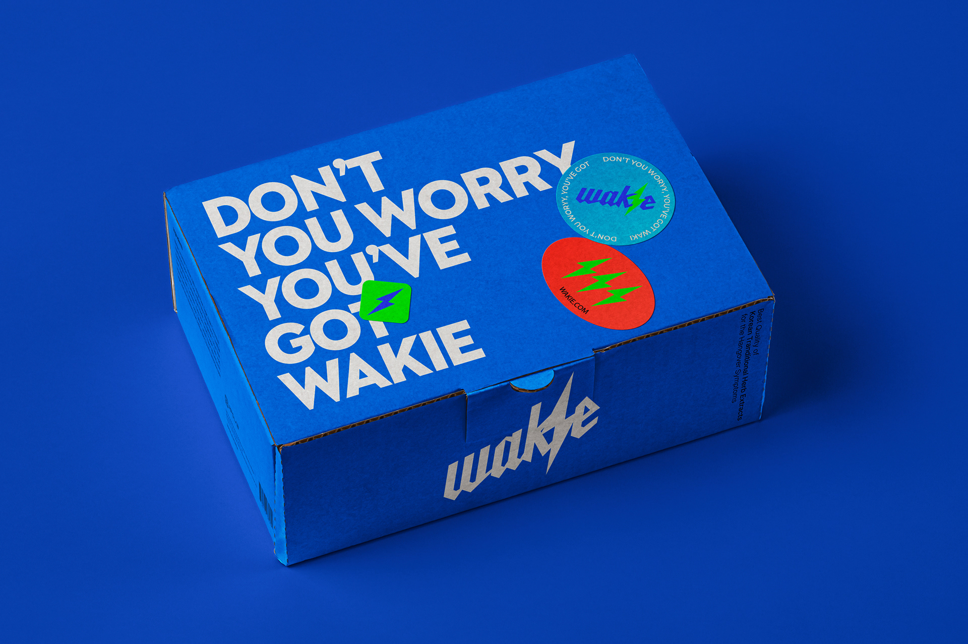
[Wakie] was a full-scope branding project—from naming and identity to packaging design—strategically developed
for the U.S. market with plans for international export. To clearly communicate the product’s energizing function,
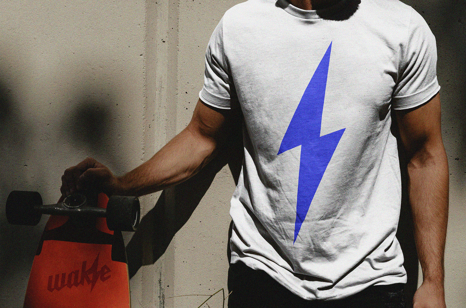
we developed a lightning bolt motif as the core branding element.
This icon serves as a visual shorthand for the brand’s purpose and is consistently applied across packaging and marketing assets
to create a unified and compelling story.
The combination of a refreshing blue with neon green—symbolic of herbal extracts—delivers a striking visual punch,
leaving a strong and lasting impression on consumers. This reflectsFDG's design philosophy:
“Designs that speak for themselves—powerful, intuitive, and storytelling-driven.”
Stripped of unnecessary details, Wakie’s design focuses solely on essential brand elements, allowing for a timeless look
that can remain unchanged over the long term. With a strong visual identity in place,
the product is now well-positioned to become a steady seller not only in the U.S. but also across Southeast Asian markets.


WAKIE Launching Project
2025
Client: RPGLAB
-
Design Area
#Naming #Brand Design #Package Design
-
Project Team
FDG Design A Team
-
Project Management
FDG / Visual Identity & Application Design Dev.
-
Art Direction by WooSang
Designed by SU JIN SON / UN SU JUNG
www.fouroclock.kr