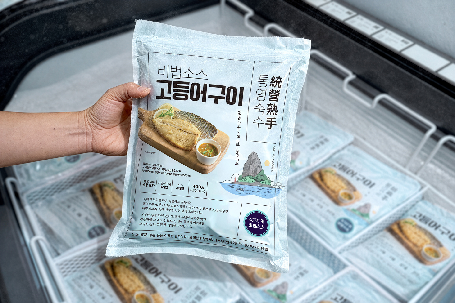
TONGYEONG SUKSU — GRILLED FISH PACKAGING
ASSIGNMENT
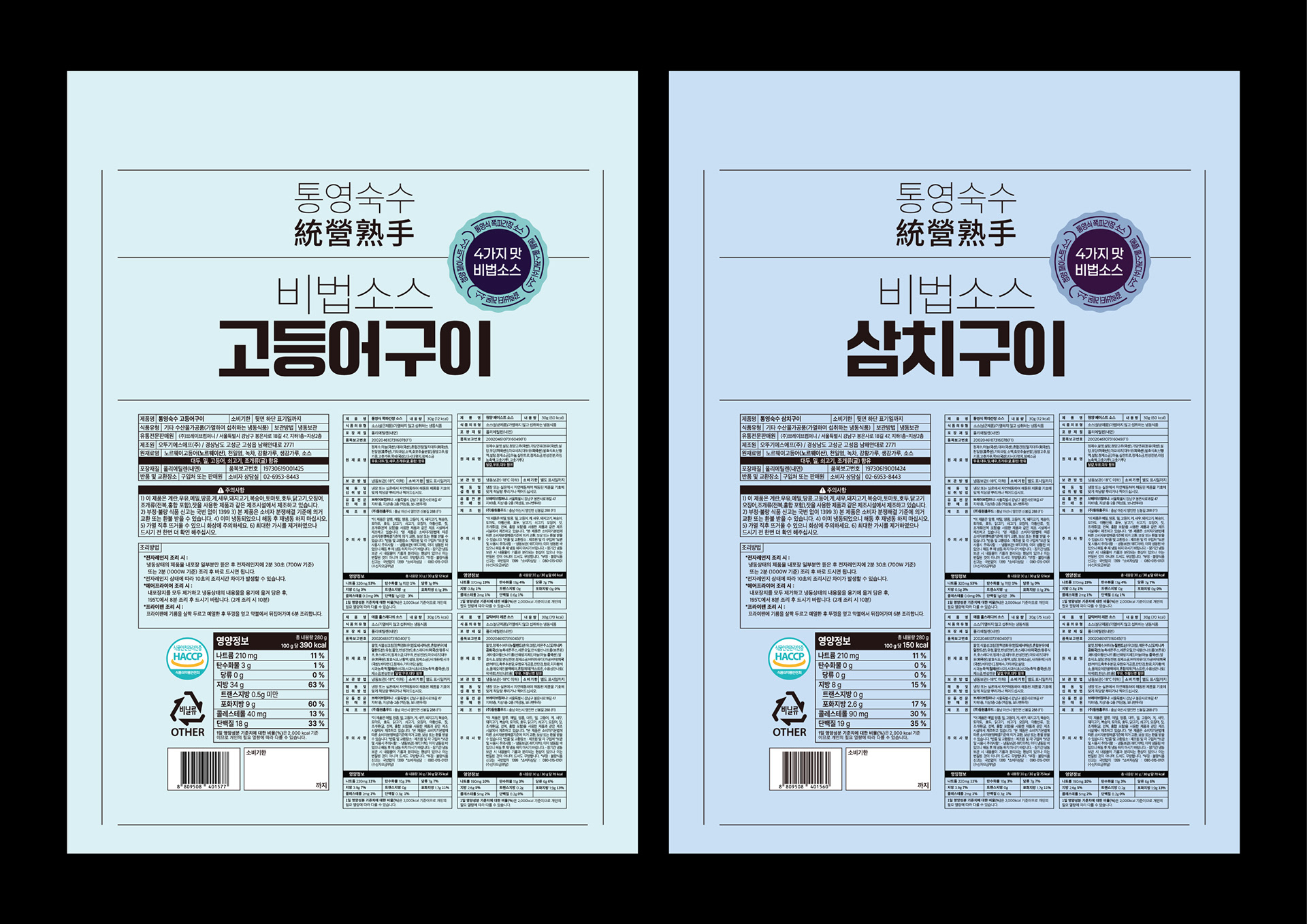
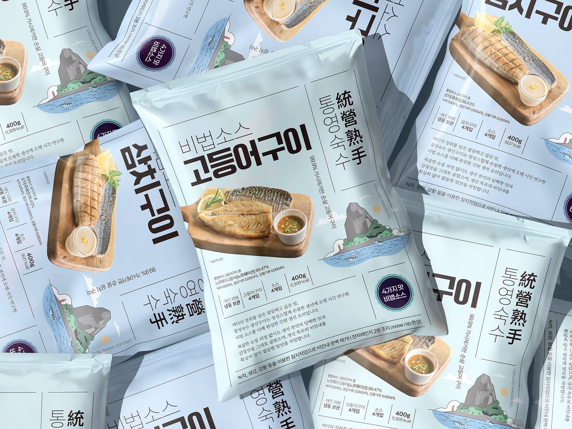
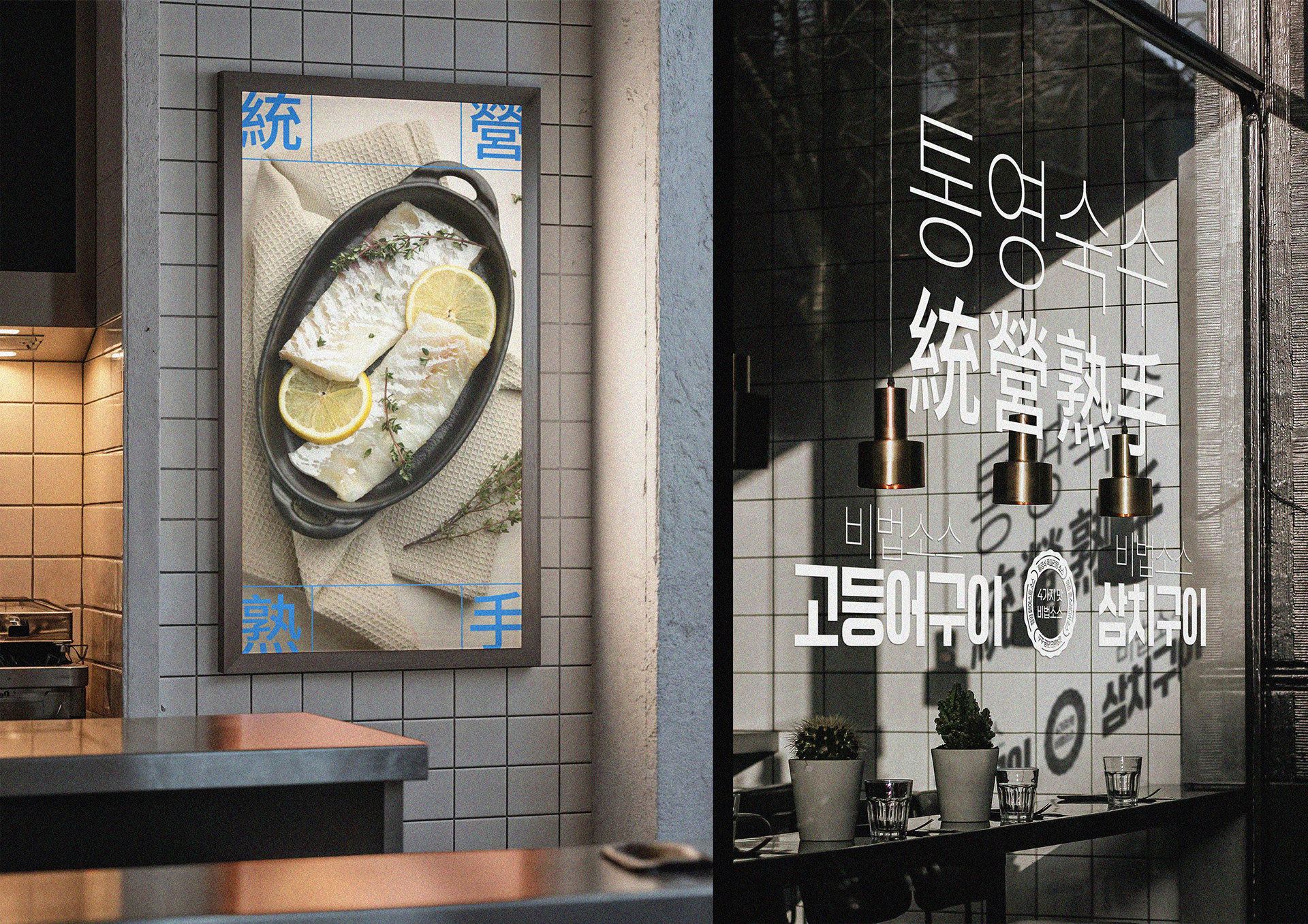
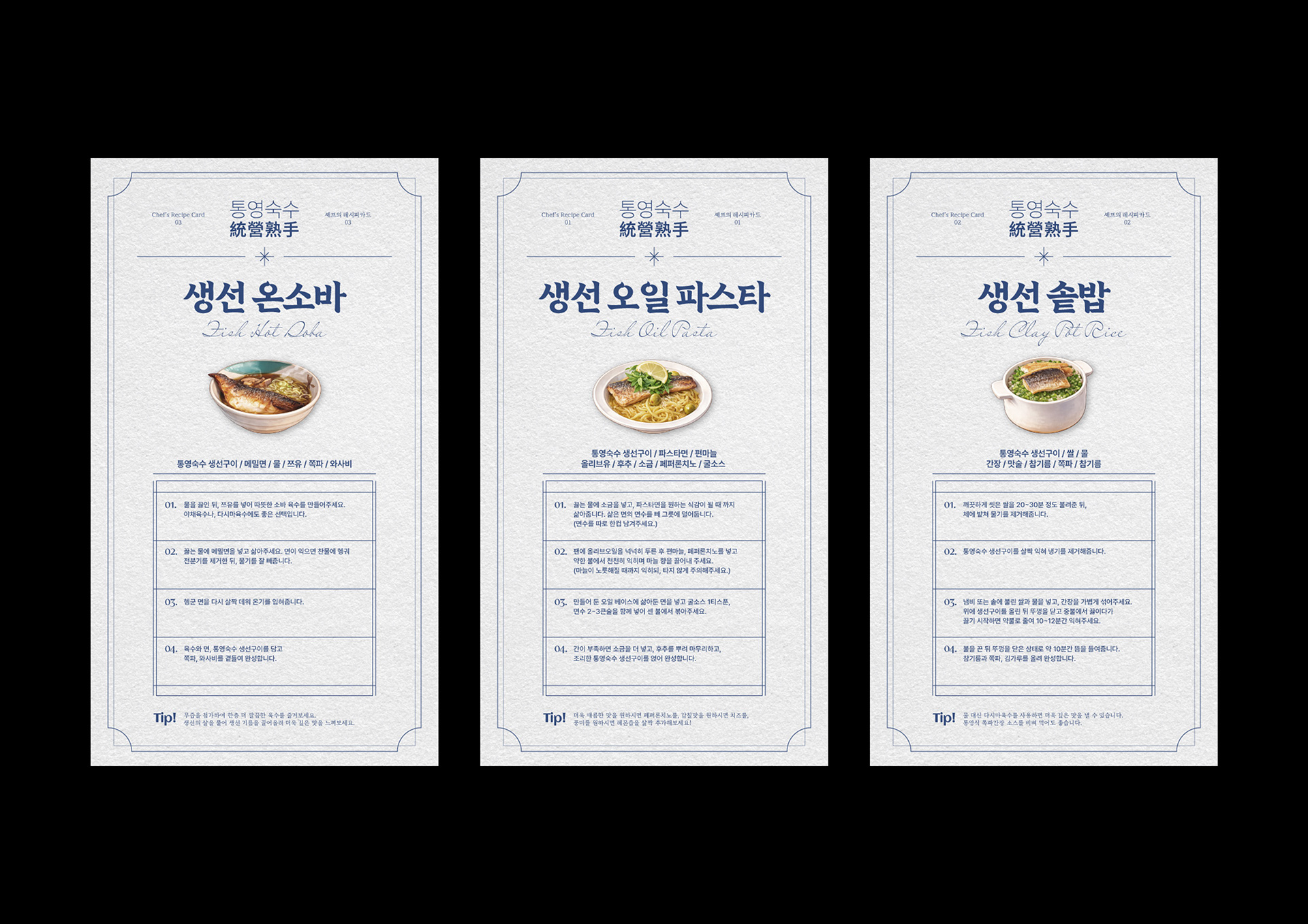
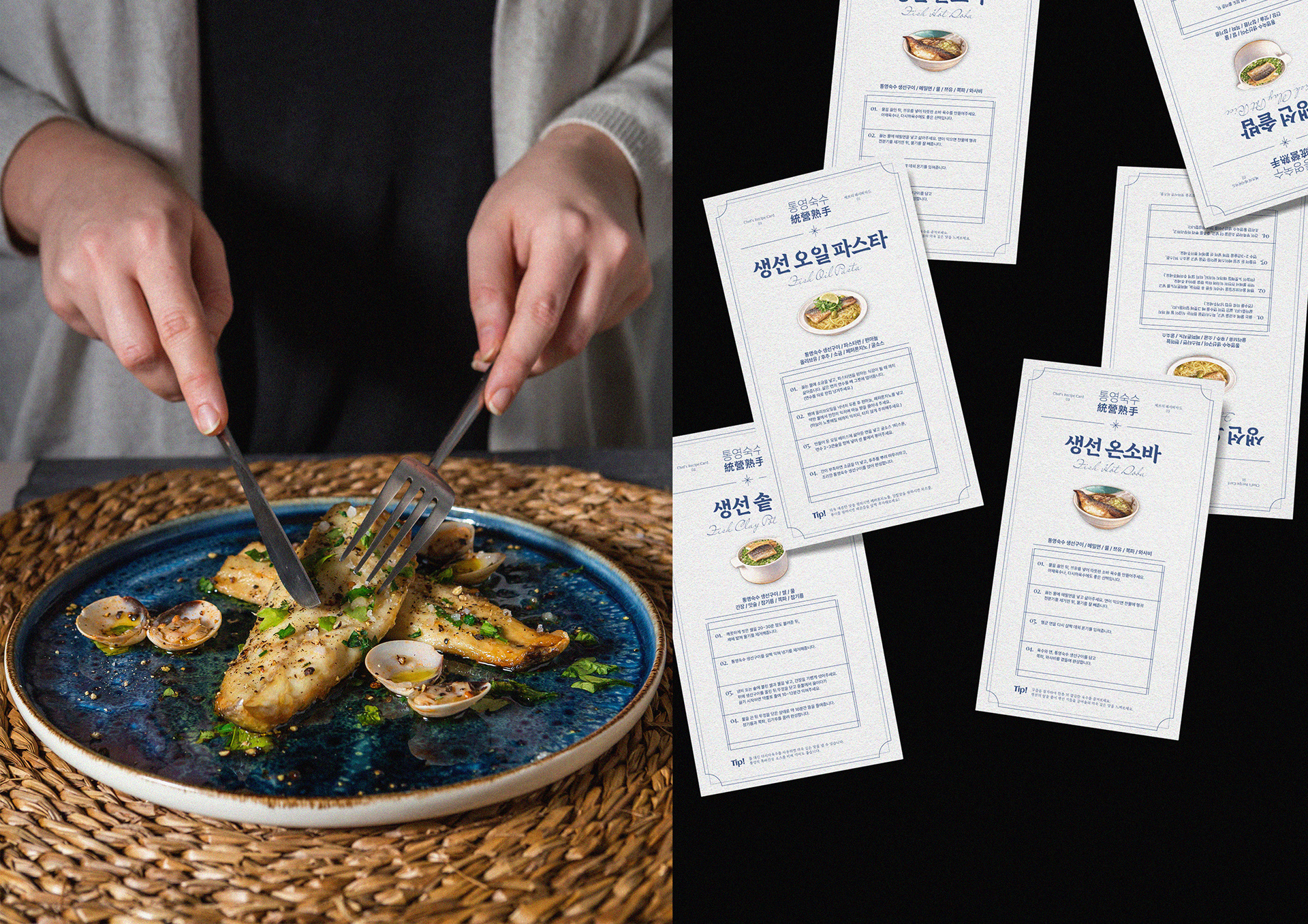
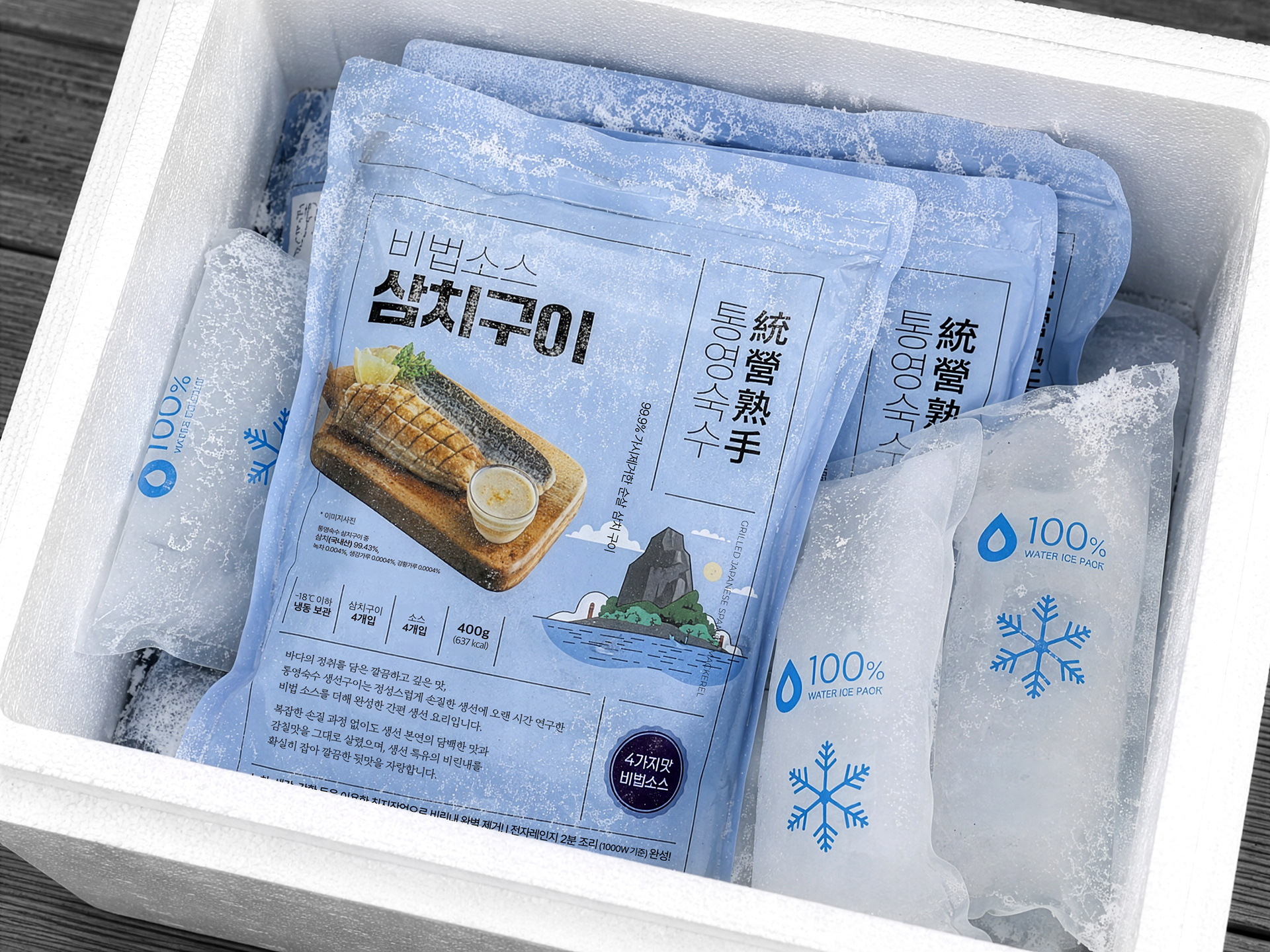
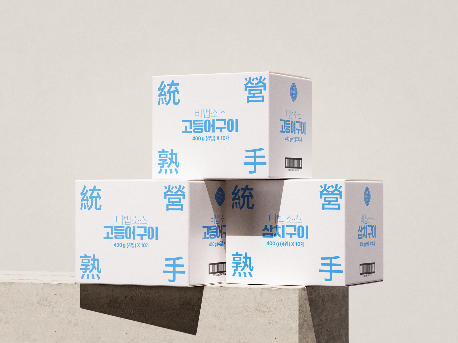
The challenge was to bring together a wide range of content within a single packaging system — from the brand and product stories to grilled fish imagery, product information, and the visual character of Tongyeong. The packaging needed to communicate these different elements clearly while maintaining a distinctive and cohesive visual identity.
SOLUTION & PROCESS
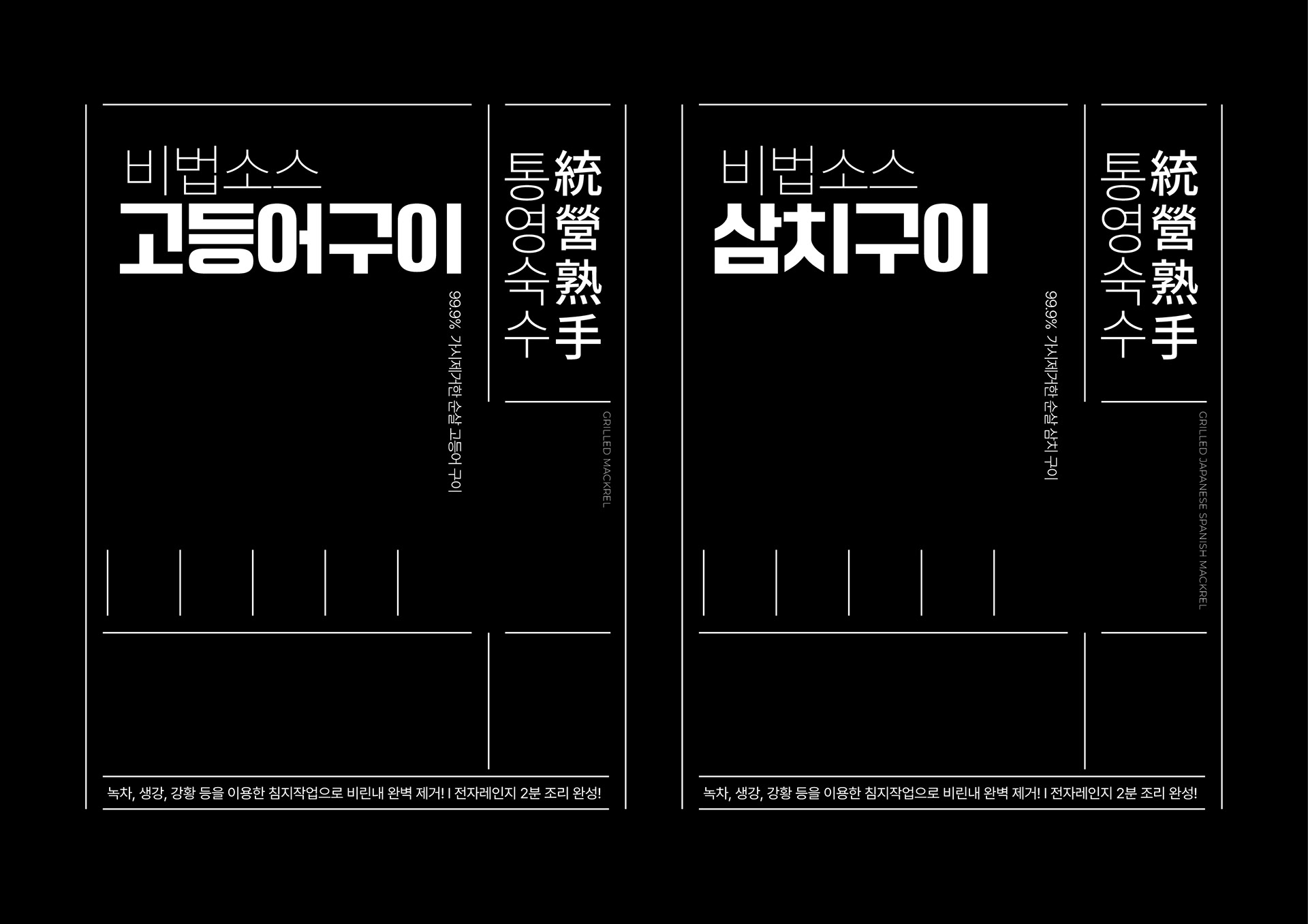
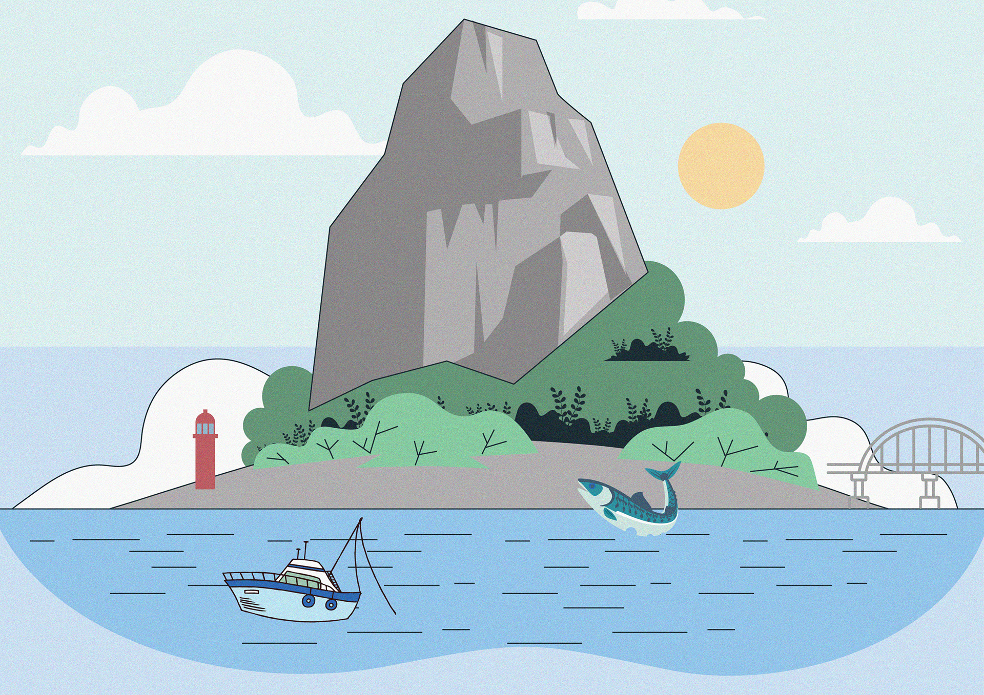
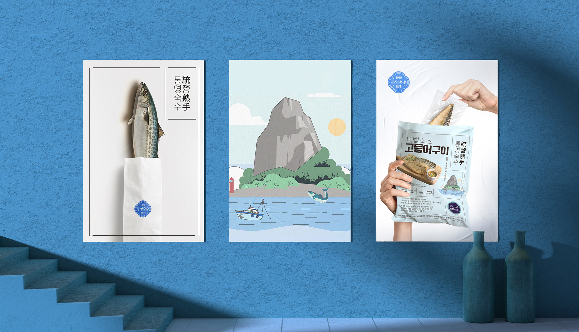
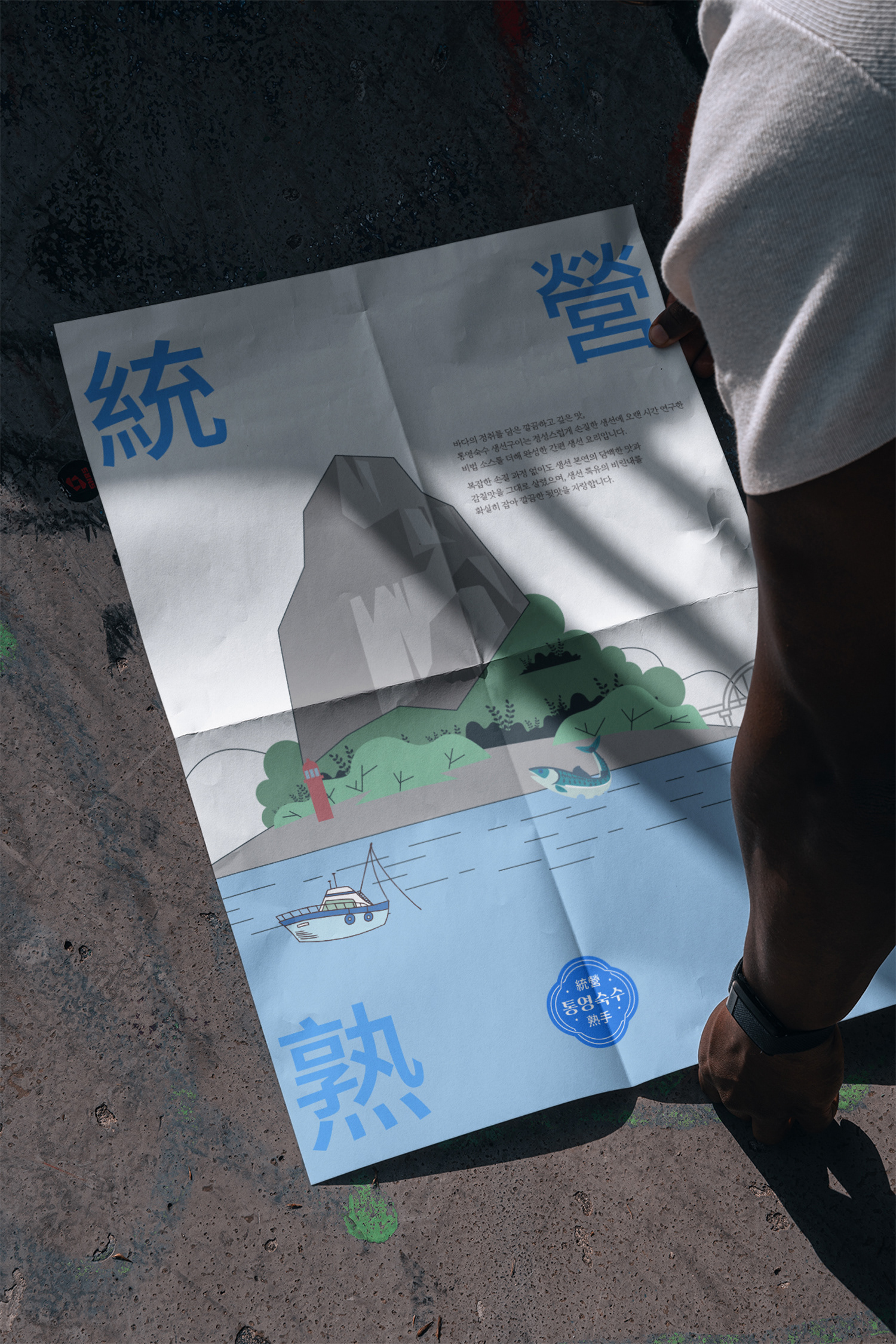
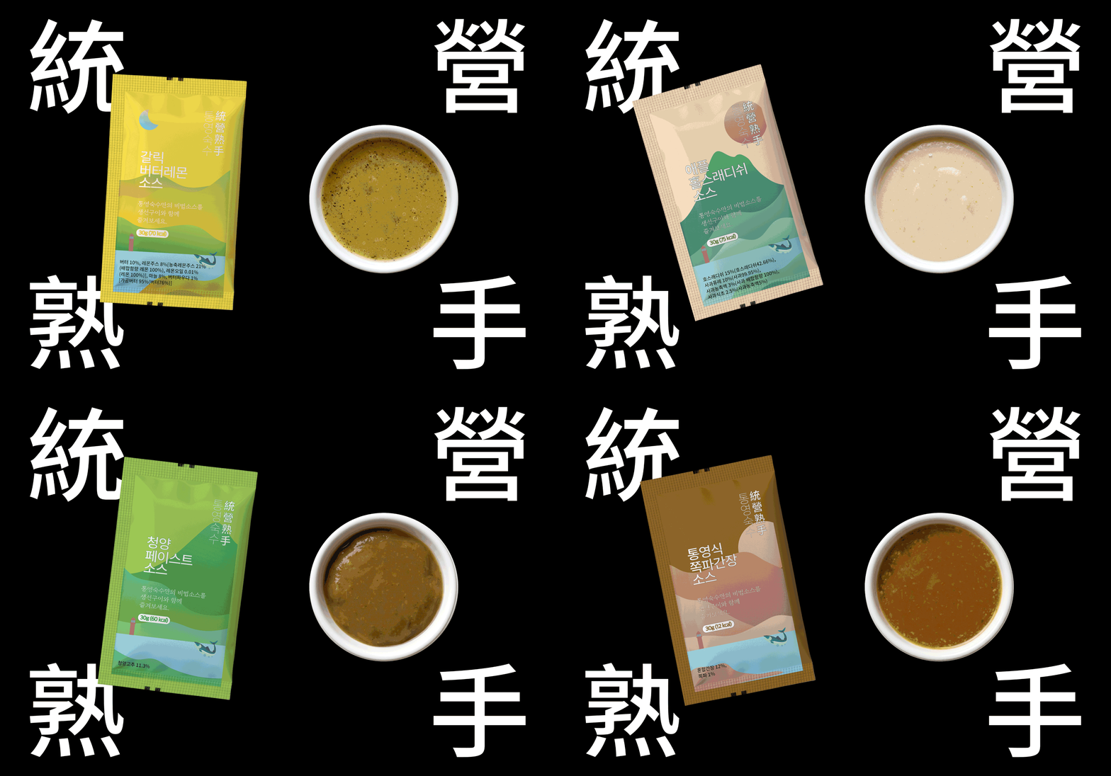
We developed a linear graphic system to organize the multiple layers of information while keeping the composition flexible. Lines establish the overall structure, while typography, illustrations, product imagery, and information interact freely within and beyond the framework. To express a sense of place, we developed illustrations inspired by Tongyeong’s coastal landscape, incorporating elements such as the sea, mountain, lighthouse, fishing boats, and marine life. The system was then extended across different products, allowing each variety to retain its own character while remaining part of a cohesive packaging system.
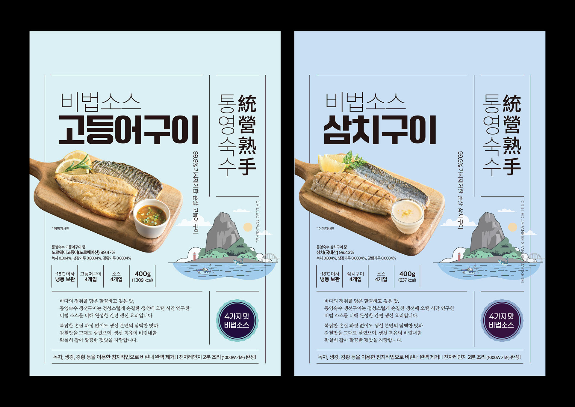
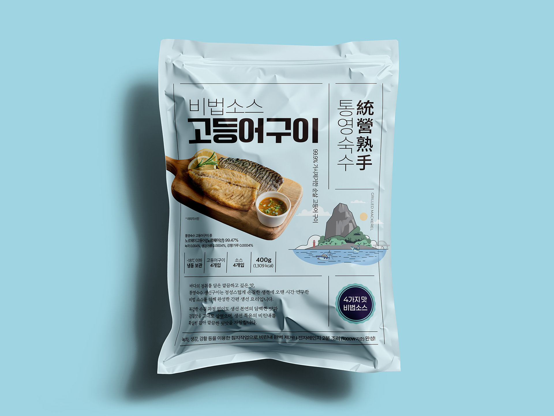
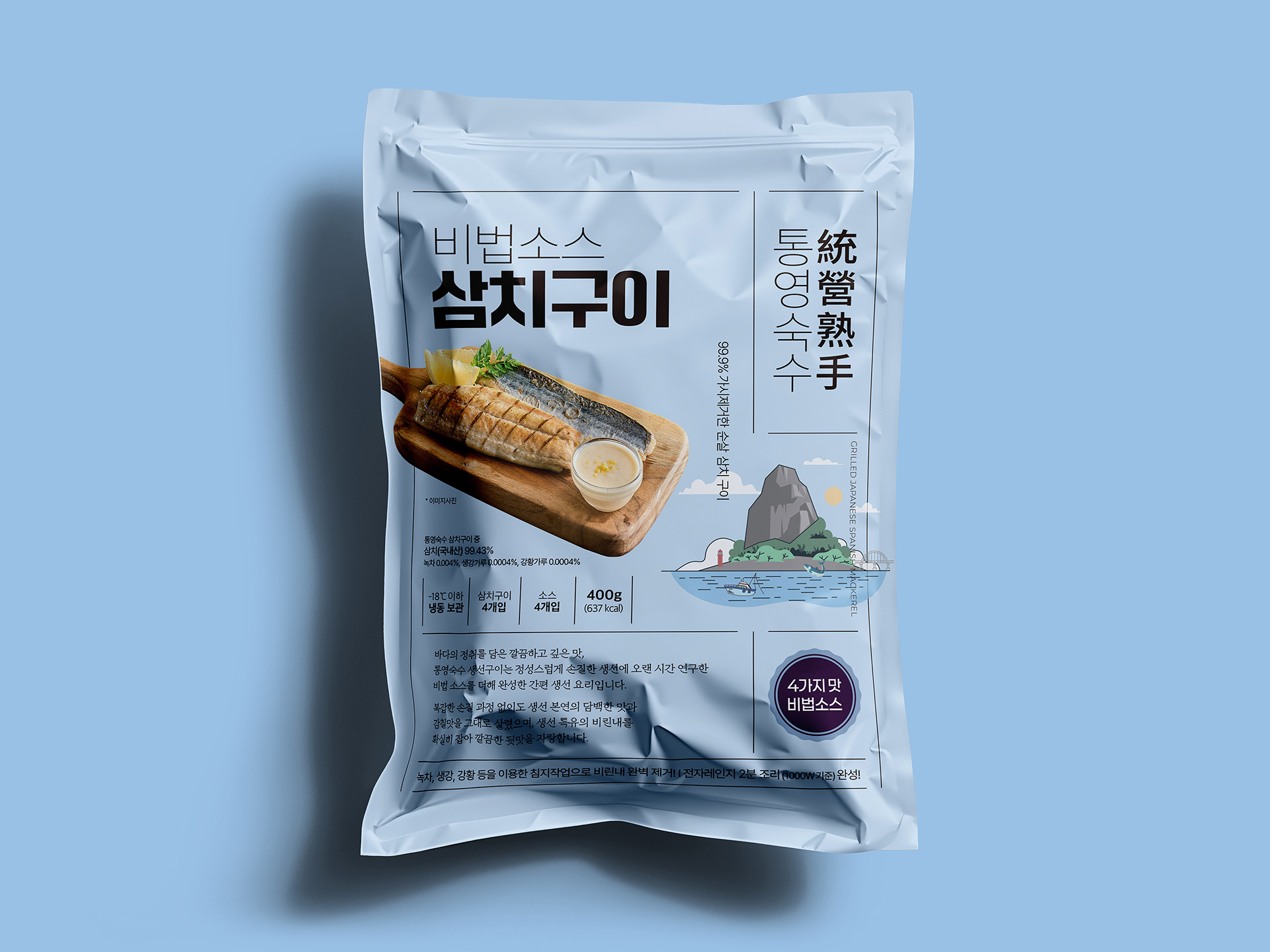
A SENSE OF PLACE
A visual language rooted in Tongyeong. We translated the coastal character of Tongyeong into a simple illustration system —
bringing together its landscape, sea, fishing boats, and marine life.
These elements were designed to work independently or as part of the packaging structure,
adding a sense of place without limiting the flexibility of the overall composition.
Grilled Fish Packaging Project
2025
Client: Brave Company
2025
Client: Brave Company
-
Design Area
#Food Branding #Package Design #Seafood Branding #Graphic Design
Design Area
#Food Branding #Package Design #Seafood Branding #Graphic Design
-
Project Team
FDG Design A Team
FDG Design A Team
-
Project Management
FDG / Visual Identity & Application Design Dev.
FDG / Visual Identity & Application Design Dev.
-
Art Direction by WooSang
Designed by MINA JUNG
Designed by MINA JUNG
www.fouroclock.kr