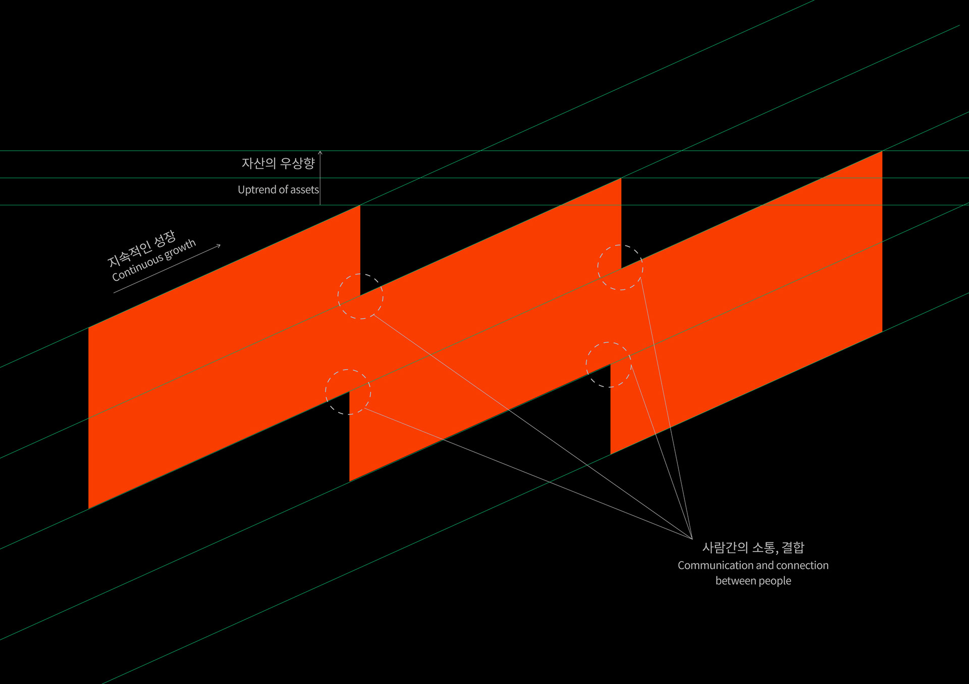
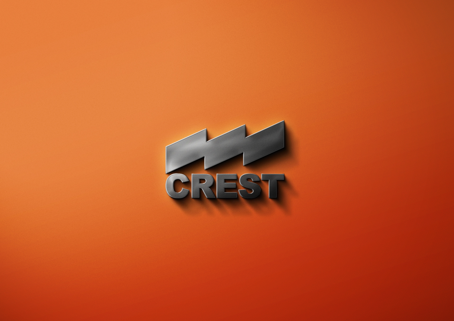
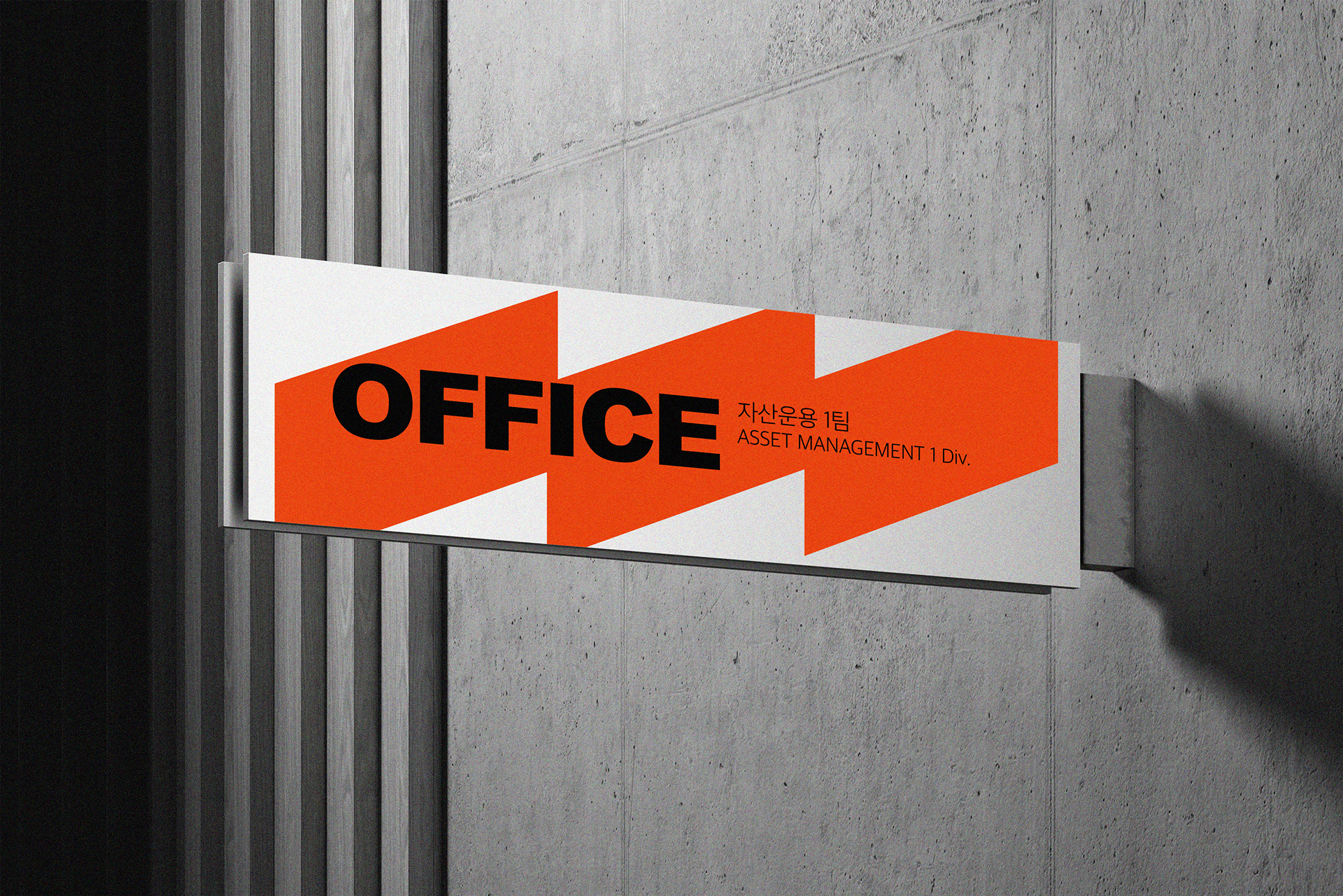
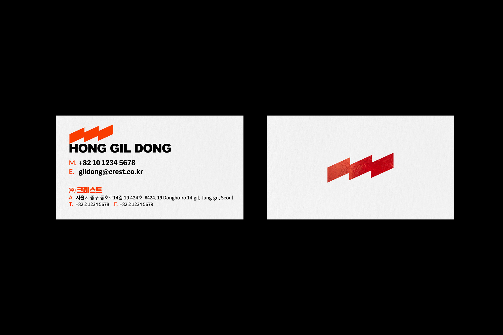
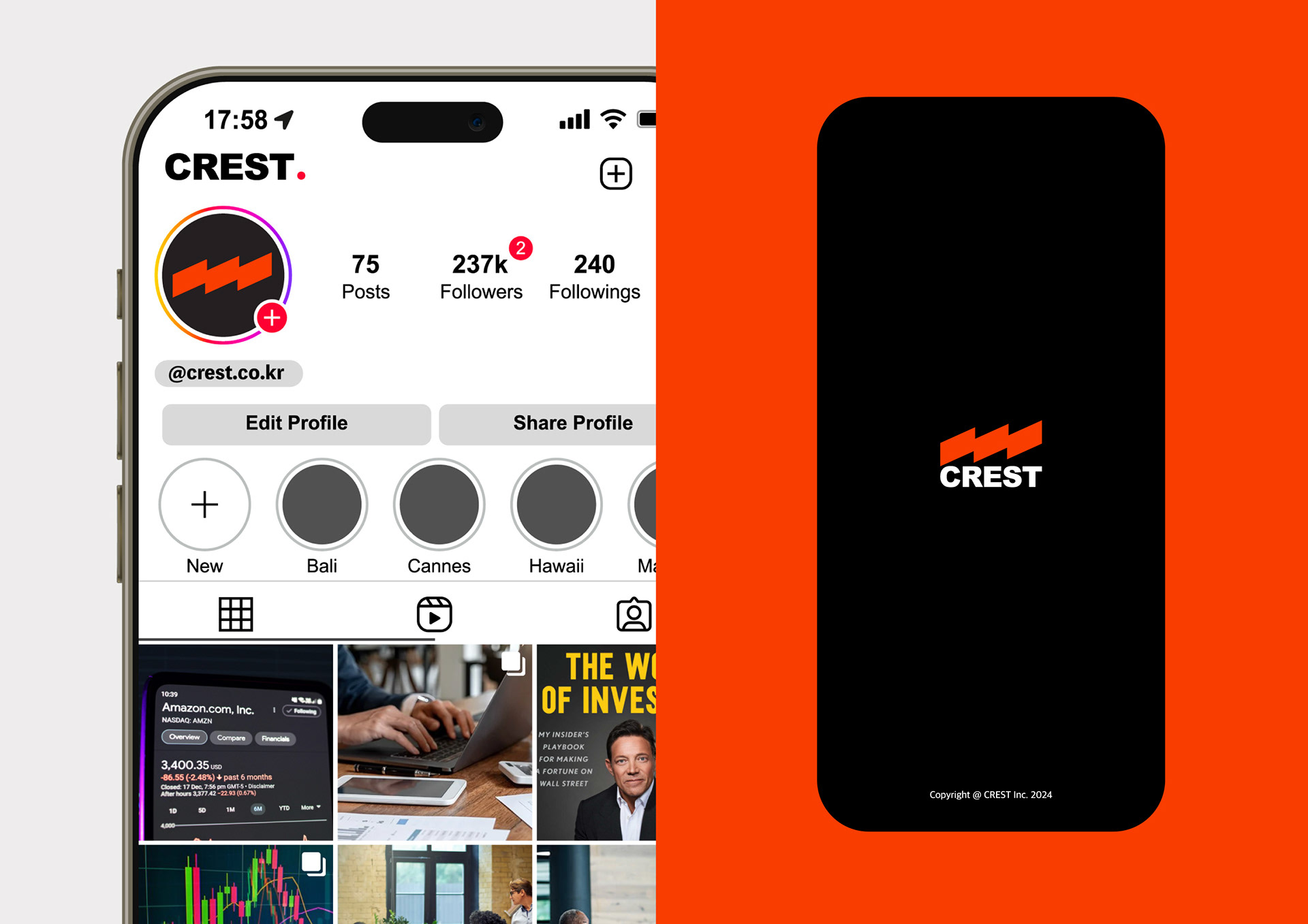
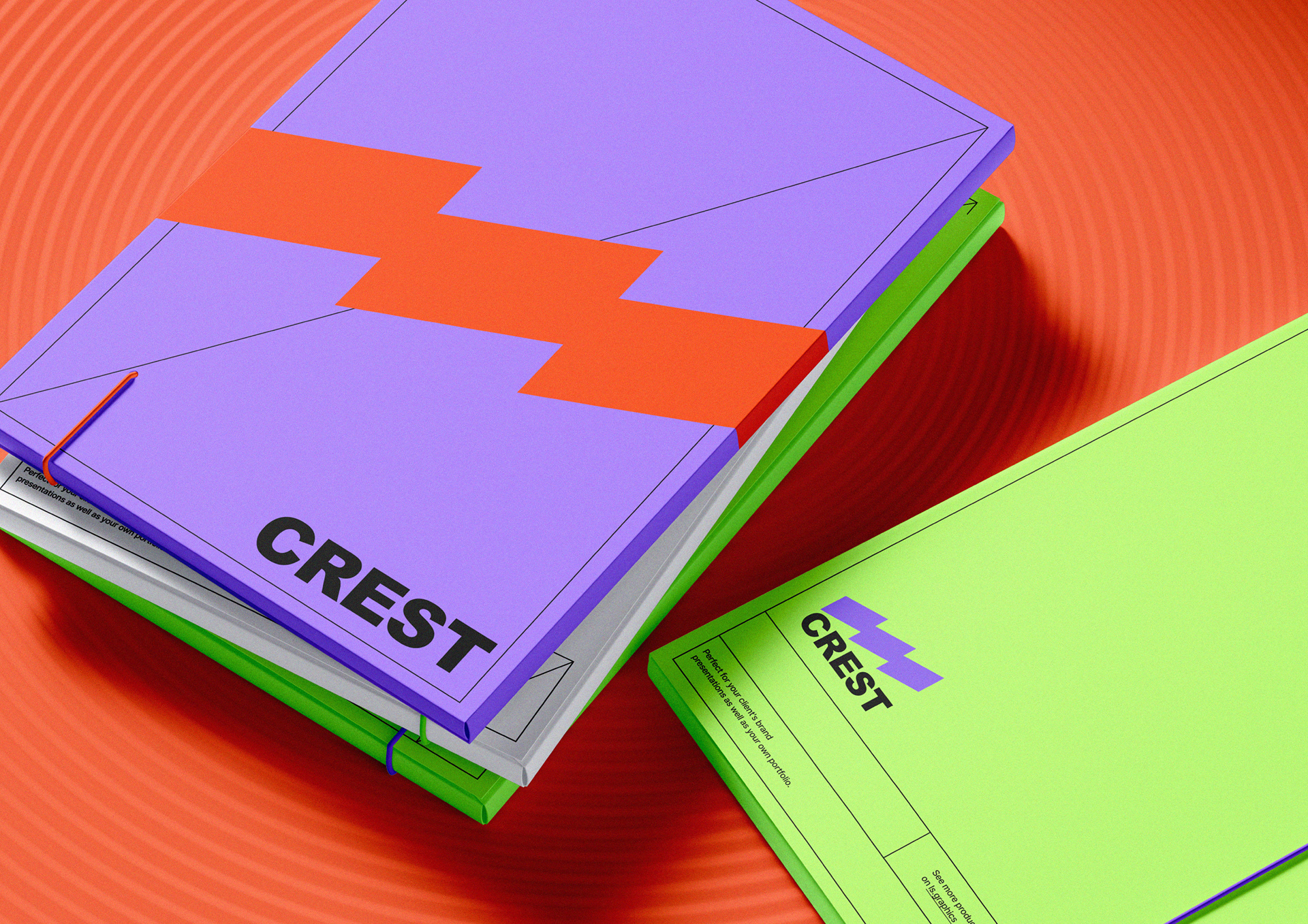
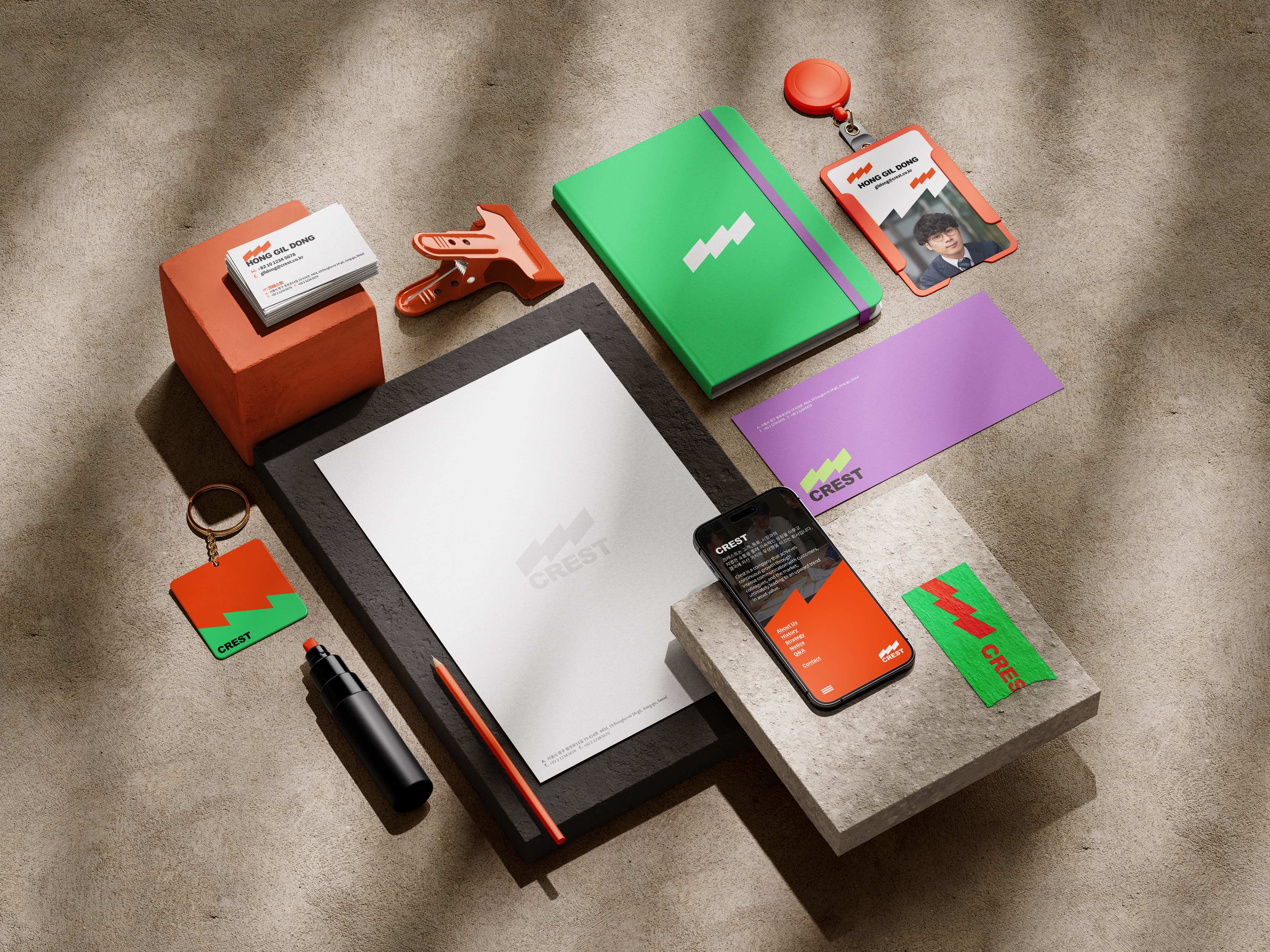
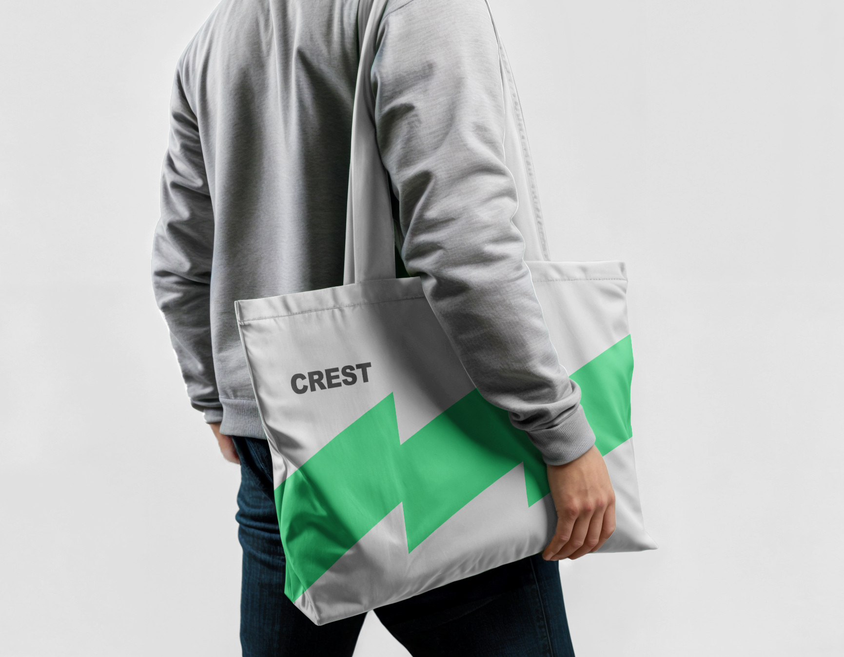
새롭게 출발하는 Crest & Partners의 C.I 프로젝트를 포어클락이 수행하였습니다. 크레스트는 어려운 환경 속에서도 언제나 우상향하는 자산을 상징하며, 그 여정을 정확히 이끌어 나갑니다. 포어클락은 이러한 철학을 시각적으로 표현하기 위해, 정확하고 명확한 방향성과 미래 지향적인 가치를 강조한 로고 디자인을 완성했습니다. 로고는 상승하는 곡선과 강력한 직선의 조화를 통해 성장과 도전의 이미지를 담고 있습니다. 또한, 단순하지만 강력한 형태로, 복잡하지 않으면서도 기업의 미션과 비전을 직관적으로 전달하도록 설계되었습니다. 크레스트 & 파트너스는 자산이 향해야 할 방향과 그 가치를 정확하게 그려내는 기업임을 상징적으로 표현하며, 이러한 디자인 요소들이 브랜드 아이덴티티의 핵심을 이룹니다. 단순함 속에서도 강렬한 메시지를 전달하며, 이를 통해 크레스트가 이끌어 나갈 기업의 신뢰성과 전문성을 강조합니다.
The Crest & Partners C.I. project was carried out by FDG as the company embarked on a new journey. Crest symbolizes assets that always rise towards the top, even in challenging environments, and leads that journey with precision. To visually express this philosophy, FDG developed a logo design that emphasizes clear direction and future-oriented values. The logo combines upward curves and strong straight lines, encapsulating the concepts of growth and challenge. It is designed in a simple yet powerful form, conveying the company’s mission and vision intuitively, without unnecessary complexity. Crest & Partners symbolizes a company that accurately charts the direction assets should move and the values they should reach. These design elements form the core of the brand identity, delivering a strong message within simplicity. Through this, the trust and professionalism that Crest will lead are highlighted.


CREST ASSET C.I Design Project
Client: 크레스트앤파트너스
-
Design Area
#Brand Design #Brand Identity #Financial Logo #회사로고
-
Project Team
FDG Design A Team
-
Project Management
FDG / Visual Identity & Application Design Dev.
-
Art Direction by WOO SANG YOON
Design by SU JIN SON / UN SU JUNG
www.fouroclock.kr