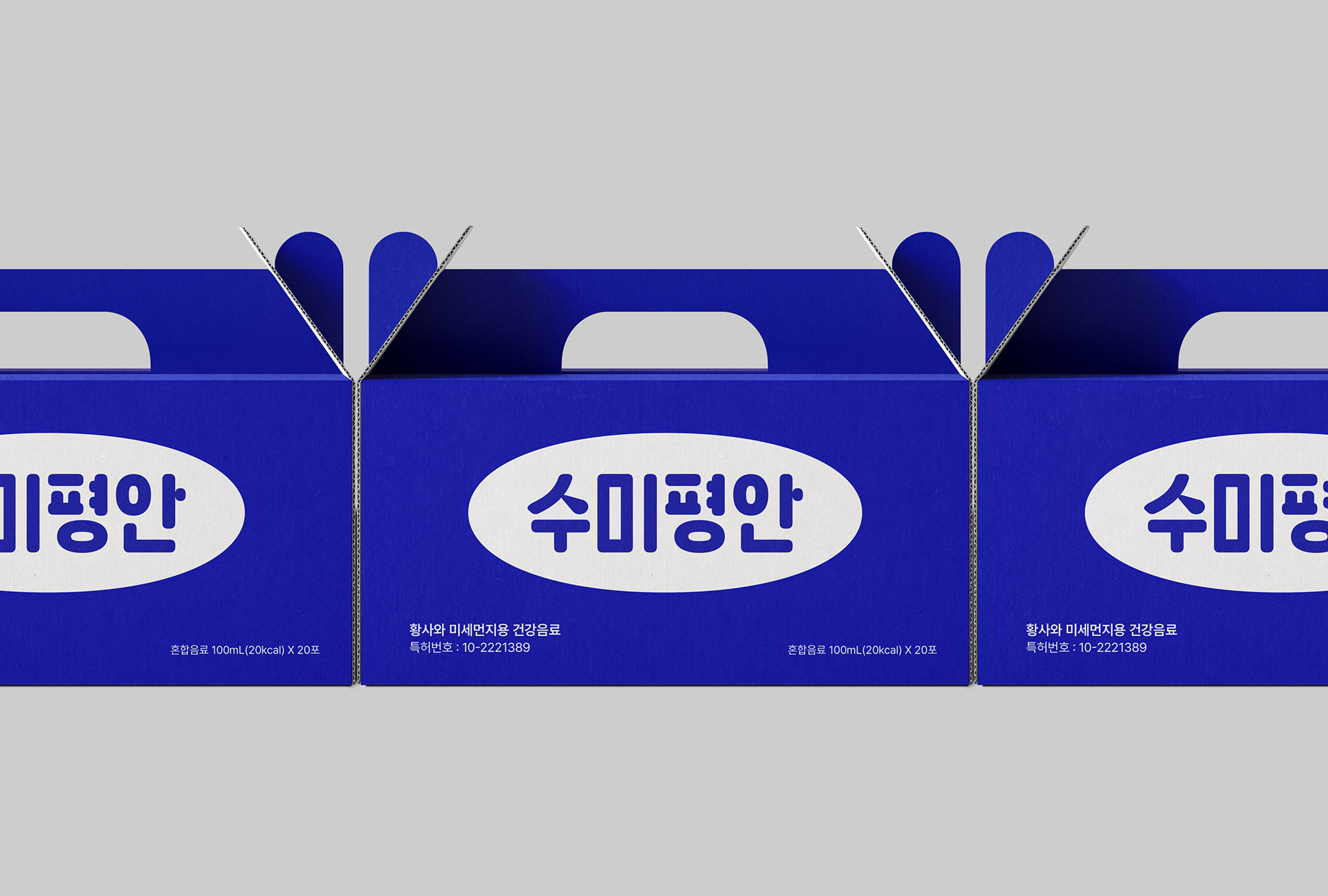
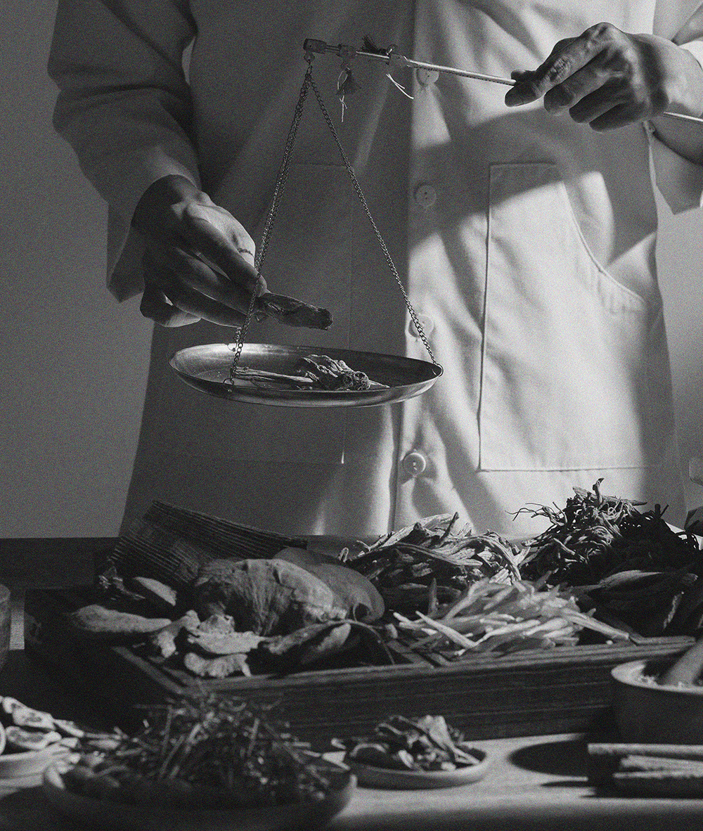
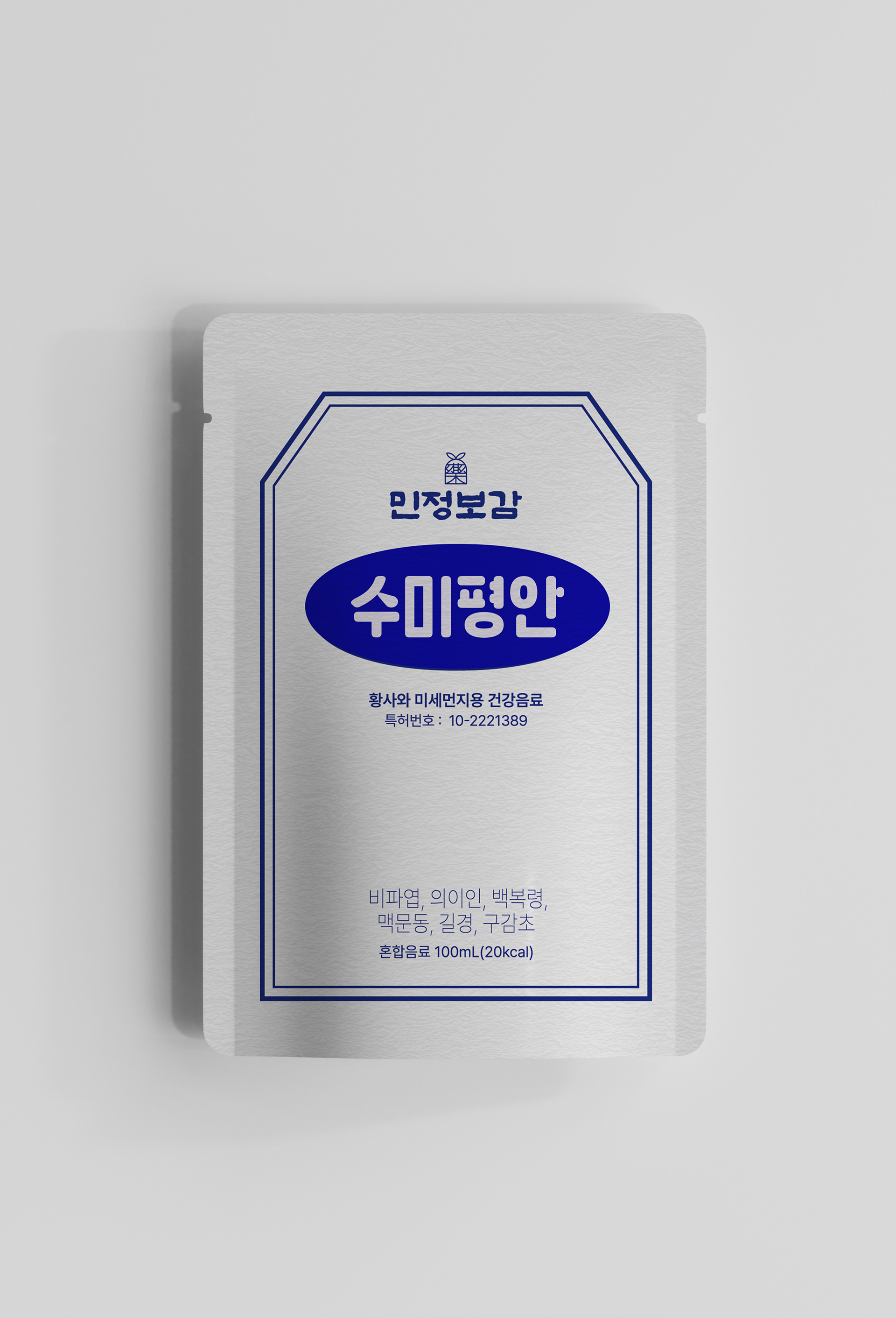
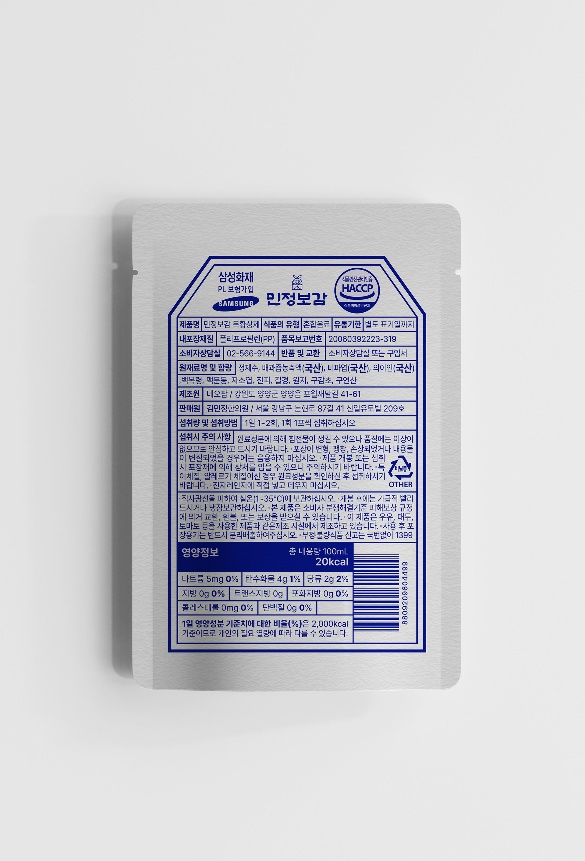
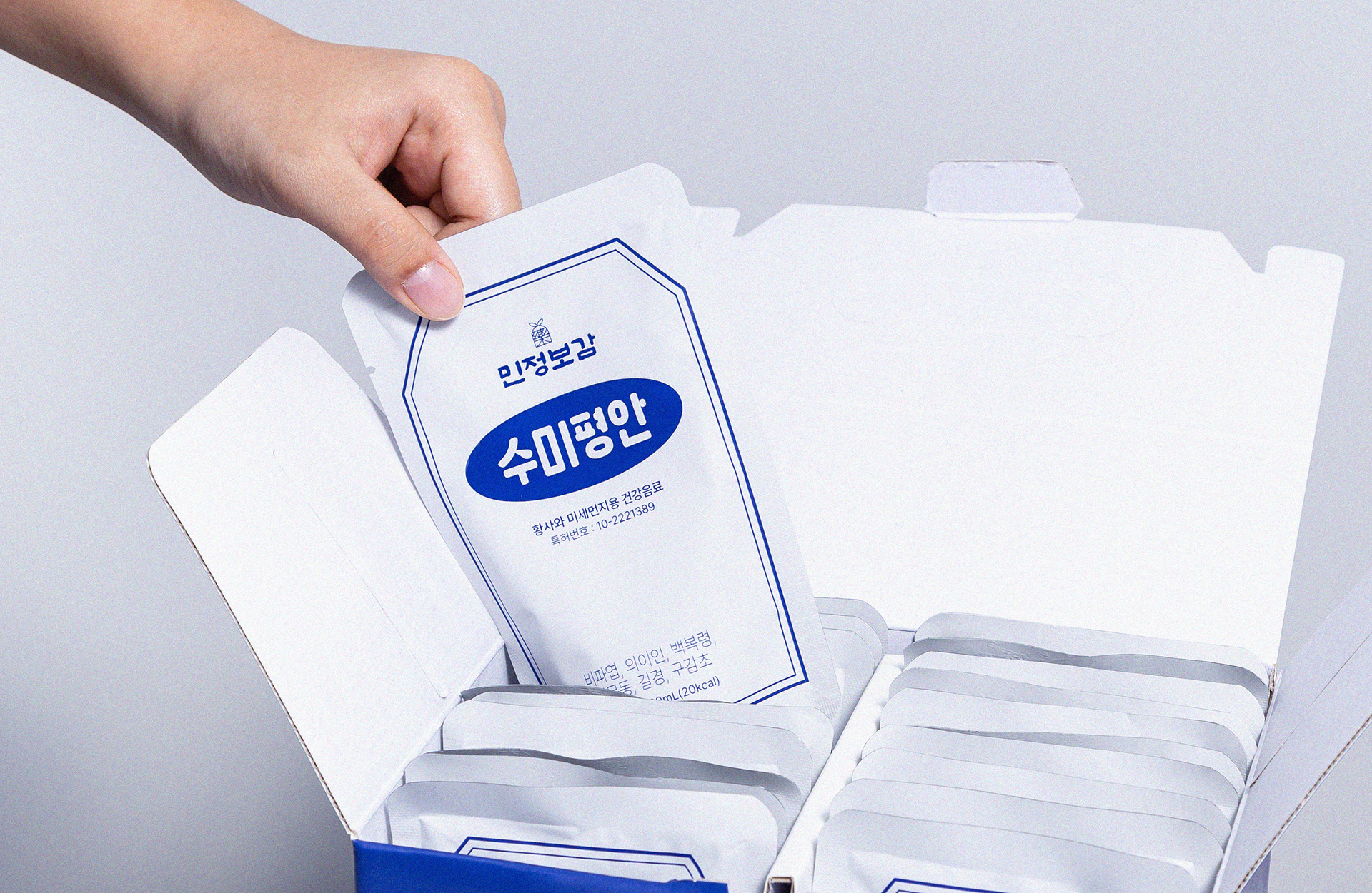
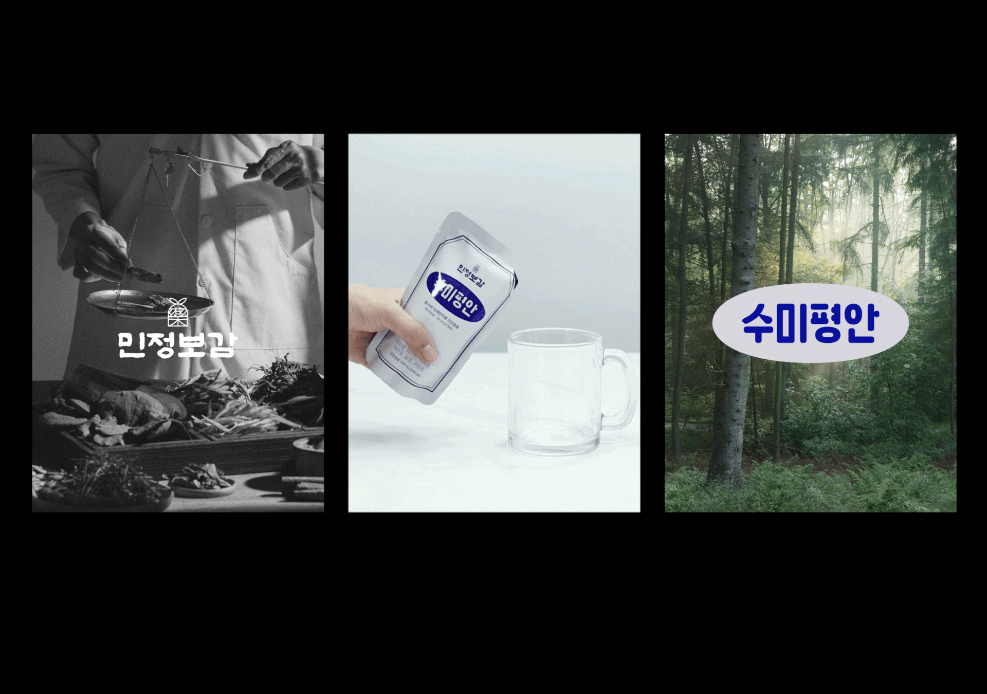
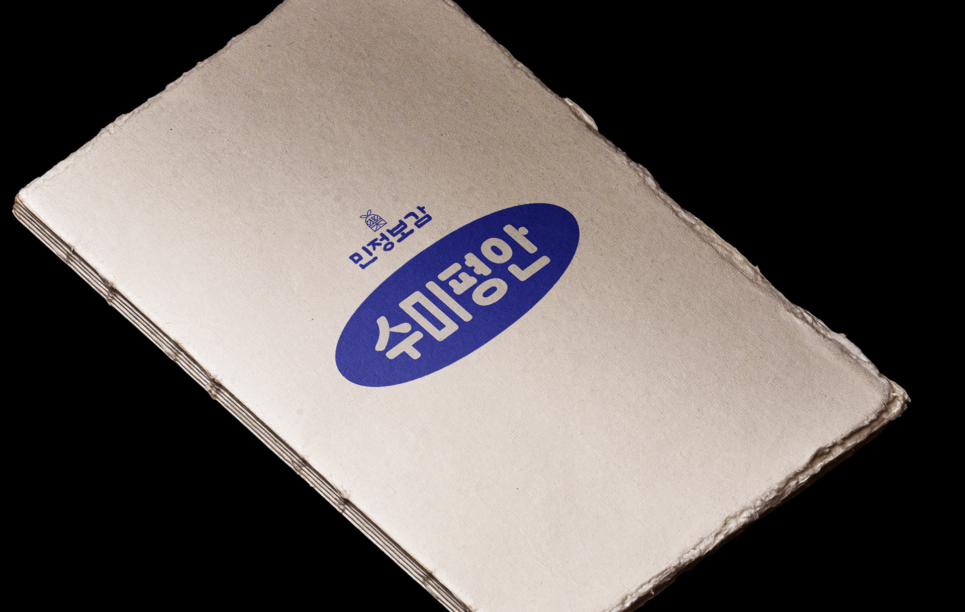
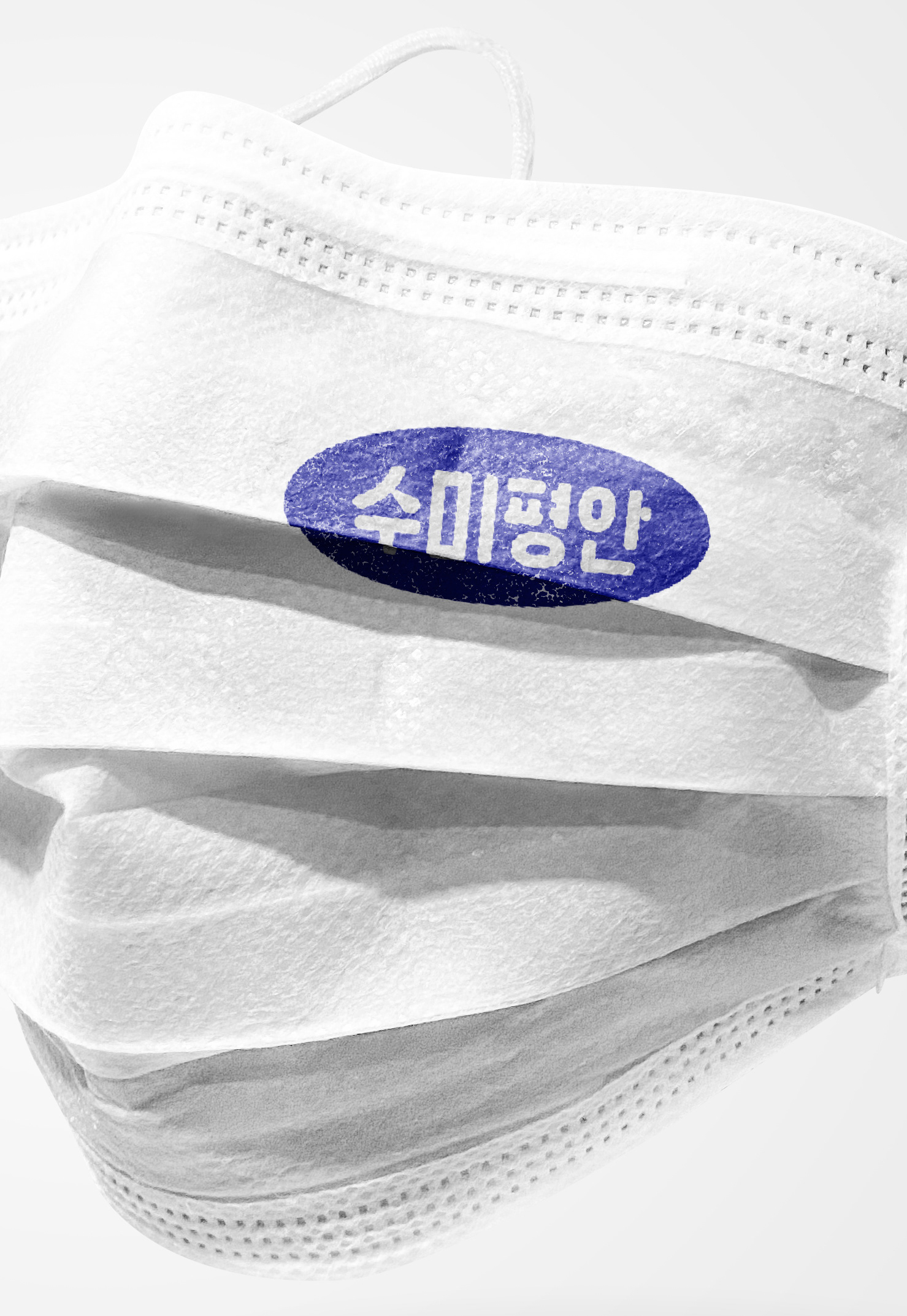
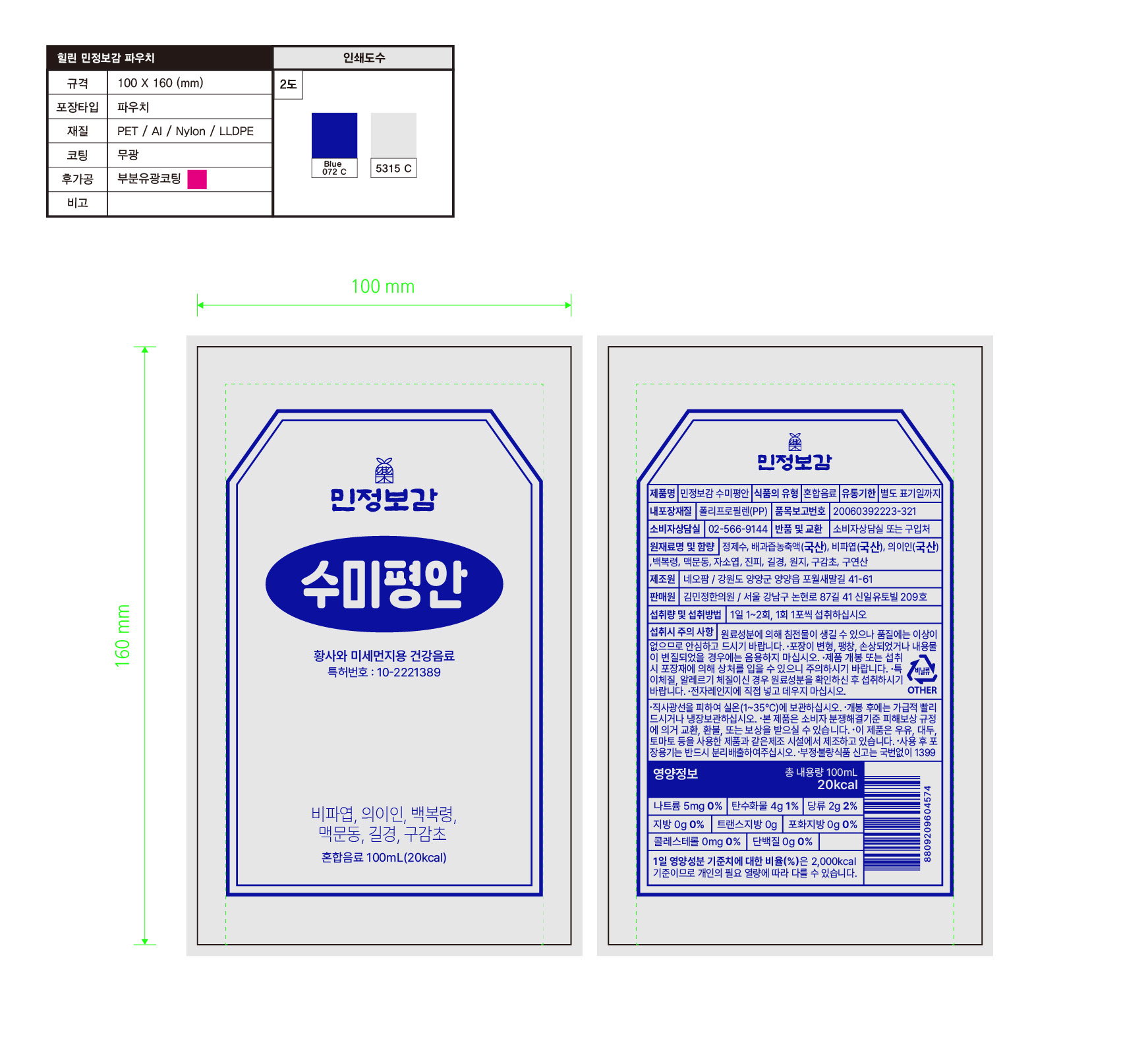
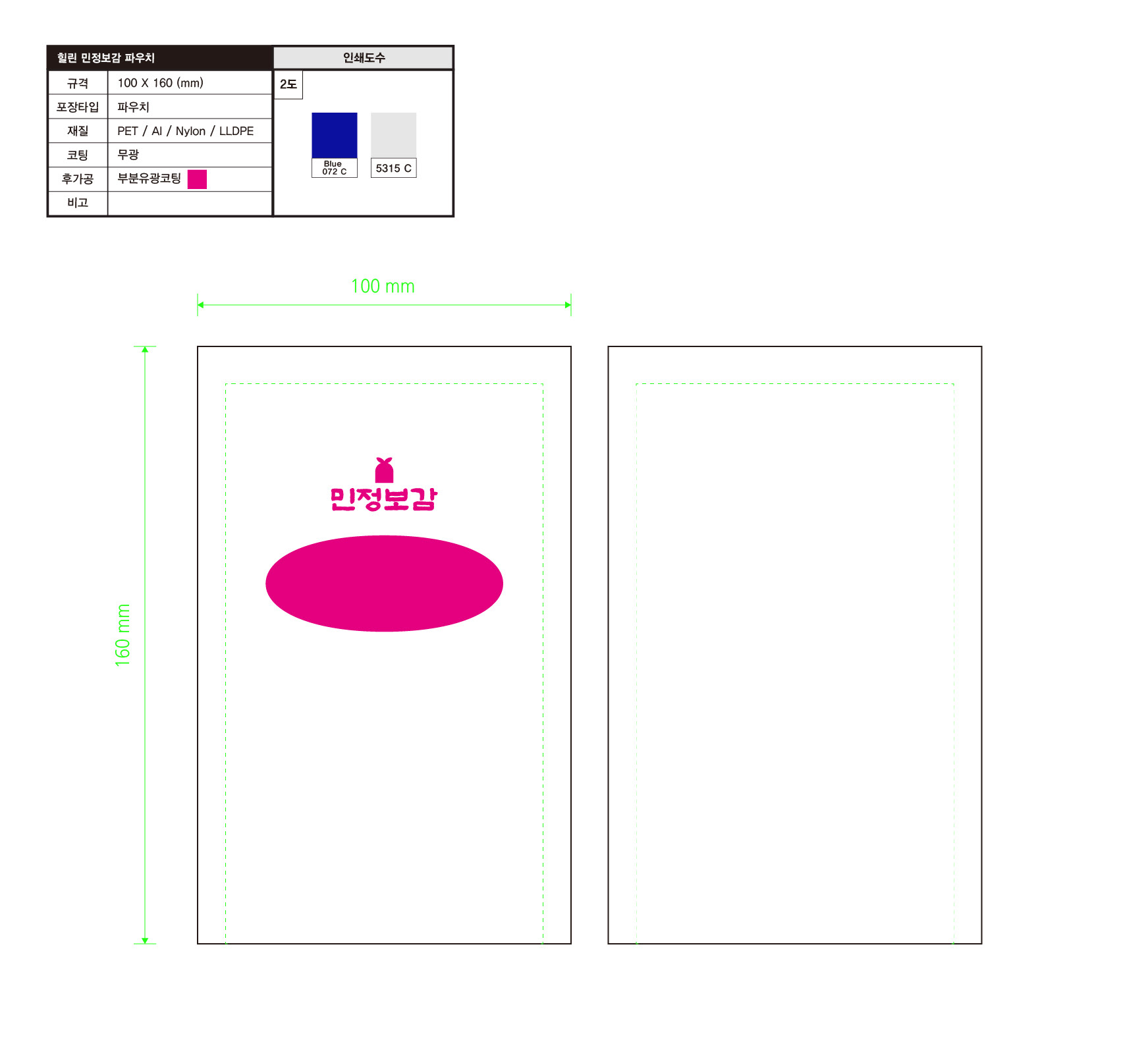
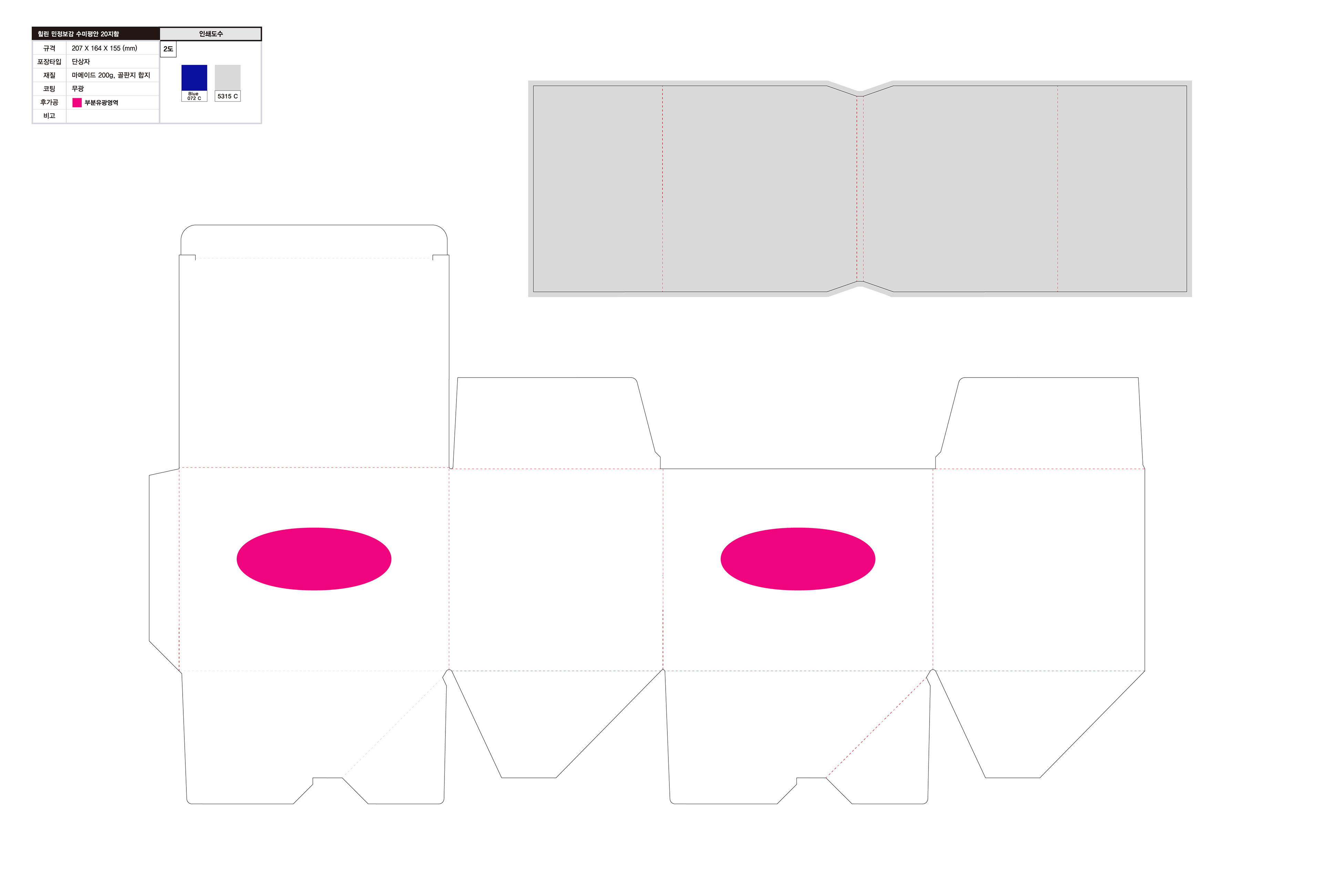
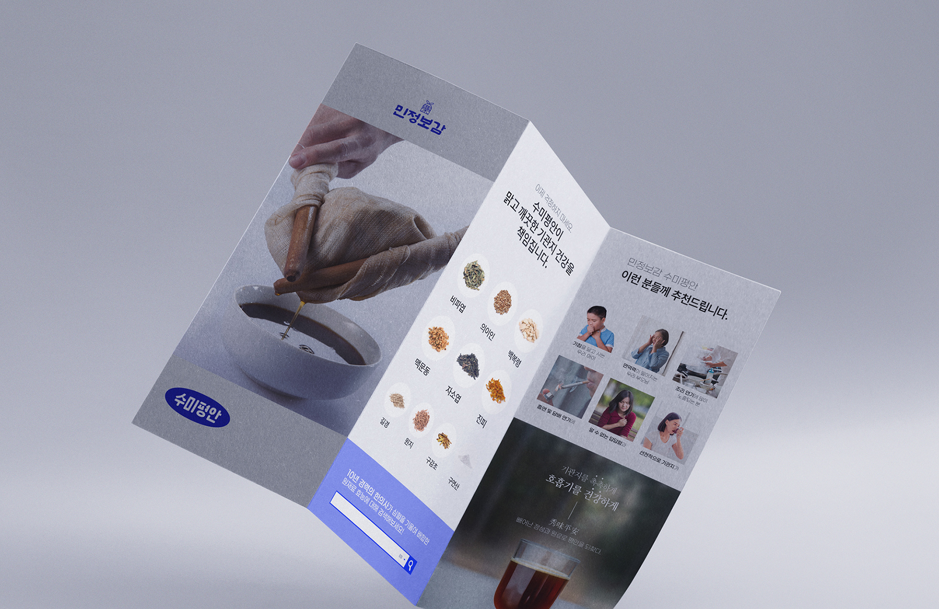
수미평안 프로젝트는 포어클락이 네이밍 개발부터 브랜드 아이덴티티 구축, 제품 패키지 디자인, 인쇄 제작까지 전략적으로 총괄한 작업입니다. 전통 한의학 제품 특유의 무거움과 제한된 소비층 이미지를 탈피하고, 누구나 직관적으로 신뢰할 수 있는 강력한 브랜드 인상을 만드는 것을 목표로 설정했습니다. 브랜딩 전략은 '전통의 현대적 재구성'과 '강한 직관성'을 핵심으로 삼았습니다. 디자인은 불필요한 장식 없이 시원하고 명료한 레이아웃과 과감한 그래픽 임팩트로 구성되어, 제품의 존재감을 강하게 부각시키는 데 집중했습니다. 이를 통해 한의학 제품군에 흔히 기대되는 '조심스러움' 대신, 강단 있고 자신감 있는 브랜드 이미지를 구현했습니다.
수미평안은 단순한 한방 음료가 아닌, 호흡기 건강을 생각하는 모두를 위한 강력한 선택지로 자리잡고자 합니다.
본 프로젝트는 디자인을 통해 제품 신뢰를 가시화하고, 브랜드의 장기적 경쟁력을 구축한 사례입니다.
본 프로젝트는 디자인을 통해 제품 신뢰를 가시화하고, 브랜드의 장기적 경쟁력을 구축한 사례입니다.
The Sumipyeongan project was a comprehensive branding initiative led by Foreclock, overseeing everything from naming development to brand identity creation, product packaging design, and print production. The primary goal was to break away from the traditional image of Korean herbal products—often perceived as heavy and niche—and establish a strong, trustworthy brand presence that resonates with a broader audience. Our branding strategy centered around "the modern reinterpretation of tradition" and "bold clarity." The design approach eliminated unnecessary embellishments, focusing instead on a refreshing, streamlined layout with impactful, assertive graphics that enhance the product's presence. By doing so, we moved beyond the cautious, reserved image typically associated with herbal products and created a brand that feels confident, dynamic, and self-assured.
Sumipyeongan is positioned not merely as another herbal beverage but as a powerful choice for anyone mindful of respiratory health.
This project demonstrates how design can make product trust tangible and establish the foundation for long-term brand competitiveness.
This project demonstrates how design can make product trust tangible and establish the foundation for long-term brand competitiveness.


SUMIPYUNGAN Branding & Packaging Project
Client: 김민정 한의원
-
Design Area
#Brand Identity #B.I Design #Package Design #Medicine
-
Project Team
FDG Design B Team
-
Art Direction by WooSang
Designed by InKyung
www.fouroclock.kr