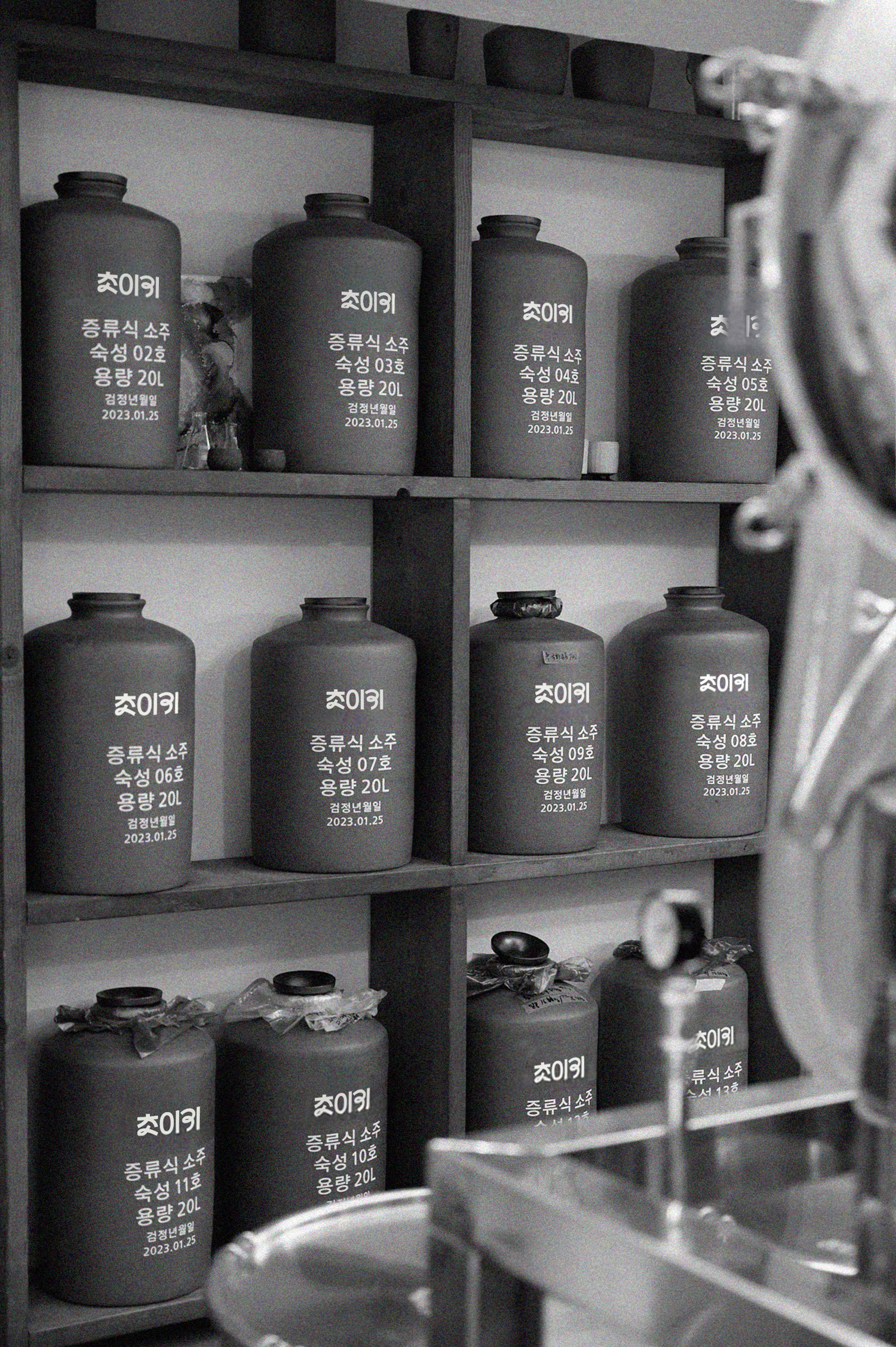
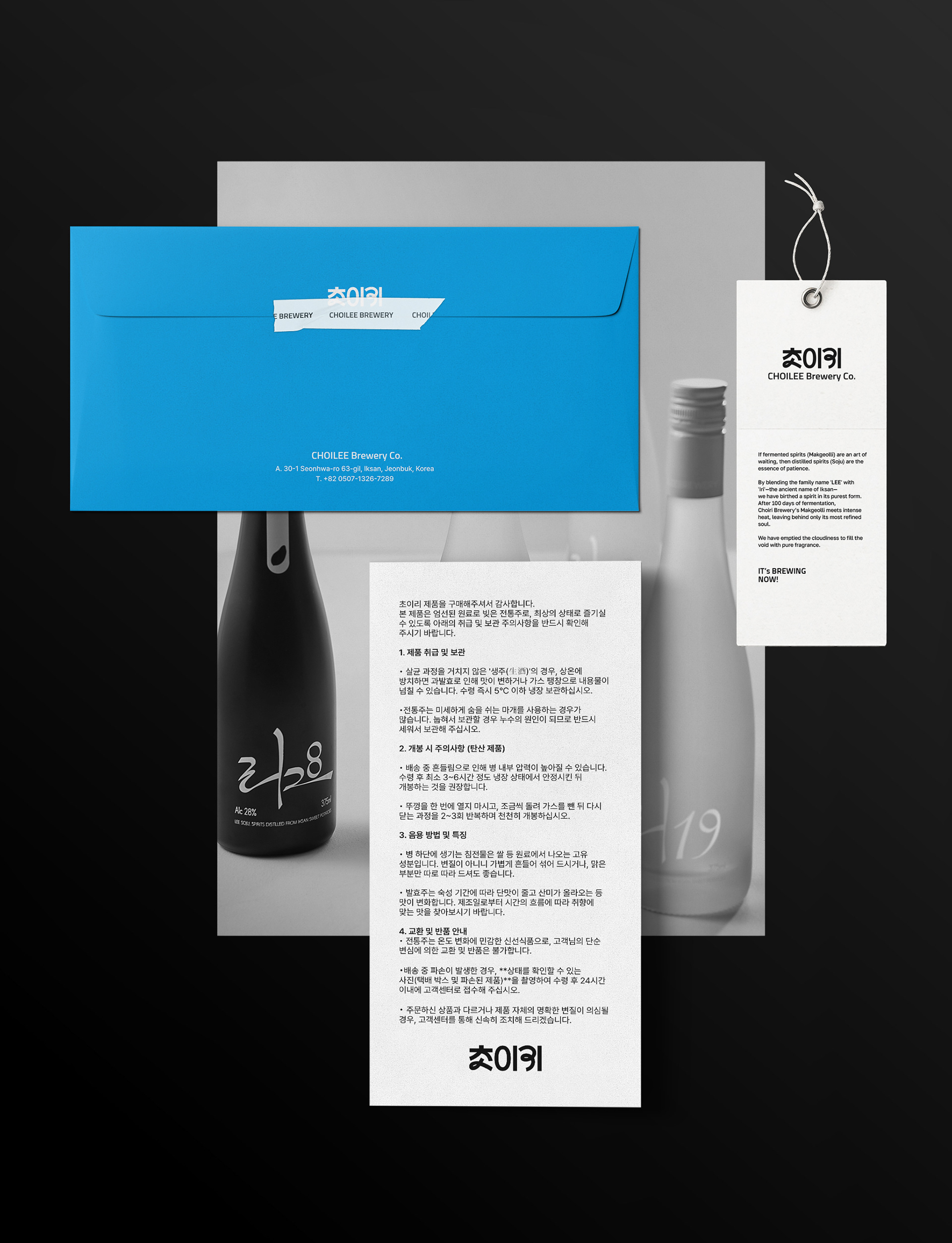
전북 익산의 물과 쌀, 그리고 지역의 작물로 빚은 우리 술, 초이리.
익산을 닮은 이 브랜드는 풍요롭고 너그러운 정서를 담고 있습니다.
포어클락디자인그룹은 초이리와 함께 전북의 기상과 익산의 여유를 현대적으로 재해석하여,
고루하게 인식되던 전통주의 한계를 넘어
보다 유연하고 확장된 감각으로 세계의 손님들을 맞이할 수 있도록 리브랜딩하였습니다.
Choilee, a Korean soul in every drop, is crafted from the water, rice, and harvest of Iksan.
This brand carries the city's warm and bountiful essence at its heart.
In collaboration with FDG, we have infused the spirited energy of the region into a contemporary identity.
By breaking the rigid stereotypes of traditional spirits,
Choilee now reaches out to the world with a fluid and welcoming grace,
inviting everyone to discover the true taste of Korea.
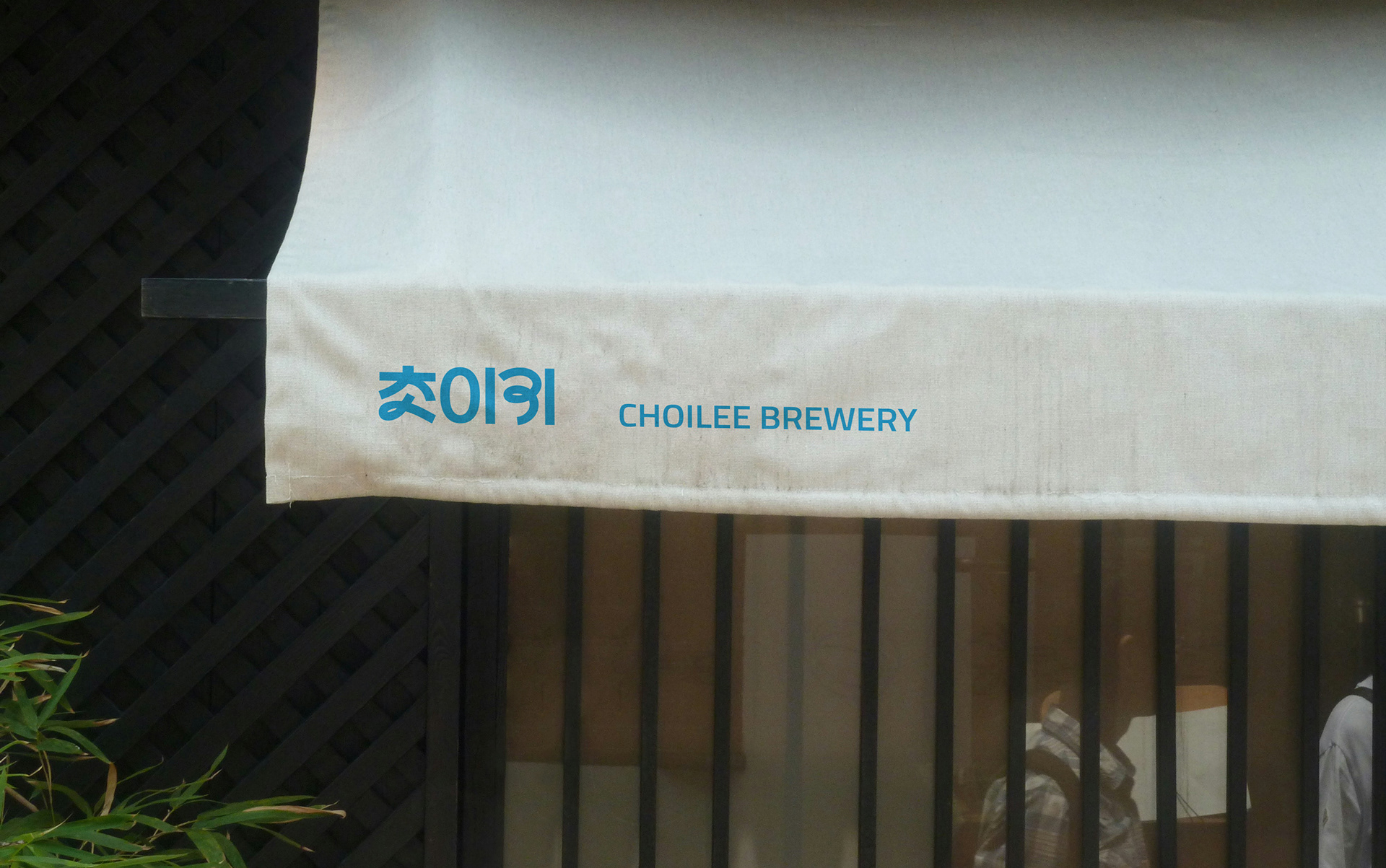
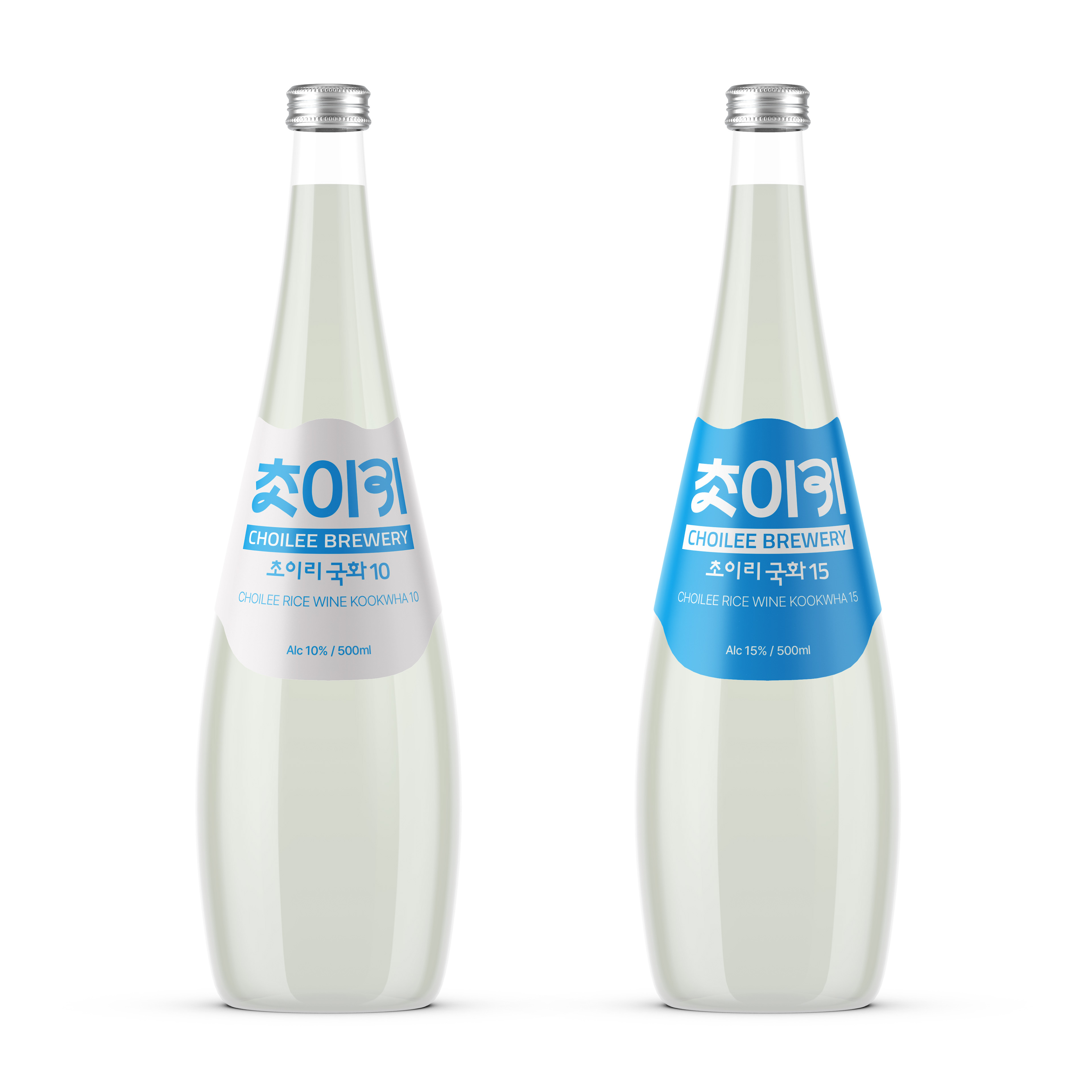
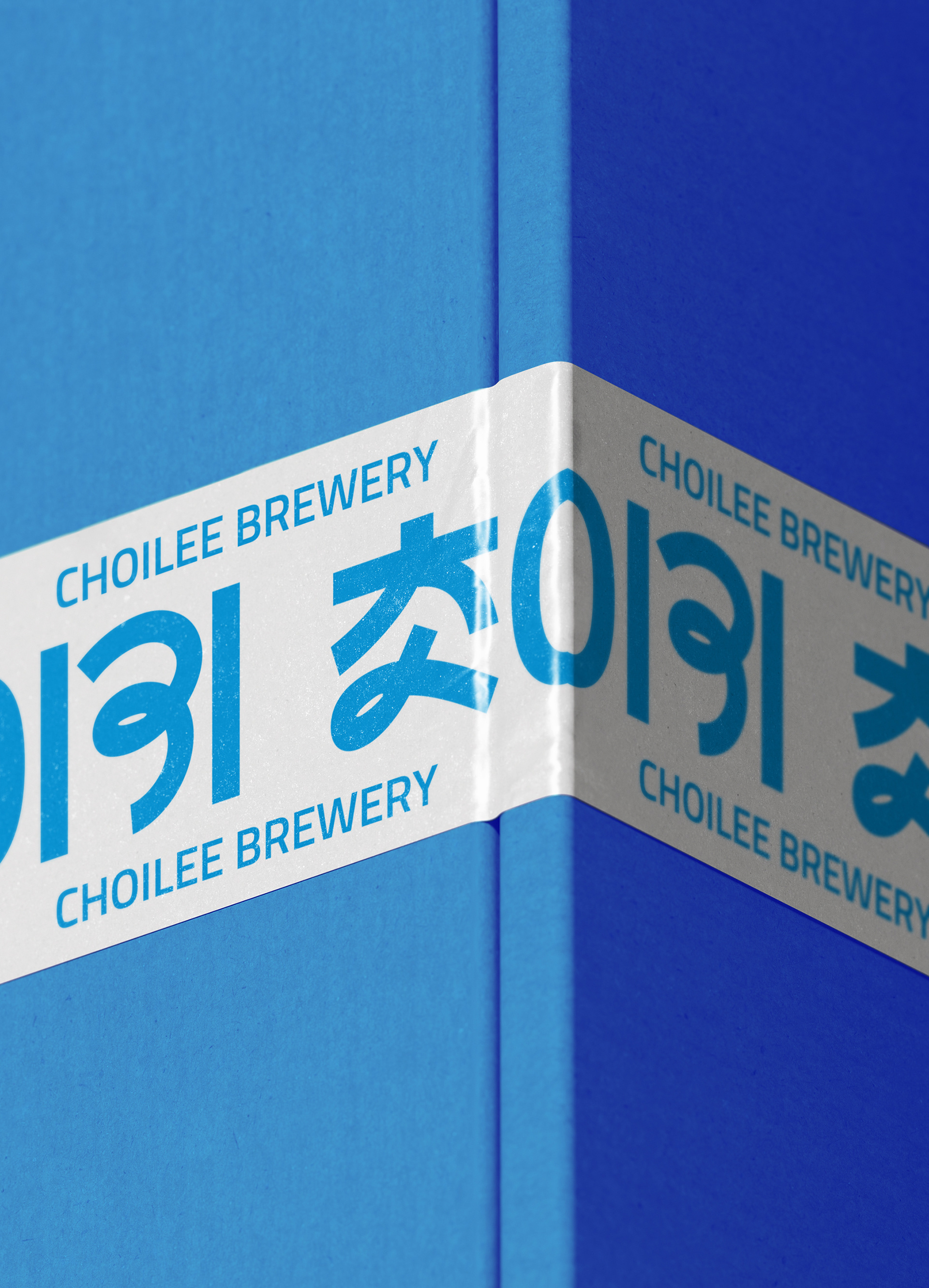
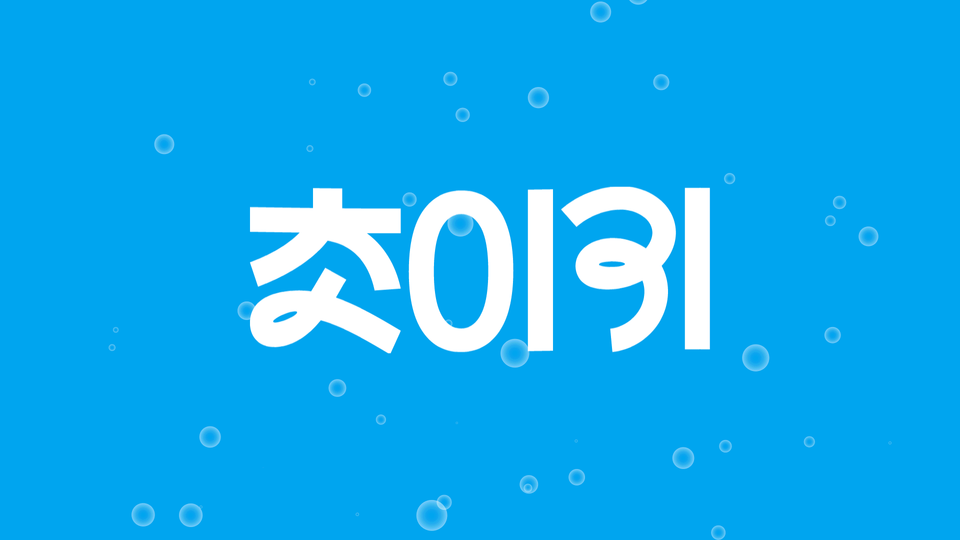
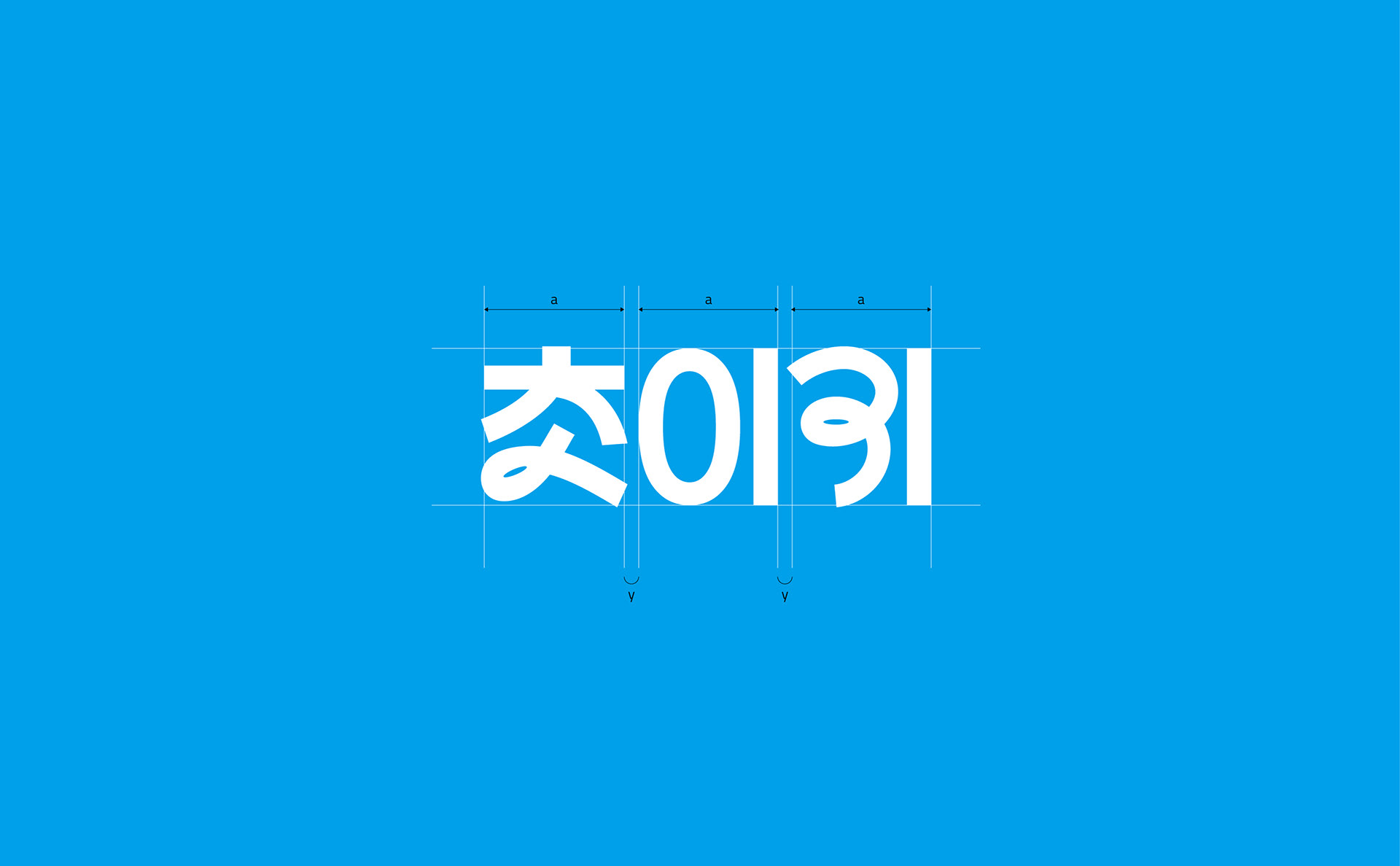
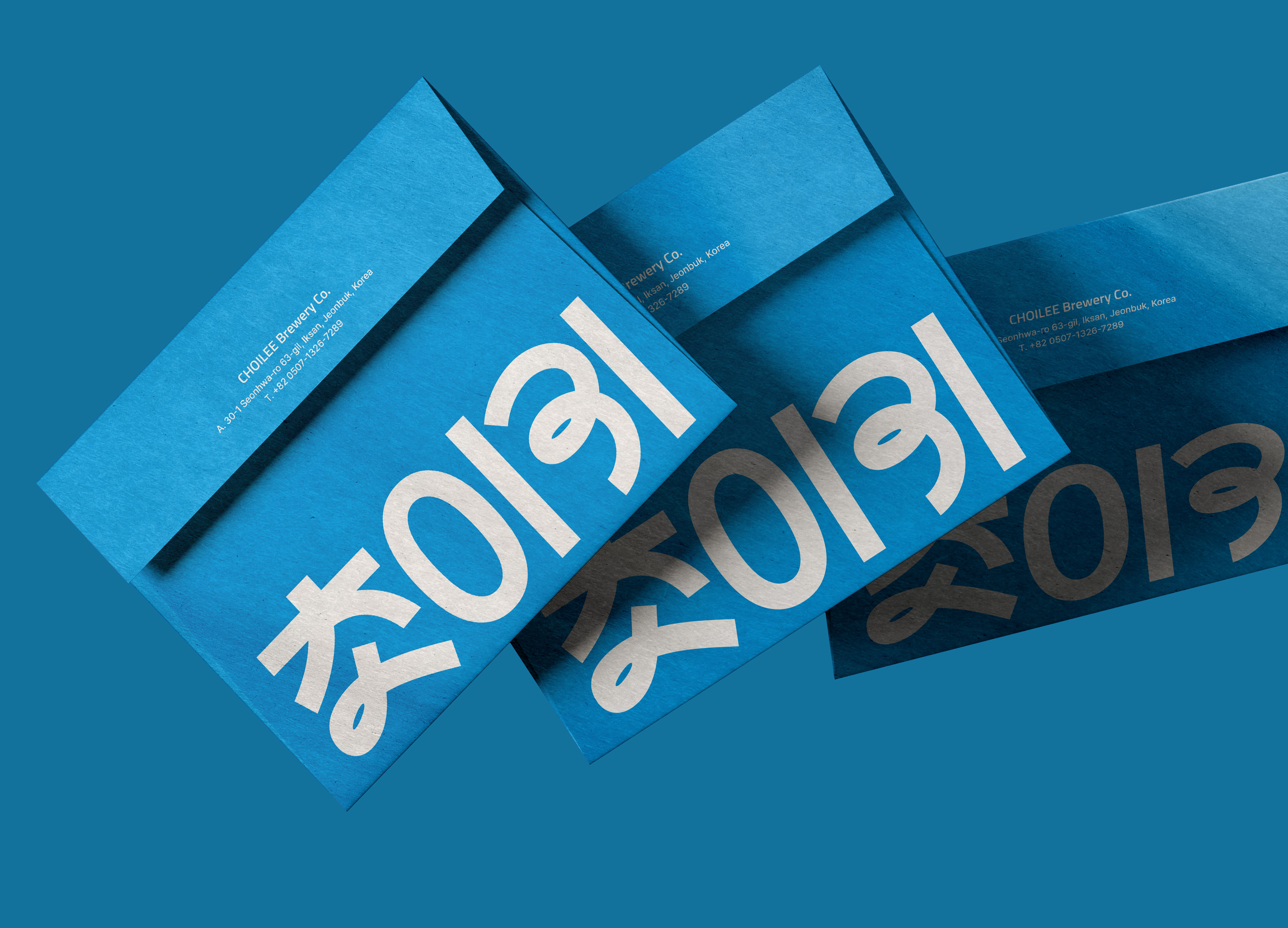
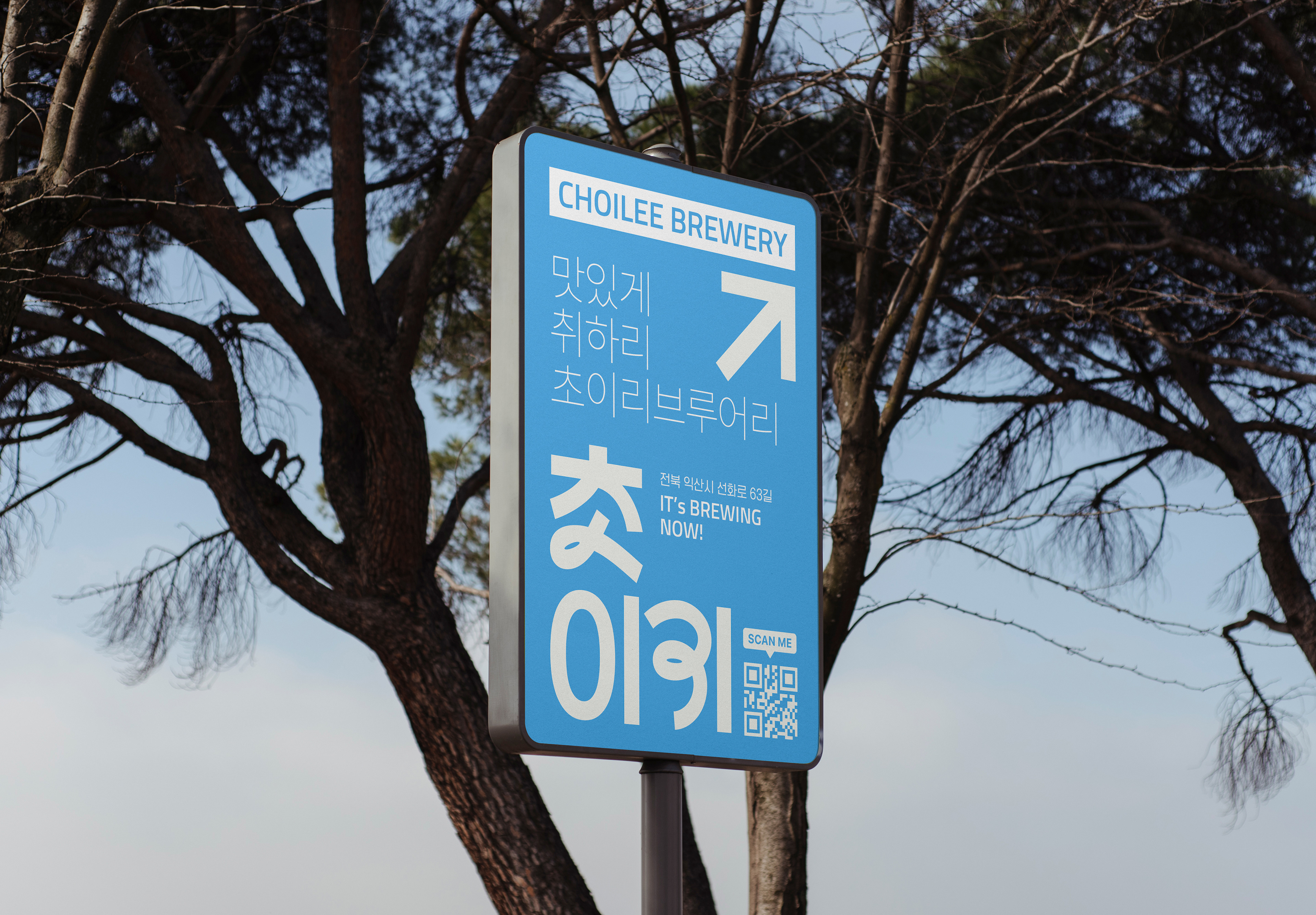
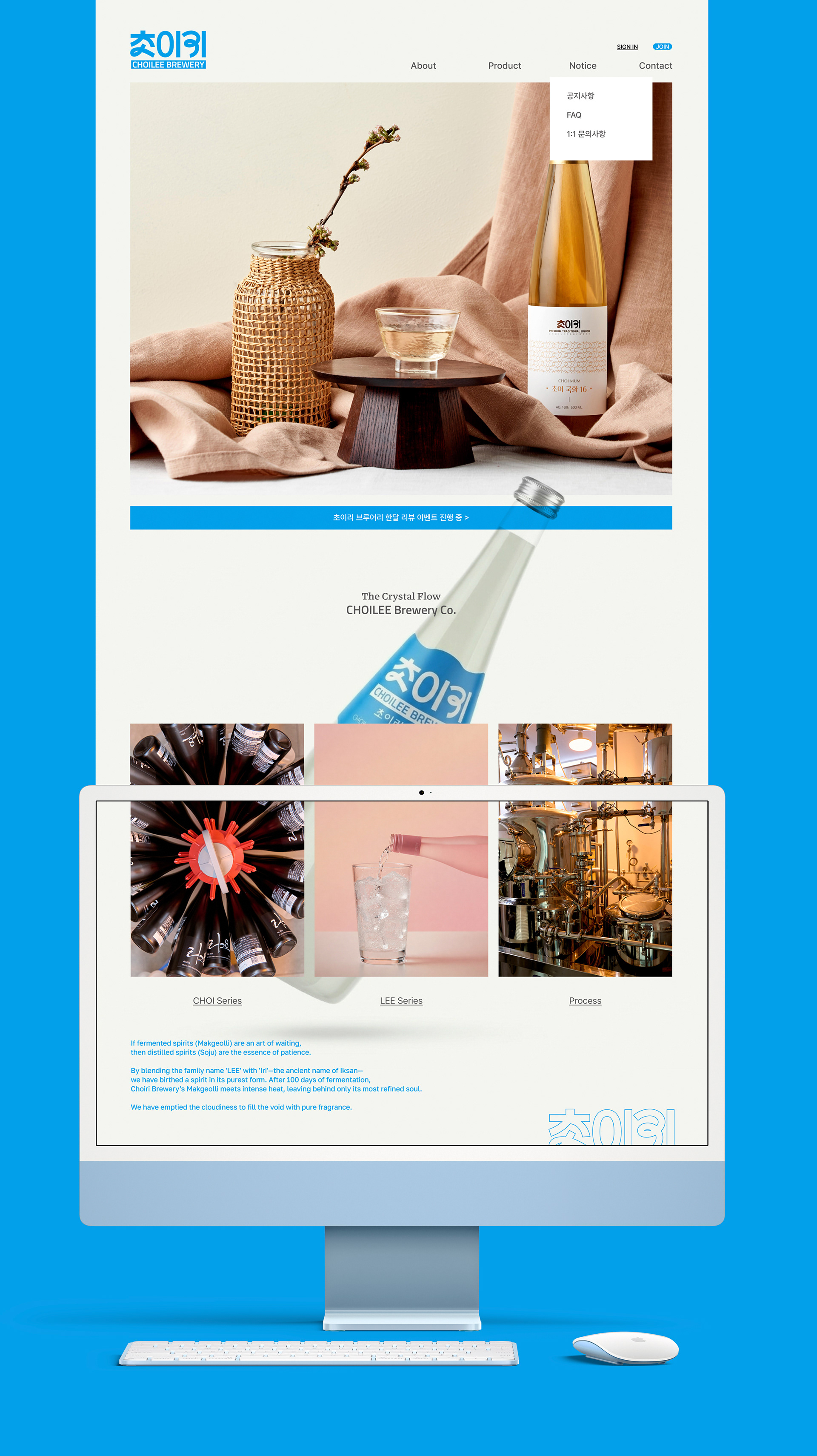
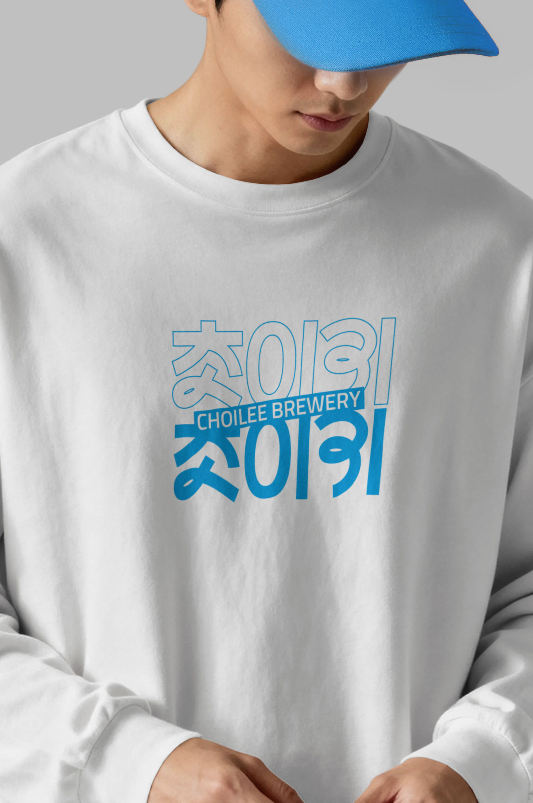
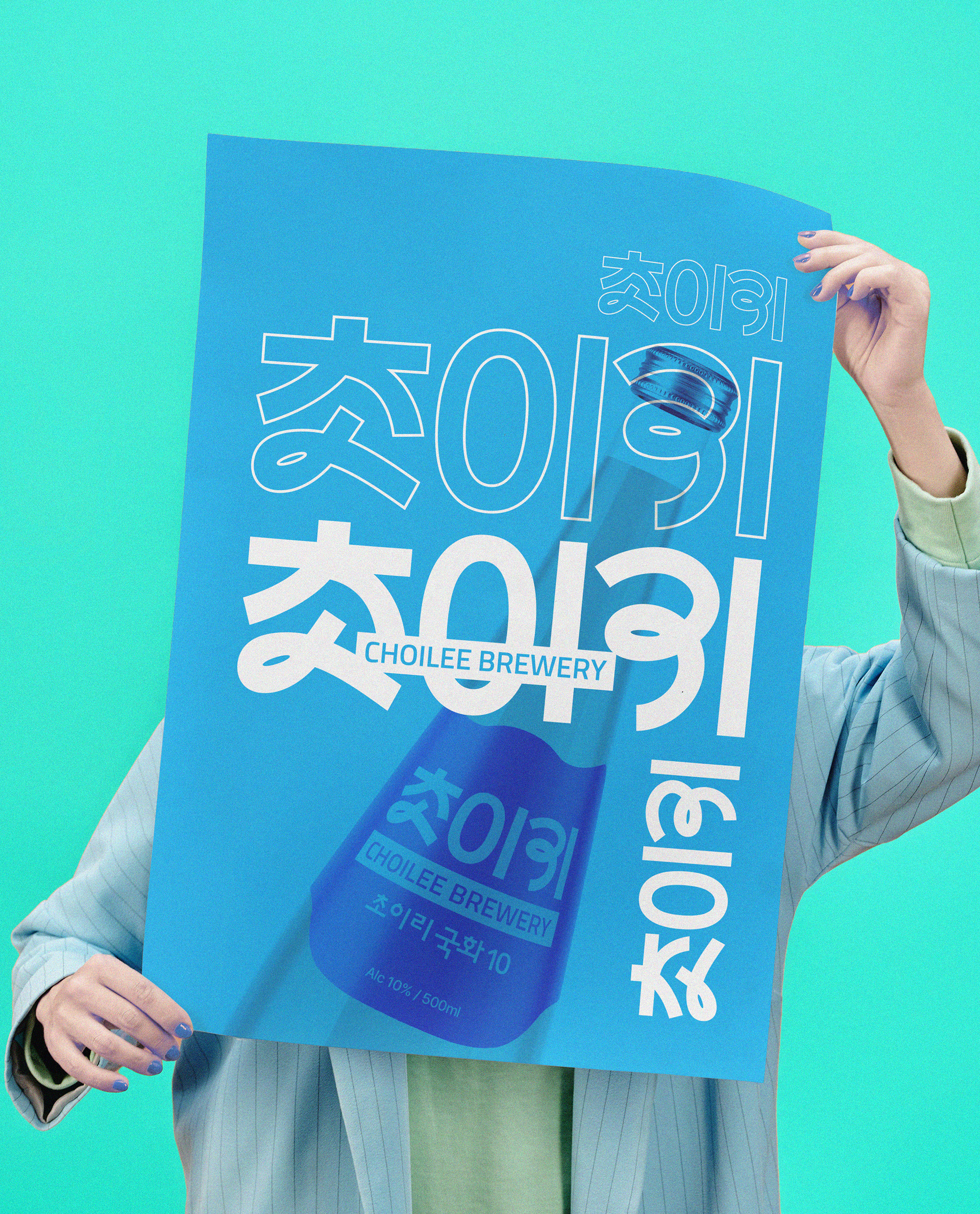
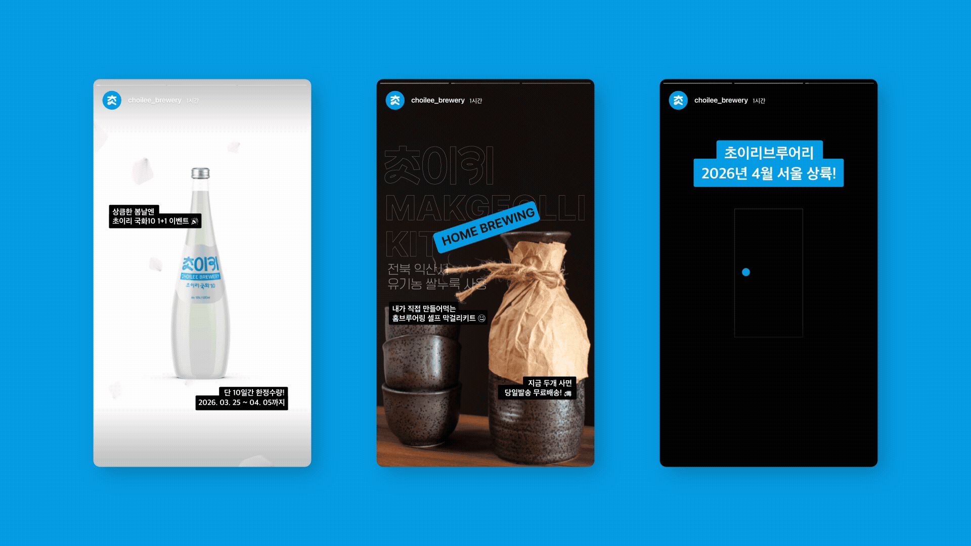
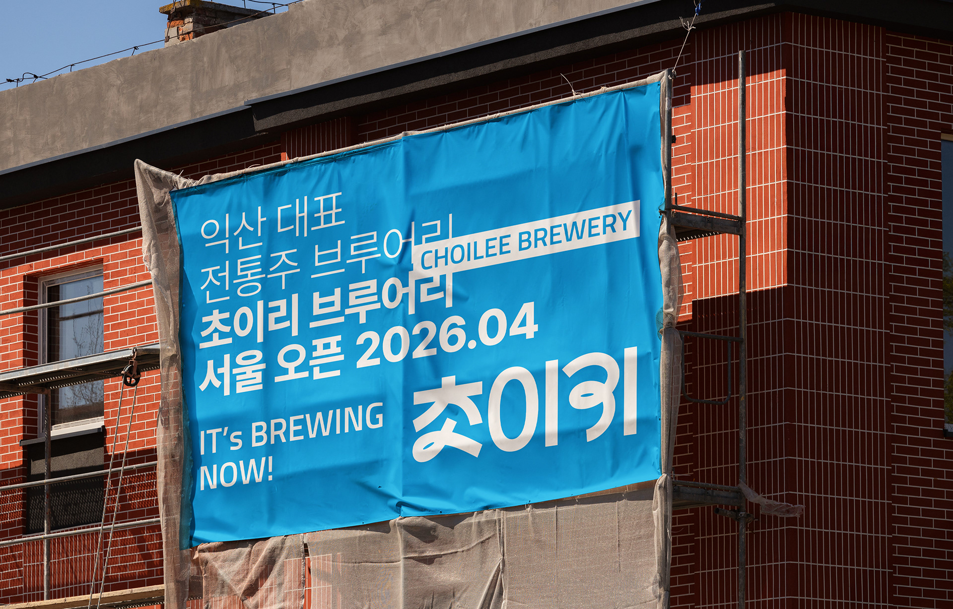
유연하면서도 단정한 초이리의 로고는 세계와 소통하는 K-Culture의 태도를 담아냅니다.
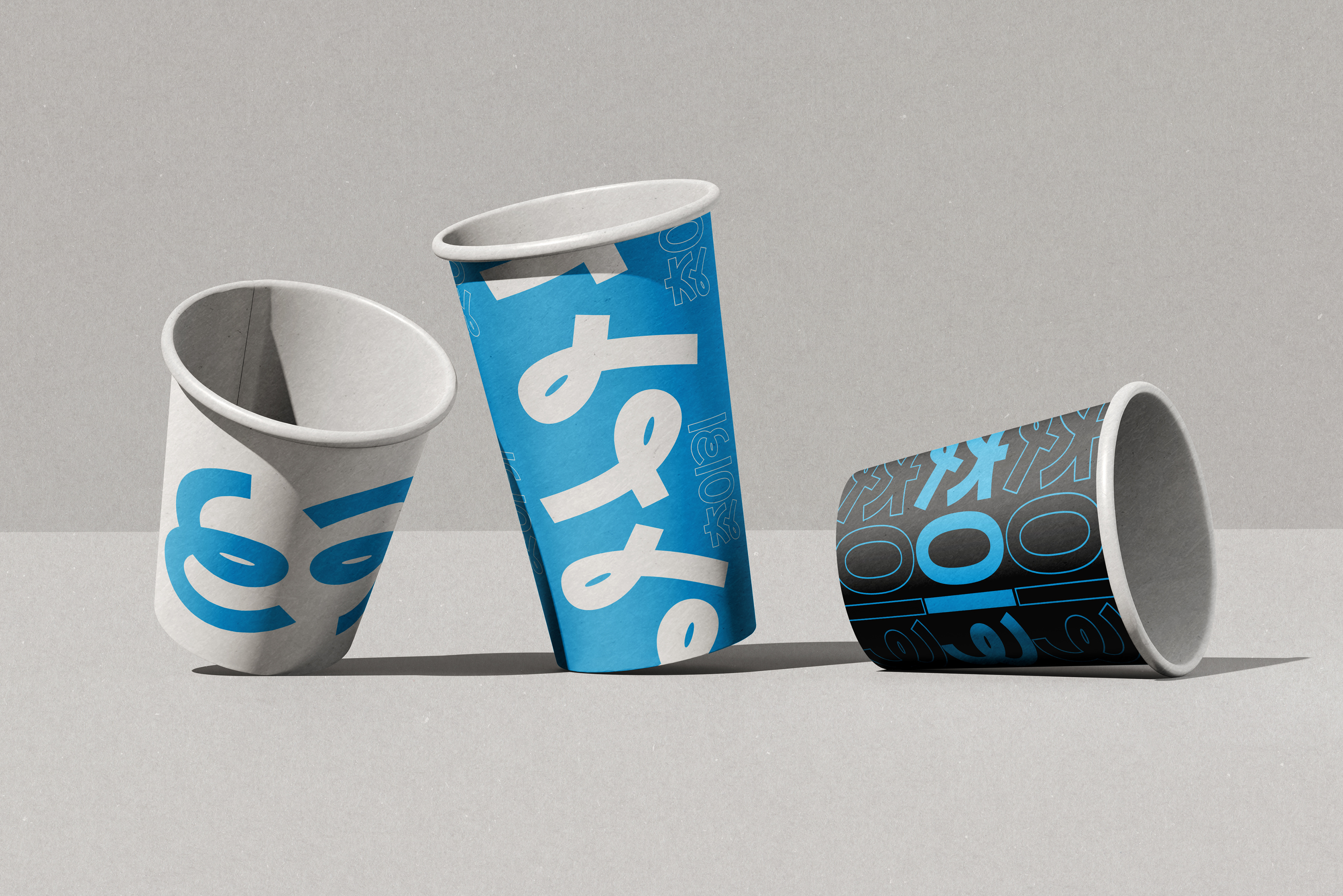
과하지도, 가볍지도 않은 균형감은 브랜드가 장기적으로 확장되고 활용될 수 있는 기반이 됩니다.
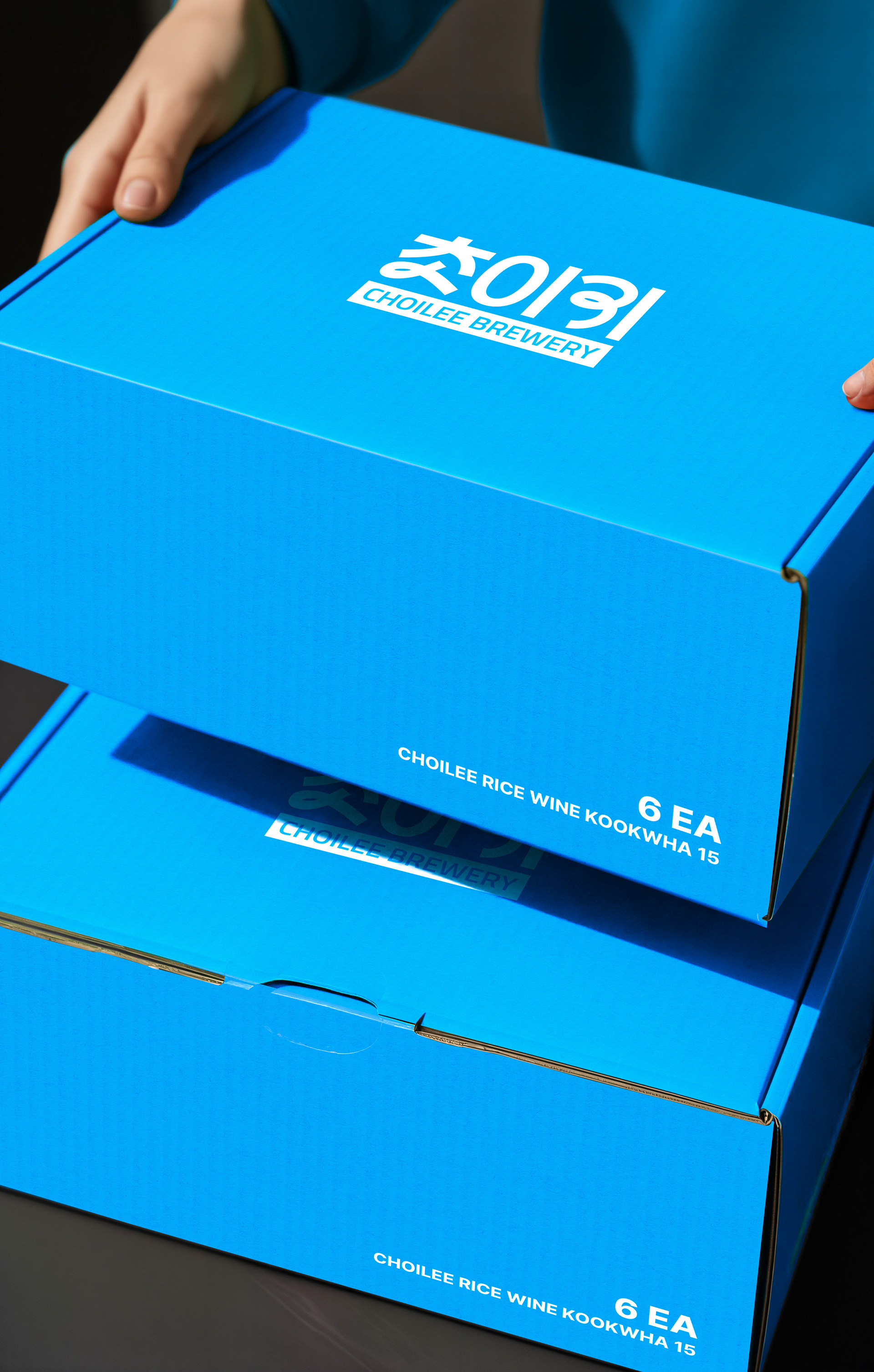
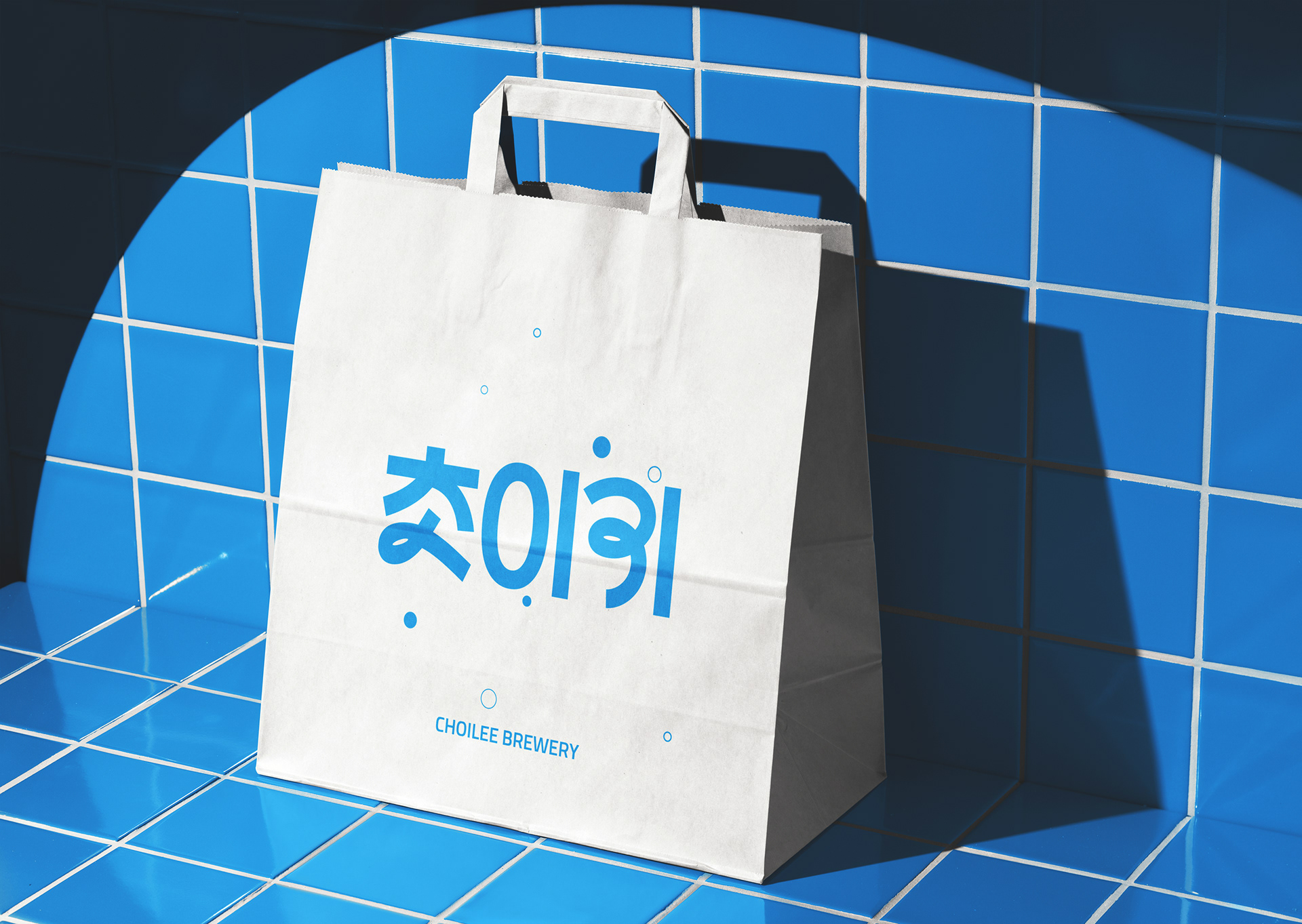
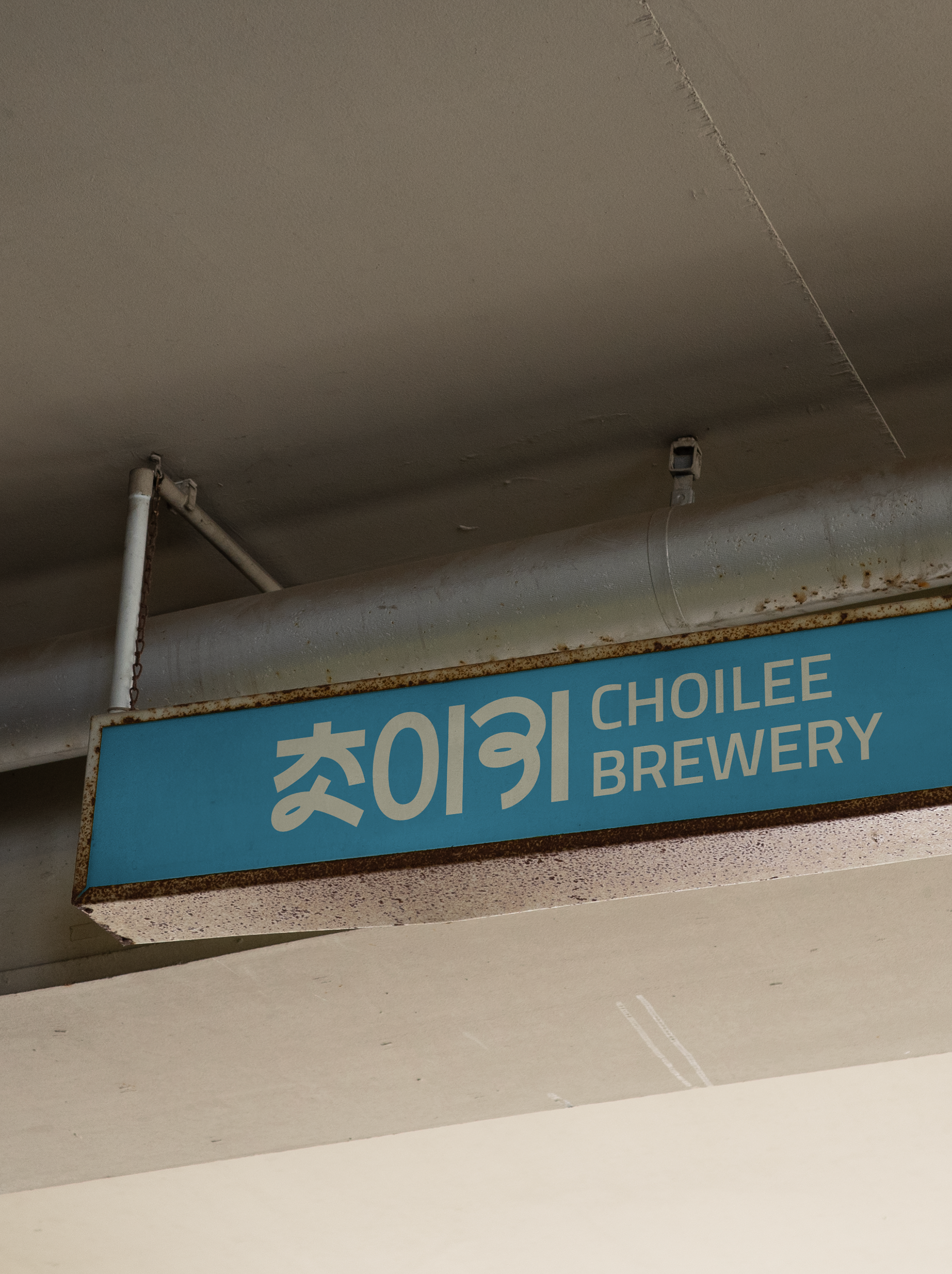
초이리의 블루는 다양한 배경 속에서도 선명하게 드러나며 브랜드를 직관적으로 인지하게 합니다.
CHOILEE’s logo, both flexible and refined,embodies the attitude of K-Culture engaging with the world.
Its balance—neither rigid nor overly playful—demonstrates the brand’s long-term versatility and value.
Choiri’s signature blue stands out across diverse backgrounds, allowing the brand to be instantly recognizable.
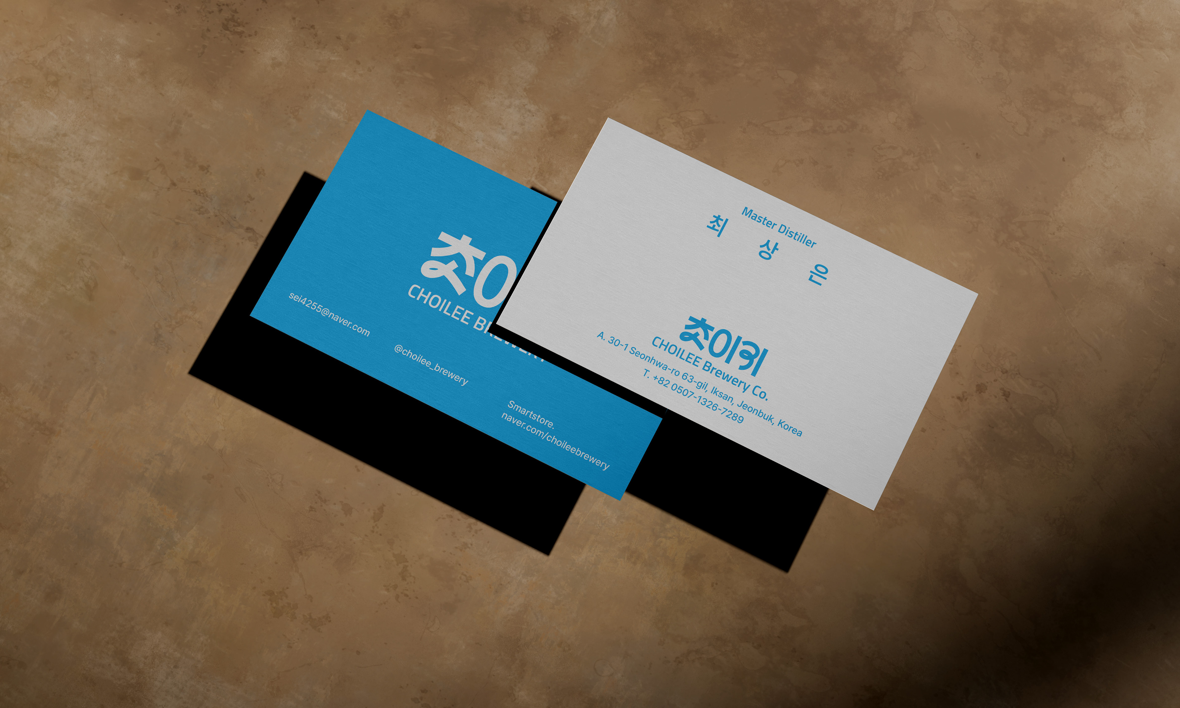
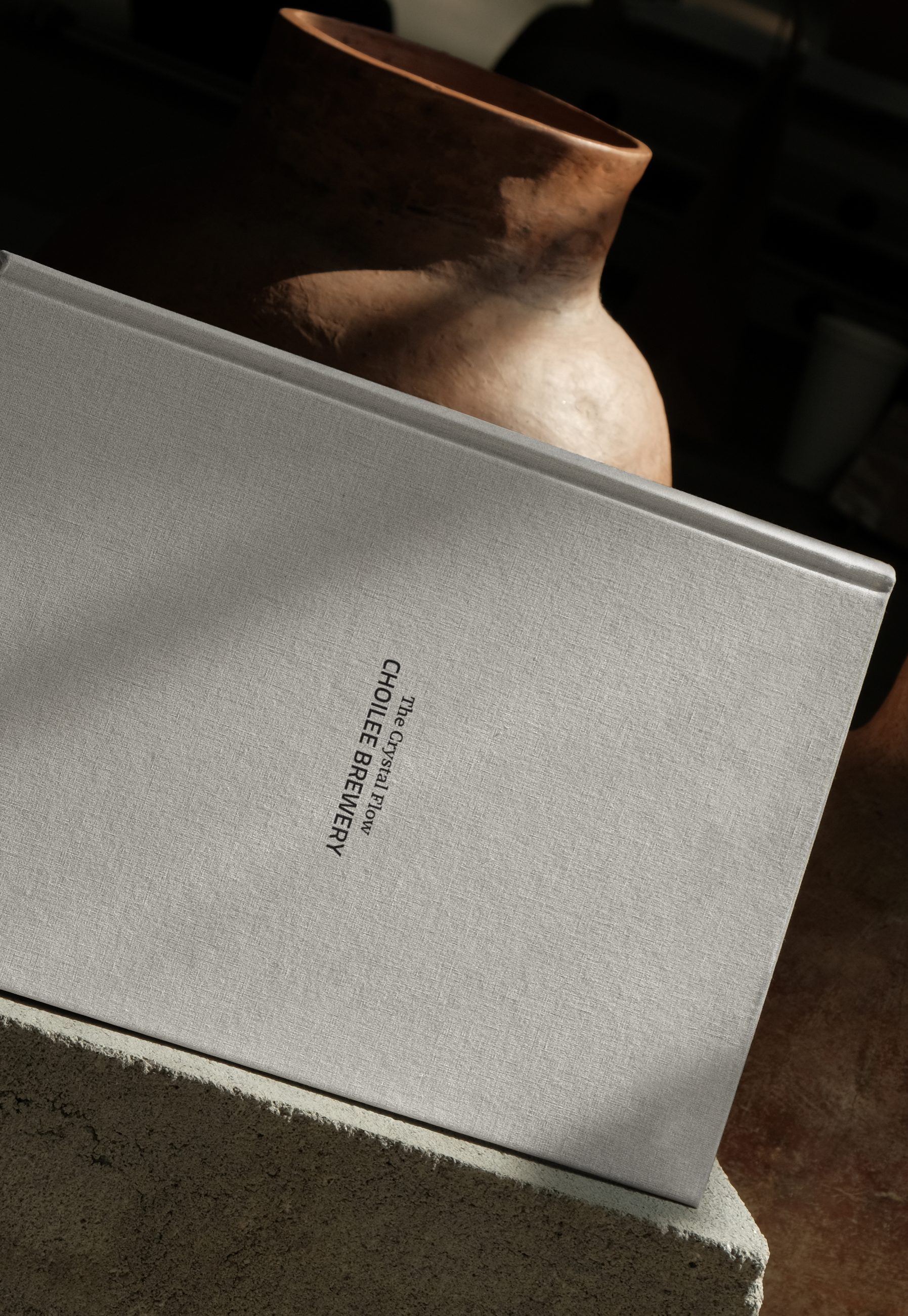
CHOILEE Branding Project
2026
Client: CHOILEE Brewery
-
Design Area
#Branding #Packaging #Graphic Design
-
Project Team
FDG Design A Team
-
Project Management
FDG / Visual Identity & Application Design Dev.
-
Art Direction by WooSang
Designed by MINA JUNG / SUN LEE
www.fouroclock.kr